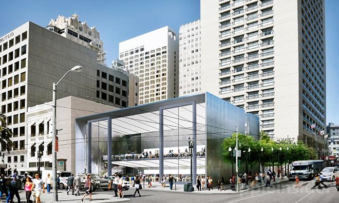
After a hearing on Thursday, the San Francisco Planning Commission approved Apple's final plans for a two-story flagship retail outlet, which one company representative said will be more iconic than the Fifth Avenue location in New York.
According to notes published by the city Planning Commission, plans for the Union Square Apple Store received a preliminary recommendation of "approve with conditions." Specifically, a review and alteration of the store's second level, as well as tweaks to the rear plaza, are required to move forward.
Following the two-hour hearing, ifo Apple Store's Gary Allen tweeted that an Apple rep said the new outlet would be more iconic than the company's Fifth Avenue location. That location boasts a giant glass cube designed by late Apple cofounder Steve Jobs.
The determination comes less than a week after AppleInsider discovered newly-submitted renderings and detailed architectural plans for the site, which call for a redesigned front facade and other alterations.
As part of the deal, Apple must comply with certain stipulations pertaining to the preservation of the surrounding area as well as a controversial folk art fountain sculpture located in a plaza behind the store.
Since being announced in 2013, plans for the Union Square Apple Store have gone through a number of revisions. The original design caused a fracas as it apparently called for the removal of the fountain installation. Designed by local artist Ruth Asawa, the sculpture tells the history of San Francisco and consists of 41 plaques made of baker's dough then cast in bronze.
The most recent Apple Store design, included in the packet embedded below, features a cantilevered building structure with an all-glass front holding two giant two-story sliding glass doors. Other improvements over older designs include a waterfall and free Wi-Fi in the rear plaza.
