Opera Software on Thursday launched Coast version 3.0, a Web browser for Apple iOS devices that eschews extraneous onscreen buttons and text boxes for intuitive gesture controls and contextual pop-out menus. The end result is a tidy full-screen surfing experience.
With the latest Coast, Opera stripped down the common browser to its basics and kept going. Left behind is a graphics-based UI with gesture control and an intuitive design that feels more like a dedicated content consumption app than a Web browser.
AppleInsider was able to test out Coast for a short time and came away impressed with what Opera has done to transform iPhone and iPad Internet surfing. It's not the most powerful browser in the iOS App Store, nor is it the most feature-rich, but Coast delivers on ease-of-use and style.
First off is the interface. Opera baked in a healthy dose of polish to its GUI, including a background parallax effect and physics-based swiping. While they don't seem out of place, certain animations like contextual pop-up menus are slow and can get old.
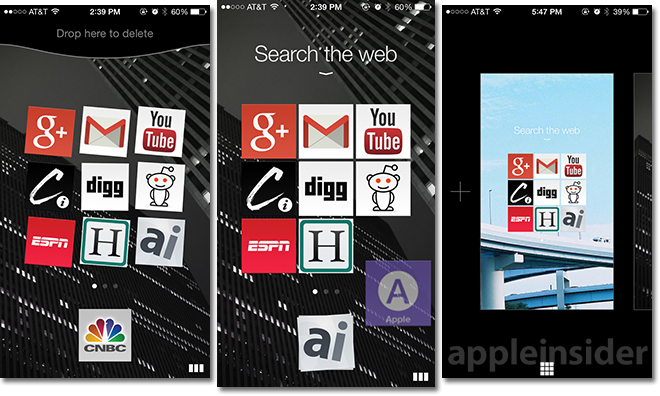
The home screen features a grid of nine web pages with tiles laid out like apps in iOS. Users can add additional slots after they visit webpages of interest and rearrange the "tiles" across multiple pages as they see fit.
As a non-functional but interesting design choice, Opera allows the background of each shortcuts page to be changed.
Above the webpage tiles are the words "Search the web" with an iOS 7-style downward-facing chevron. Pulling down from anywhere on the screen pushes the grid and background out of view, revealing a dark gray search pane hooked into Google.
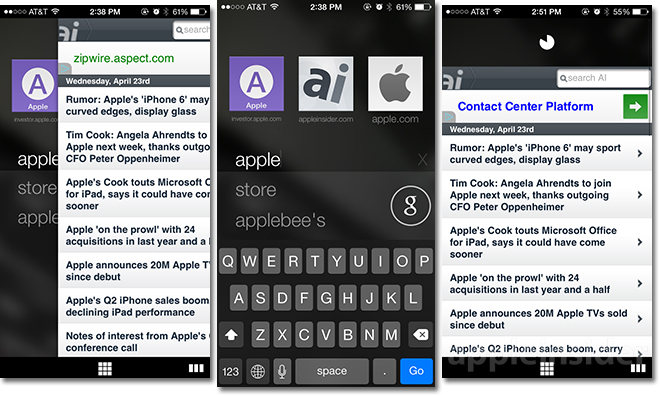
A swipe-able row of recommended tiles populate the top of the screen, while an empty space text input box sits above the keyboard. Start typing and Coast begins predicting possible search queries. The prediction feature also works for website addresses.
For example, typing "APP" brings up results like "Apple" and "Applebee's," which are displayed just below the search bar. Corresponding webpages are shown above the search area for quick navigation. Tapping on a result will result in more choices, like "Applebee's California." If the app doesn't find a website that matches a search, it defaults to Google's search page.
In Coast, there are no loading bars. Instead, navigating to a website like Applebees.com will "flip" the current card to a loading screen that displays nothing but a pulsing Applebee's logo until the page is loaded.
As for viewing, the app automatically rejiggers content to fit onscreen. According to Opera, the process is more than scaling down images and text, but actually placing Web assets in a way that is pleasing to the eye and touch-friendly. This system worked in most cases, though some mobile pages didn't play nice with Coast's design and would sometimes drop text off-screen.
Gesture controls work similarly to Apple's Safari, with swipe motions for moving back and forward, pull down to refresh. A novel swipe right gesture closes the browser window from a website's landing page.
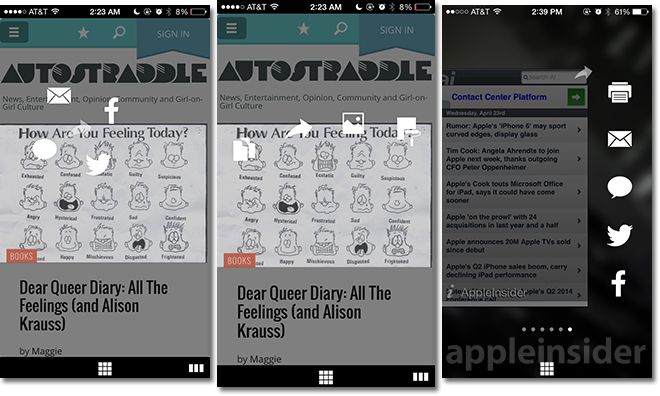
Without onscreen controls to clutter the view, Opera implemented an intuitive contextual pop-up menu for copying, saving and sharing images. A tap-and-hold gesture invokes a radial selection tool with options for copy to clipboard, sharing (which brings up a second menu leading to social media sites), save to Photos and set as wallpaper. Text selection and copying is handled by iOS.
Down at the bottom of each browser card is a shortcut back to the home page grid and an icon that leads to browsing history. As with almost everything else in Coast, histories are visual and can be viewed page by page. Flick upwards and the card is deleted. The mechanism is identical to iOS 7 multitasking, but with webpage snippets instead of apps. Sharing of webpages is also an option from the history view.
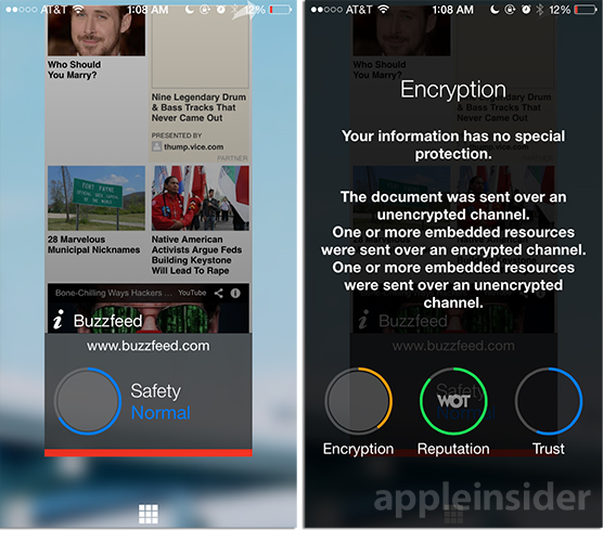
A novel features accessible from the visual history view is a site's safety rating, seen above, which factors in encryption, reputation and trust metrics.
Finally, Coast uses iCloud to sync favorite websites between devices.
Coast may not be the best choice for users wanting to deep dive into a particular subject, flipping back and forth between 12 active pages, but that's not the experience Opera is trying to deliver. The app is designed for casual browsing, when you have time to kick back and just surf.
Opera's Coast is available now as a free 22.7MB download from the iOS App Store.
