 AppleInsider Staff
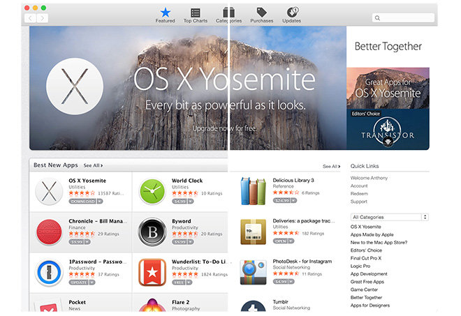
Apple late Wednesday began rolling out a redesign of its Mac App Store with new flat graphics, thinner font styles and a more open feel, in line with the latest OS X Yosemite release.
As seen in the screenshot above, the Mac App Store moves further toward a "flat design" aesthetic with the removal of shading and skeuomorphic assets like lighting effects left over from past Apple software.
Compared side-by-side, the new look delineates content with thin gray lines instead of shaded boxes with thick "shiny" headers. In some cases, like informational app sidebars, text is simply floating in free space, denoted as a group through paragraph formatting and font sizes.
Images, too, are slightly tweaked and no longer pop off the screen, but instead appear integrated into the page alongside release notes and hyperlinks, which are a few shades darker than surrounding text.
The background no longer sports a stippled gray granite-like look, replaced with a solid light gray color. The net result is a less cluttered interface that puts focus on imagery and content rather than page design elements, much akin to the look of Apple's new iTunes 12.


For now, the update appears to be rolling out in stages as some users have reported seeing the fresh design only intermittently, while others are now seeing it full time.
Apple is slowly transferring its entire collection of first-party apps and Internet services, including the Apple.com website, over to the spartan design theme introduced with iOS 7. The most recent changes came when OS X Yosemite rolled out in October.


 Charles Martin

 Malcolm Owen
 William Gallagher

 Christine McKee
 Wesley Hilliard


32 Comments
"puts focus on imagery and content rather than page design elements, much akin to the look of Apple's new iTunes 12" "text is simply floating in free space" Yes, it puts the focus on Ive's non-existent understanding of user interface design, since it just removed all visual differentiation, any user interface elements that made it easier for users to navigate, scan, and choose quickly, forcing all of us to over-focus and read every element of text to browse for something we might want. This is similar to what happened to the OS X sidebar which forces you to read through every piece of information as there's no color and hardly any icon visual differentiation. Brilliant, modern design seems to equal removing any user interface and just putting up a list that looks like it was made in MS Word by an accountant. It looks like it was designed by someone who has no clue about design. Yey! Just pondering... (or just venting this time, Sorry.)
Looks nice. – I think, it is removing all elements, so that they can re-add more differentiating elements, just in a very different way. As usual, Apple is moving slowly there, without rushing in a cluttered new design and then change it, as it doesn't work.
Here's an idea to take out the clutter from iTunes:
Why not have the mac, iPhone, iPad and ? watch apps in one unified App Store?
It does not make sense to me to have:
Just rebrand the Mac App Store to App Store in order to cater all.
In all honesty, I do wish Jony's duties with regard to UI would be spun off to a far more experienced person. Surely there are experienced people around somewhere?
Oh, and one more thing:
Can I move my .mac, .me and .icloud account to just one account? It is annoying having to sign in/out in order to update the different apps on my various accounts I accumulated through the years.
e.g. I always have to use my .mac account to upgrade iPhoto and iMovie. The Yosemite upgrade was on my .me account. It does get very cumbersome.
Perhaps Apple should make use of the touch id on your iPhone (via continuity)?