If you've ever found yourself despairing over Apple's insistence that home screen icons be lined up neatly in rows, but can't — or won't — turn to jailbreak tweaks, a relatively new Web app called Makeovr has come to your rescue.
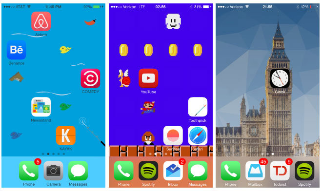
Makeovr provides a quick way to create "invisible icons" — icons that will occupy slots on your home screen, but which appear to blend into the background. Using this technique, you can position regular app icons or folders in a slot of your choice.
It works by taking advantage of an iOS feature that dates back to the first-generation iPhone: the ability to add Web pages to the home screen as pseudo-apps. This was, of course, Apple's initial strategy for third-party apps on the platform but was quickly superseded by the iOS SDK and App Store.
Apple gives web developers the ability to define custom icons for use in the event that their site or Web app is added to an iOS home screen. Makeovr creates a number of custom icons based on a specific wallpaper, and lets users select individual icons based on which portions of their screen they'd like to be "blank."
You can choose from one of Makeovr's ready-made themes, including an excellent Mario offering, or upload a screenshot of your own background to create bespoke blanking panels. To get started, visit makeovr.io from an iPhone 5, 5s, 6, or 6 Plus.
For those who want an entirely blank first page of their home screen, Apple began catering to minimalists with this option starting in iOS 8.
 Sam Oliver







 Charles Martin
 Wesley Hilliard
 Stephen Silver
 William Gallagher

 Marko Zivkovic
 Andrew Orr





16 Comments
This is absurdly useless. Plus I'd imagine if you tap on the "empty" space where normal apps would've been that it will take you into safari. What is minimalistic about having multiple useless invisible icons? I think that goes against the idea of minimalism.
Doesn't this just create a bunch of links to MakeOvr's site on your screen? I don't want to launch Safari every time I touch one of those spots accidentally....or am I missing something? Clever...but not very practical?
Have to agree. Of things that irritate me from time to time about Apple what some see as inflexible I don't bother about. I'd rather have a bit of inflexibility but an ecosystem that 'just works'.
I wouldn't bother myself (and I like my parallax!) but I'll admit, it's a clever hack!
This is a great idea, I like having only a few icons per screen without bunching them together in the top left corner. I have the 6 and this would also work great to leave left column blank. I'm trying it :)