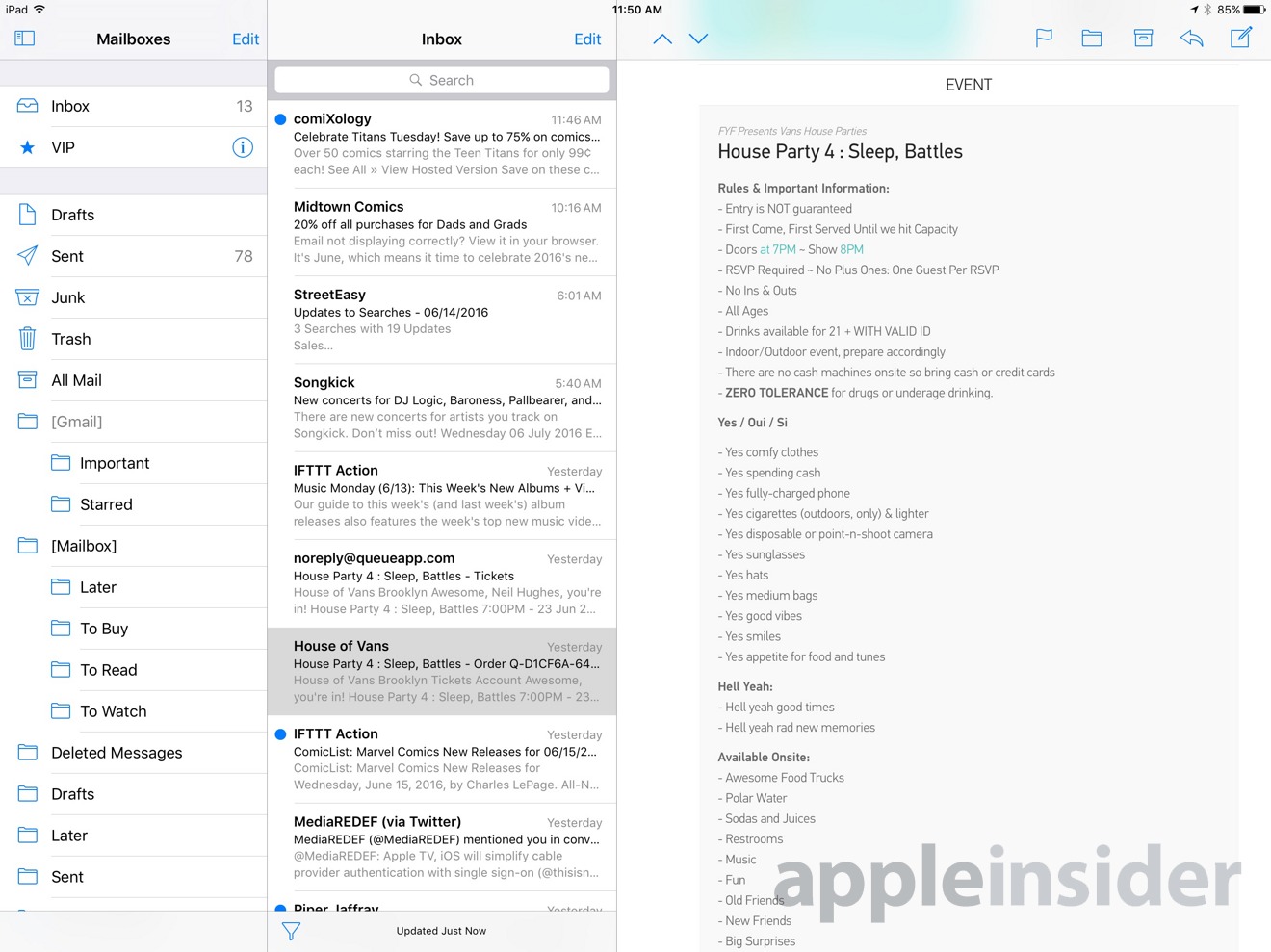
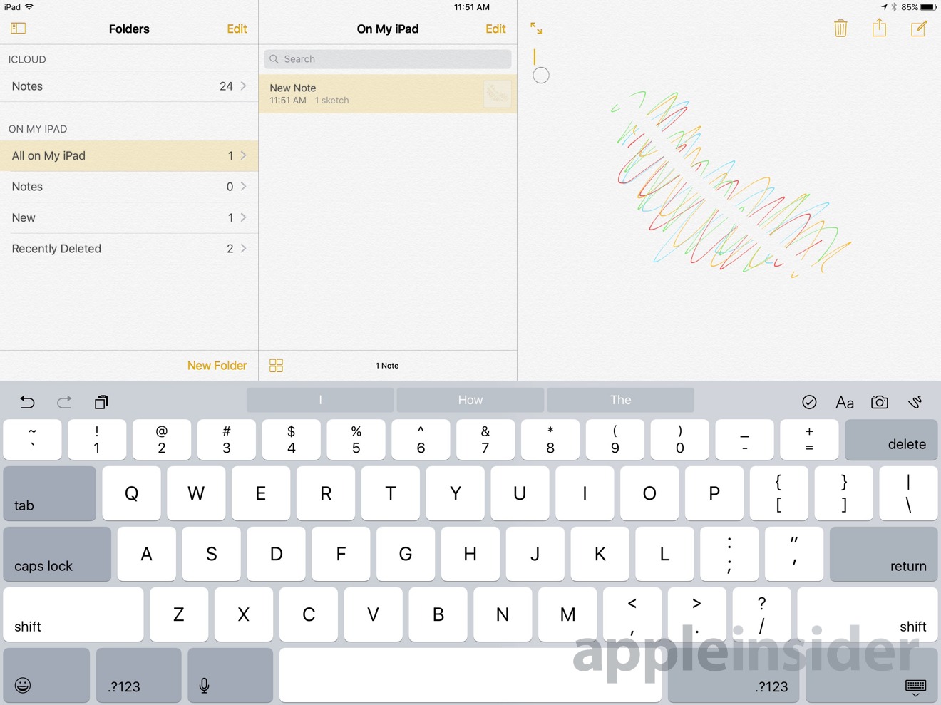
Owners of the 12.9-inch iPad Pro can take better advantage of their screen space in iOS 10, thanks to new versions of Apple's Mail and Notes apps that include three panes in landscape mode instead of the two present on other iPads.
In Mail, the 12.9-inch Pro will show top-level mailboxes, their contents, and selected message bodies all at the same time. On smaller iPads, users can see either the top-level view or mailbox contents, but not both.
Likewise, Notes can now display folders, item lists, and note contents simultaneously on the largest Pro, whereas other iPads can only offer one of the first two alongside note content.
Editor's note: This article was originally published in June following Apple's announcement of iOS 10 at WWDC 2016. It has been updated and republished to coincide with the mobile operating system's public release. For more on iOS 10, see AppleInsider's ongoing Inside iOS 10.
 Roger Fingas




 Charles Martin
 Malcolm Owen

 William Gallagher

 Christine McKee
 Wesley Hilliard






5 Comments
Are these toggle-able? I like the idea in Mail, but not in Notes.
I find the attachment feature still needs work. Whilst it is terrific to still be able to attach actual files, if you want to attach more than one file, you cannot select more than one at a time, whilst not a major drama it does become a pain, especially if you say have attached it via DropBox and you have to click through all the folders to get back to where the two files are stored. I would like to see the simple option of being able to attach more than one file at once and it to at least remember the last place you attached a file so at least you can save time without going through the whole process each time you want to attach another file.
Found a glitch in Mail, while in split screen mode in landscape on iPad Pro 12.9", when reading emails, the the '' (previous and next buttons) are missing, such that you have to return to the inbox to get to another email. They do show up in portrait split screen, but are missing in the landscape split screen mode...
I'm hoping for some iPad only enhancements in iOS 10.1. The new lock screen + notification centre seems a tad bit off.
Still, I just love very small things that Apple does. For example, I have a pic of a planet as my lock screen background on my iPad Pro and now, in landscape mode, the time is not defaulted to the centre, but to a side, making it look very classy.