This week's launch of watchOS 3 brought about fundamental changes to the way the Apple Watch hardware and software interact with each other, including a rare admission by Apple that a number of key concepts introduced with its wearable device missed the mark.
Previously, the hardware side button on the Apple Watch brought up a list of contacts for sending Digital Touch messages. Apple initially thought quick access to this menu would help to make the Apple Watch a deeply personal device, connecting with others in new and intimate ways.
As it turns out, Digital Touch didn't catch on in the way Apple had hoped. And so in an about-face, the company rethought the use of the side button with watchOS 3, along with other major elements of the wrist-worn operating system.
In reinventing the watch for watchOS 3, Apple has looked to iOS and macOS, borrowing the concept of an application dock for recently and frequently used apps.
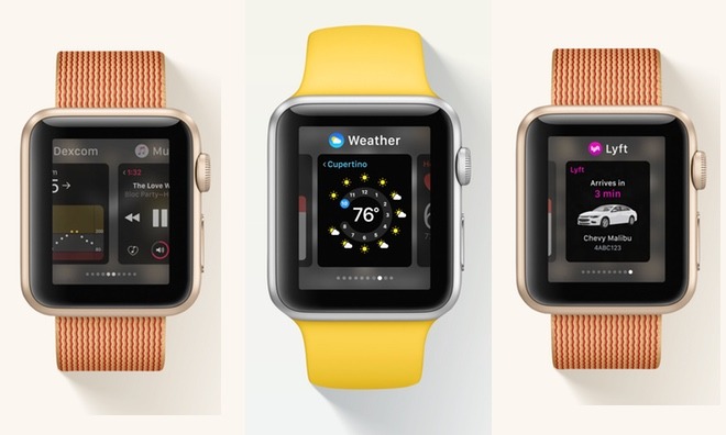
Starting with watchOS 3, pressing the side button will instead bring up a new application dock. In reinventing the watch, Apple has decided to turn to a familiar concept, echoing the docks already found on macOS and iOS.
The watchOS 3 dock shows recently opened apps, and also present a recent screenshot of the app, providing users with quick access to information. Apps also remain in a paused state, allowing them to open much more quickly than in previous watchOS builds.
Users can customize the dock by pinning apps of their choosing, ensuring they will always be quickly accessible when pressing the side button on the Apple Watch.
The new app dock replaces the concept of Glances that was introduced with the first watchOS and remained in watchOS 2.
Here is yet another admission by Apple that a concept it heralded with the first-generation Apple Watch simply wasn't working — Glances from third-party apps proved slow to load, and flipping between them was cumbersome and inefficient. By going back to the drawing board, Apple hopes that watchOS 3 will help shape the future of wearable devices and make the Apple Watch even more essential than before.
While Glances got the ax watchOS 3, Digital Touch remains — just without quick access via the side button. In fact, Digital Touch support has grown, expanding to iPhone and iPad with iOS 10, where it is featured directly within the Messages app.
Eliminating Glances also forced Apple to rethink access to common settings and controls, which were previously made available in the Glances view. Here again, Apple has borrowed from iOS and introduced a new Control Center for watchOS 3, allowing users to swipe up from the bottom of the screen to access most-used settings.
Editor's note: This article was originally published in June following Apple's announcement of watchOS 3 at WWDC 2016. It is being republished to coincide with the wearable operating system's public release. For more on watchOS 3, see AppleInsider's ongoing Inside watchOS 3 series.
 Neil Hughes



-m.jpg)


 Marko Zivkovic

 Christine McKee
 Andrew Orr
 Andrew O'Hara
 William Gallagher


 Mike Wuerthele
 Bon Adamson
-m.jpg)


41 Comments
Using the side button for said feature is a smart move. It could make performing a quick task even faster than Siri. Smart move. Getting rid of glances was also smart. Having glances on a display of this size was never going to fly long term.
Access via side button feels a little clunky - much preferred acess via upward swipe. Better than contacts I suppose. I wonder how useful scribbles will be.
Scribbles will be huge. Sending a quick note by spelling will be great. You can't interrupt everyone with Siri when you're in an important meeting.
ui seems much better than the current version...looking forward to it...but generally...the watch has too many hidden interactions, from arbitrary force touch actions, single vs double button clicks, and swipes from all sides of the watch.