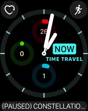
In refining the Apple Watch experience with watchOS 3, Apple is focused on making information and functionality as quickly accessible as possible. It accomplishes that in a number of key ways, including a variety of new watch faces and complications.
With watchOS 3, Apple is introducing new complications for the following Apple Watch apps and features:
- Breathe guided meditation app
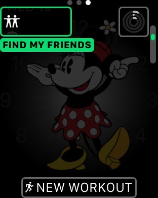
- Find My Friends
- Heartrate monitor
- Home app for HomeKit controls
- Apple Mail
- Apple Maps
- Messages
- Music
- Phone
- Reminders
- Remote
- Weather conditions (separate from temperature display)
- Workout
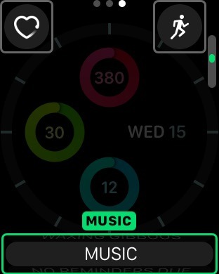
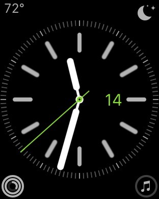
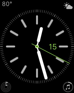
The complications work largely as you'd expect, displaying relevant information and allowing quick access to their respective apps when tapped. For example, the Music complications will show how far along the currently playing song is in the smallest view, while watch faces that allow larger complication displays will show track title.
The expanded lineup of complications also show that Apple is rethinking how users interact with their Apple Watch. While in previous version of watchOS complications were largely for displaying information, some of the new complications in watchOS 3 exist primarily to serve as quick links to open apps, like Phone and Remote.
Customization is even greater in watchOS 3 with a handful of new watch faces and tweaked options. For example, timelapse and custom photo watch faces now have an additional complication space, which can be used to display information beyond just the time and date.
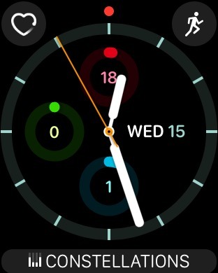
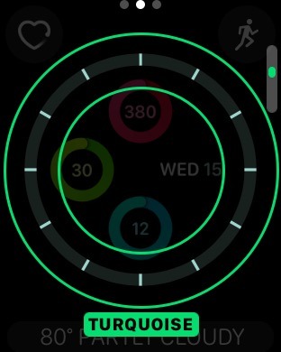
There are also a pair of all-new watch faces that are focused on fitness, displaying the progress of a user's activity rings in prominent forms. Like other watch faces, these are highly customizable with layouts, colors and complications that can be tailored to the user's liking.
With an expanded lineup of faces and complications, Apple has also made it easier to quickly switch between watch faces on the fly. On the standard watch face display, users can simply do an edge gesture, swiping from either the left or right side of the Apple Watch screen to quickly jump to the next face.
The new watch face options are joined by a change to the Apple Watch's side button, which now serves as dedicated access to a new app dock in watchOS 3. Now, pressing the side button gives users quick access to commonly used and recently opened apps, which are also saved in a static state, allowing them to open much more quickly than in previous versions of watchOS.
watchOS 3 is compatible with all Apple Watch models and is currently in beta for developer testing. It will launch as a free update this fall.
 Neil Hughes








-m.jpg)


 Malcolm Owen
 Marko Zivkovic
 Wesley Hilliard
 Christine McKee


 William Gallagher

-m.jpg)


9 Comments
Out of all the announcements at the WWDC this year. watchOS excited me the most. Making me now want an Watch while before I was more ambivalent. With new watch hardware expected this Fall, it could be the perfect storm!
I've had my Apple watch for 4 months now, and I really like it. It's really handy for a runner like me, being able to control my music and Map My Run app from my watch rather than having to fumble with my phone while running. That alone was worth the purchase price. But beyond that, getting notifications without having to have my phone on my person, especially when around the house, is also incredibly handy. But the watch definitely shows signs of a first generation product. I'm still learning the nuances of how to navigate around watchOS and find the best ways to activate and control the apps I use the most. These new updates look incredibly promising in streamlining control of the watch and making it much more user friendly. Can't wait until this is release, going to really change the watch for the good.
Yeah I agree. If they have managed to make this many improvements to the watchOS then I can't wait to see what they have planned for the new hardware.
One thing I haven't seen is how you access what was the Friends feature now that the Dock has taken over the side button.