Affiliate Disclosure
If you buy through our links, we may get a commission. Read our ethics policy.

macOS Sierra may expand use of Dark Mode to native app backgrounds

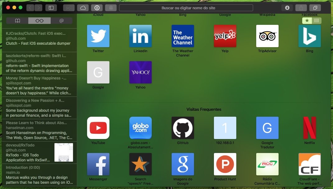
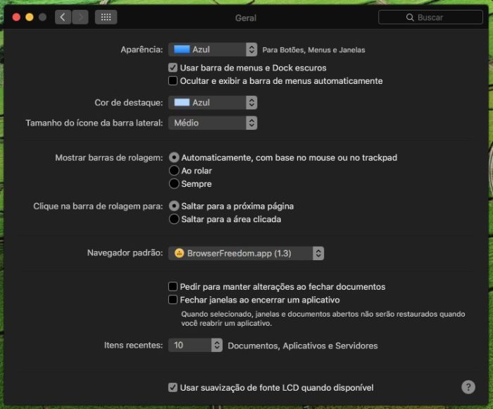
When macOS Sierra launches this fall, it might include an improved Dark Mode which carries the theme beyond just the Dock and menu bar, according to posts by a developer on Twitter.

Screenshots shared by the developer show Sierra's System Preferences window running with a dark background, as well as Safari, though the latter app has translucent elements. It's unknown how the new graphics were activated, and indeed there's no guarantee they'll appear in the final release of the OS.

Similar code has been discovered in the iOS 10 beta, however, and it would make sense for Apple to offer a similar Dark Mode experience across platforms, given its tendency to share other features between iOS and macOS. Even tvOS is slated to gain a Dark Mode later this year.

Macs have traditionally featured bright, often stark-white interface elements, but even some people who prefer that aesthetic have complained that it can be painful on the eyes in low light.

Apple may also be paving the way for adoption of OLED screens beyond the Apple Watch. Because OLED panels can turn individual pixels off to achieve a pure black, using as much of that color as possible in an interface is actually a way of extending battery life.


11 Comments

macxpress 16 Years · 5913 comments

I hope this is truly available throughout the entire OS (and apps)sooner rather than later. I absolutely love this feature as I use the computer in low light conditions a lot. Plus, I think it looks nicer overall.

hypoluxa 22 Years · 619 comments

This is a great move if they do this. Yes please.

volcan 10 Years · 1799 comments

macxpress said:
I hope this is truly available throughout the entire OS (and apps)sooner rather than later. I absolutely love this feature as I use the computer in low light conditions a lot. Plus, I think it looks nicer overall.

To each their own. As long as it is optional, no big deal.

Personally I don't like Apples recent iOS trend of making text difficult to read. Dark grey text on a black background is stupid in my opinion. (See the title of the control panel image in the article.) At least Apple's website is designed with plenty of whitespace, large type and sufficient contrast, making it very easy on the eyes.

That said, I do like the dark mode in Photoshop because serves a purpose, to prevent bright white from interfering with the true colors in the image, but that is a special case because it is a photo retouching app. In general purpose apps I see no real advantage to using a dark background with lighter text, because in most cases it will only apply to the menu bar and I don't think it improves readability at all, but as long as it has enough contrast I'm ok with it.

I spend a lot of time on the web where most of my really important sites use white backgrounds anyway, so the dark mode wouldn't have much of an effect on the overall appearance for me. If the dark mode was really beneficial to the app content, such as with Photoshop, then the app or the web page itself is probably already providing that interface.

hypoluxa 22 Years · 619 comments

volcan said:
macxpress said:
I hope this is truly available throughout the entire OS (and apps)sooner rather than later. I absolutely love this feature as I use the computer in low light conditions a lot. Plus, I think it looks nicer overall.
To each their own. As long as it is optional, no big deal.

Personally I don't like Apples recent iOS trend of making text difficult to read. Dark grey text on a black background is stupid in my opinion. (See the title of the control panel image in the article.) At least Apple's website is designed with plenty of whitespace, large type and sufficient contrast, making it very easy on the eyes.

That said, I do like the dark mode in Photoshop because serves a purpose, to prevent bright white from interfering with the true colors in the image, but that is a special case because it is a photo retouching app. In general purpose apps I see no real advantage to using a dark background with lighter text, because in most cases it will only apply to the menu bar and I don't think it improves readability at all, but as long as it has enough contrast I'm ok with it.

I spend a lot of time on the web where most of my really important sites use white backgrounds anyway, so the dark mode wouldn't have much of an effect on the overall appearance for me. If the dark mode was really beneficial to the app content, such as with Photoshop, then the app or the web page itself is probably already providing that interface.

It will most definitely be optional, if they implement it.

coolfactor 20 Years · 2341 comments

Dark mode in those screenshots looks very similar to Accessibility's "Invert Colors" option.