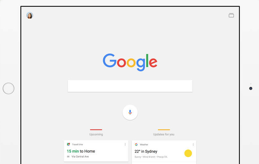
Google has updated its stand-alone search app for iOS, and has shifted the focus of information presented to user away from a personal upcoming events feed, and towards a curated news and current events feed in an effort to boost user interaction with the app.
The upcoming feed integrating calendar data, travel time, and other user-specific information is still selectable by hitting the icon on the bottom right to toggle the screen. However, there does not appear to be any way to revert the app's main screen away from the news-centric feed.
As with the previous version of the app, specific points of data to track, like stocks to watch, named people or topics of interest are still customizable. Google claims that this list will become more and more tailored to the user's desires the longer that the app is used.
The overall design of the app is retained from previous versions, with the same card-based design, sporting Google's latest visual identity.
Initial AppleInsider testing of the App shows slightly slower returns of data from Google, but this may be a result of a new user profile being built with the new version of the app.
Version 21.0 of the Google Search app requires iOS 8.0 or newer, and 180 MB of storage space.
 Mike Wuerthele




 Charles Martin
 Malcolm Owen
 William Gallagher

 Christine McKee
 Wesley Hilliard



9 Comments
I don't know how I feel about this. The best thing about that app, to me, is the focus on my personal stuff. I really *like* the Google Now concept.
For me at least, making news and current event stuff front-and-center is going to cause me to use the app less, not more.
I have other apps that I like (Apple News, Google Newsstand, Feedly) for getting my news from, and I don't really want the feed to get smarter and smarter (by which they mean more and more narrowly focused on showing me just things that match my preconceived notions or prejudices).
This is a meh for me. Wonder how other people will receive it.