With nearly every version of iOS since Apple Music rolled out in 2015, the company has been tweaking the user interface in a bid to make things easier for users — and iOS 10.2 is no exception.
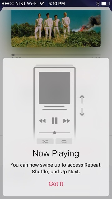
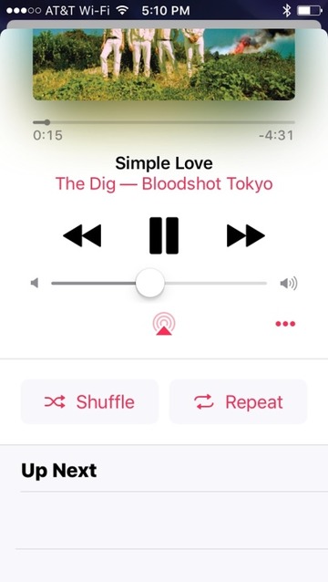
Rather than needing multiple screens for "Now Playing" in Apple Music, users can now swipe up while listening to a track to invoke the shuffle, repeat, and up next display. Apple helpfully points this out in an early launch of the app after the update.
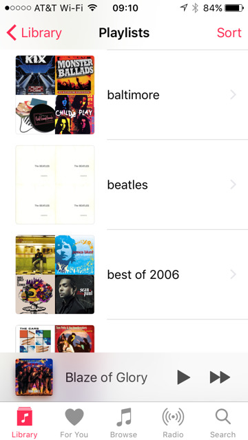
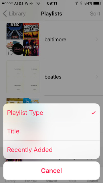
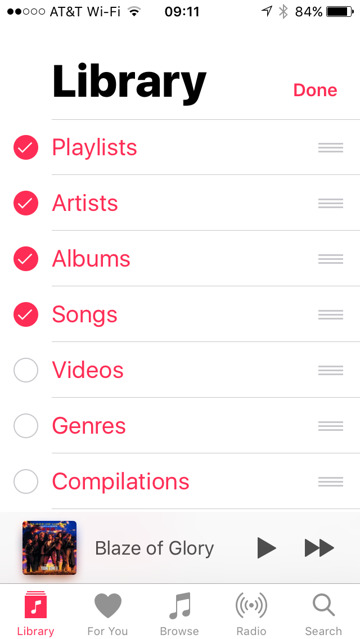
The Library feature has been modified, giving the user more clear options to select and sort albums and songs, as well as playlist modification.
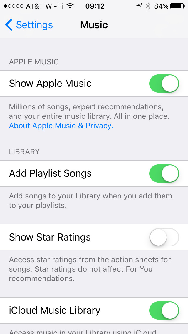
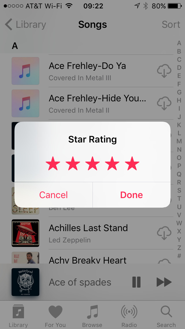
Apple didn't make a big deal about one feature re-addition, however — star ratings have returned. Users wanting to utilize ratings again can turn on the feature in the main Settings menu, under Music.
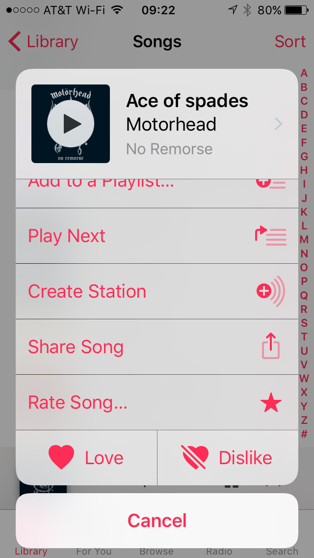
After the option is toggled, users can rate songs on the action sheets for the track in question, by invoking the menu with Force Touch, or tapping the "..." button, and scrolling down on the list to "rate song"
Work in progress?
Overall, the new Music app is a bit faster in every regard than its predecessor on an iPhone SE and an iPhone 7 Plus on both Wi-Fi and LTE — but a hair slower on an iPhone 6 and 6s on the same networks.
Regardless of the speed benefit or loss, it appears, at least on the surface, that Apple has listened to complaints about the Music app, and by association, Apple Music's functionality on iOS. It just takes a few minutes to adjust to some of the new, and sometimes optional, changes that the new version of iOS brings.
 Mike Wuerthele



-m.jpg)


 Wesley Hilliard
 Malcolm Owen
 Amber Neely
 Christine McKee
 Andrew Orr
 Mike Wuerthele and Malcolm Owen




16 Comments
Apple have really made some fantastic improvements since launching the Music app, and listened to customer feedback. Pretty much all pain points have been addressed. Kudos to them, this is now a really, really solid app. I expect them to keep gaining subscribers at a fast rate.
Long time apple investor and apple music user from the start (had beats music before that, and spotify before that), but i recently setup a 4 month free trial of google music...and am surprised to find that it's much better designed than apple music. will probably switch back to apple music after the trial just because of apple music integrates better with the apple ecosystem, but hope apple continues to make their offerings better.
It's cool. However, I've been using 8tracks dot com since 2009. IMHO the best service. All human-user curated playlists.
The new music approach did at least one thing terribly wrong. All of those music videos I spent a fortune on are no longer easily aggregated in the videos tab. What was the wisdom of that?
The updates are nice small improvements. One small ask: I'd like to see the entire Music application updated to take advantage of the added screen real estate on the "Plus" model iPhones when in landscape orientation. That's all.