Google's YouTube on Tuesday began rolling out a series of planned changes to its mobile and desktop interfaces, including new aesthetics and several feature upgrades.
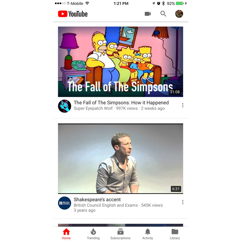
The iPhone and iPad app now sports a white header, which also showcases the company's redesigned logo. More practically, users can adjust video playback speed by tapping the triple-dot menu.
Further improvements are due on iOS and Android in the coming months, Google said, such as an experimental option that will let people skip between videos by swiping their hand left or right. The player itself will eventually adapt to the aspect ratio of each video, even vertical ones, while the area below will offer new ways to browse clips.
People worldwide should be seeing a redesigned youtube.com, which applies Google's Material Design concepts and an optional, oft-demanded dark theme.
Still missing in action is a native YouTube TV client for the fourth-generation Apple TV. At the moment, Apple TV support is limited to AirPlay — the service is on relatively few platforms overall though, including iOS, Android, Chrome, and Chromecast.
 Roger Fingas





 Andrew Orr
 Amber Neely
 William Gallagher


 Christine McKee
 AppleInsider Staff




25 Comments
The only thing that still bugs me - unless I've missed it or it's forthcoming - is that you cannot "close" the YouTube app and have the video miniaturize down as a floating window to continue playing.
material design UI is unintuitive and hideous, youtube app feels completely out of place with rest of iOS experience (i guess this is mostly intentional; that said, this should detract anyone who gives a damn about a nice mobile experience of considering a switch to android)