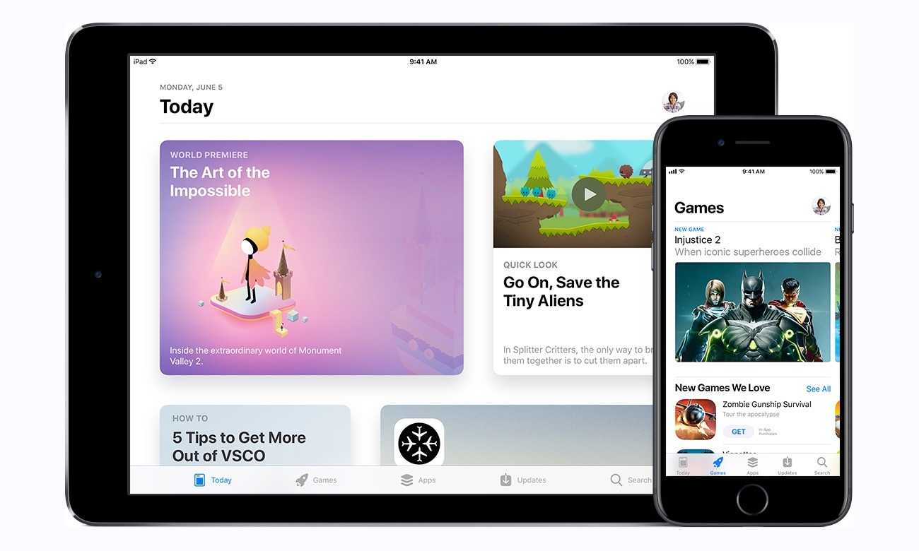
Apple has made it easier for developers to show off their app in App Store listings for the iPhone, iPad, Apple TV, and Apple Watch, by increasing the maximum number of screenshots that can be included in a product page to 10 images per device.
Announced on Thursday through the Apple Developer pages, the notification from Apple reads "You can now display up to 10 screenshots on your product page," in order to "show customers more of your app's experience." The new 10-image limit is on a per-device basis, making a maximum total of 40 screenshots that can be added to the App Stores per app.
Before the change, developers were restricted to five screenshots per device category. Doubling the number of images available to view may help developers give potential users more of an idea of how the app will work, such as by showing more individual features, or in the case of games, more levels, characters, or environments.
Developers are still able to submit 30-second videos previewing an app alongside the screenshots in the app stores. While the image limit has increased, the video previews amount remains at a maximum of three clips.
Search results will continue to show the first three images of an app's gallery, when no app preview clip is available. Apple advises developers to make sure the first three viewable images "highlight the essence" of the app, due to their potential appearance in searches.
4 Comments
Video previews are good enough.
About time!
The App Store (iOS and macOS) is one of the great tragedies of our time. Never has such a huge collection of consumable goods created by so many dedicated makers been so inaccessible and terribly difficult to discover. Whether there are 100, 1 million, or 100 million apps in the store doesn't really matter because the average shopper's view of the store is through a tiny pinhole that reveals almost nothing of the immense collection that exists. When you start drilling down into the App Store categories you quickly discover that the hierarchy is very shallow and just one or two levels deep it suddenly balloons out into an immense flat list with no apparent organizational model. Heck, some of the titles are in languages that are only readable by native writers/speakers of the language with a vague description, like "Utilities." With such vague and nondescript identifiers, not to mention meaningless names and useless app icons, finding an app using text based search is of little value. It's a huge and unfortunate mess that's starting to take on the characteristics of the mother of all dung heaps - and it keeps growing.
This isn't a problem that is unique to Apple, but it is a problem that is ripe for a solution and maybe Apple can attack it with the appropriate ferocity. Eventually AI may provide a solution, but in the interim I'd bet that Apple could put together a multidisciplinary team with library scientists, data scientists, retail specialists, big data analysts, UX architects, etc., to go after this problem. I have no doubt that Apple is unhappy with the current App Store model, and maybe they are trying to solve it, but all current implementations are very thin lipstick on a very ugly pig and the problem continues to get worse.
I realize the App Store numbers are immense, but if your local grocery store can provide a reasonable shopping experience with 30K-60K unique items, why can't the owners of app stores provide at least a comparable experience for a similar number of items while they go figure out how to scale their stores to work with millions of items? Apple's current App Store only provides a reasonable shopping experience for hundreds of items before punting shoppers into the massive abyss of flat lists. Moving us from hundreds to 50K would be a worthy first step. Without any hope of improvement developers and ISVs are going to revert to homegrown solutions and pull out of the App Store entirely. Throwing your hard work into a black hole that is the current App Store isn't worth the effort.