Steve Jobs may have been dismissive in January when asked about the Kindle (in-depth review), claiming that "it doesn’t matter how good or bad the product is, the fact is that people don’t read anymore."
But when the App Store launched this summer, there was a section dedicated to Books, which has since seen a steady addition of apps like Stanza (free, App Store) eReader (free, App Store), as well as a raft of single books and comics wrapped up as apps. The latter serve as poor solutions, forcing users to maintain an icon on their home screens for each book while lacking a means to encouraged discovery of new content.
And while some of these apps look good or offer a gigantic library to choose from, they lack a certain level of polish associated with the highest tier of iPhone applications.
Classics is the newest e-book reader to make an attempt at solving this problem. While not yet offering an enormous library of content, the team behind Classics has opted to instead focus on enhancing the experience of reading a book on the iPhone, taking up books from Project Gutenberg, and placing them into an aesthetically pleasing wrapper. AppleInsider has managed to get a early first look into the fledgling app.
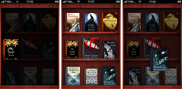
Opting out of navigation panes and lists, Classics instead goes the way of the visual metaphor, presenting you with a shelf full of books to choose from, which you can drag up and down. There are currently 12 books to choose from, ranging from Alice in Wonderland and The Jungle Book to Paradise Lost and Flatland, forming a healthy spectrum of tastes from which to choose. You won't find any Stephen King or J.K Rowling in there — copyright of course prevents this — but that's why it's called Classics. It's a particularly clever move to package well-established cultural items in a more tempting guise, and there's really no doubt that the books will appeal to a wide swath of users.
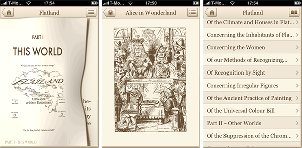
Graphically, no detail has gone ignored. Each book has an illustrated cover made especially for Classics by Daniel Goffin, David Lanham and Sebastiaan de With (who I've met before and is a pretty nice guy; check out his blog for a deeper look at the design of this app). The only problem with these covers at the moment is the absence of a view with larger detail, a feature which will be introduced in future versions. Some of the books have extra illustrations inside, such as Alice in Wonderland, which includes Sir John Tenniel's original and wondrous woodcut illustrations (unfortunately also unavailable in higher detail in this version of the app).
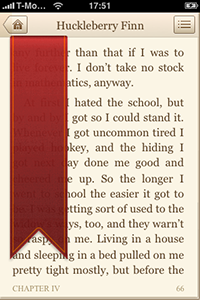
The process of reading introduces Classic's main gimmick: simulated page turning, with page turning sound effects. If it sounds like overkill, you grossly underestimate the power such novelties have upon the unsuspecting App Store browser. It looks great and has a solid feel. It's only natural that one would want to turn a page with one's finger, or at least something a little more heart-warming than pressing a "next page" button. There's also a nicely done Chapter navigation pane for skipping through texts more quickly. As for the reading itself, it is a huge relief to see black on white abandoned for the more subdued brown-and-beige scheme, evoking the feelings of real books. The formatting of the text has been completely redesigned for the app, right down to the typography. This lead me to turn page after page and willingly experience the odd sensation of reading a book on a phone.
As it stands, Classics looks to be a compelling purchase. It's all there: the good looks, usability, and the classic literature. With the promise of free updates providing new books, interface improvements, and more, Classics promises to stand out amongst a growing breed of iPhone apps. Classics is expected to be priced at $2.99 when it's released in the coming weeks.
Developers who would like to submit interesting new application ideas to AppleInsider for advance coverage consideration should contact Sam at sam (at) appleinsider (dot) com.


