Jump to a different section
If you buy an iPad, there's very little that you have to learn, and almost nothing you'll need to consult any sort of manual for.
Everything is minimalist and uncluttered, with tools appearing only when they make sense. Most things that you'd usually do with a mouse and an Inspector panel are now performed by hands-on finger work.
Touch a graphic object in a word processor and you can rotate, crop or mask it with your fingers using intuitive controls. Paint with your fingers but see results that look like a pencil or airbrush or wide tipped marker. Flick through videos as if they are pages in a magazine.
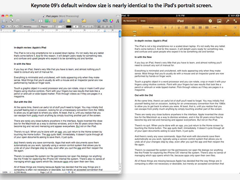
Apple's Pages word processor on iPad (which I used to enter all the text for this review) will probably look familiar to desktop iWork users (pictured opposite of each other, below), but it certainly doesn't demand any experience with the Pages 09 app in order to begin using it.
At the same time, there's an awful lot of stuff you'll need to forget. You may initially find yourself feeling lost on occasion, looking for an unnecessary convention from the 1980s to allow you to get back to where you were. At least, that is, until you realize that you can escape from pretty much anything by simply touching another part of the screen.
There are rarely any close buttons anywhere in the interface. Apple invented the close box for the Macintosh as a way to dismiss windows, and in the 30 years since they've become big and red and menacing and appear everywhere. But not on the iPad.
There's no quit. When you're done with an app, you just return to the Home screen by touching the Home button. The app quits itself, immediately. It doesn't cycle through all of your open documents asking to save them, it just quits.
And there's rarely any save commands. Apps that work with documents save them automatically as you work, typically using a version control system that allows you to undo all of your changes step by step, even after you quit the app and then reopen the file again.
There's no exposed file system nor file permissions nor open file dialogs nor anything like the Finder for exploring the iPhone OS' internal file system. There's also no sense of managing which app opens which file, because apps only open their own files.
All of these things are missing because Apple has decided that the way things are in computing is often not necessary or desirable, but merely an accepted convention that is often confusing and complicating in a way that adds very little value to most users, but saddles them with a level of complexity they needn't bear.
This review will present an overview of iPad as Apple's vision of the future of computing, which rejects the notion that "computing" should force people to wrestle with lots of low level complexity, and which instead seeks to harness powerful technologies to make performing complex things easy for end users.
Whether this vision will be well received and commercially successful is yet to be seen, but iPad is certainly set up with the perfect circumstances: it has achieved massive visibility, it is familiar to an installed base of 70 million iPhone OS users, it hits reasonable price targets, and it has a lot of big name developers adding value to it via the more than 3,500 new, iPad-specific titles in the iTunes App Store.
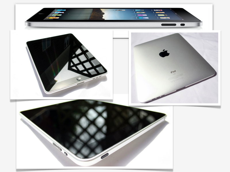
The hardware form factor of iPad is quintessentially Apple, with minimal lines, few exposed buttons and switches, and like iPhone, no ports other than the standard Dock Connector.
While it's commonly described as a "big iPod touch," iPad really looks a lot more like the top half of a small MacBook. It uses the same bright LCD screen as the new MacBook Pros, with "IPS" display technology for delivering accurate color and extremely wide viewing angles. It also sports the same glossy black wide margin around the display.
There are only four physical controls: the Home and Power buttons, a volume rocker control, and a switch to lock the orientation of the screen to prevent it from shifting as you tilt it. This welcome addition will hopefully make it to the existing iPhone and iPod touch as well, if only in software.
There's a headphone jack that supports the iPhone/MacBook integrated mic and remote control features (although no headphones are included in the box), as well as a built in mic and a decent quality (but mono) speaker grill that plays audio fully sufficient for enjoying a handheld movie or video game.
Its weight (1.5 lbs, 0.68 kg) and density makes it feel substantial, although it can hardly be described as heavy given the fleet of Tablet PCs that came before it (and are promised to come after it), which are all much bulkier and often significantly heavier in the 2-3 lbs range.
The back shell uses the same aluminum unibody construction Apple pioneered with the MacBook Air. This gives the device a strong, very rigid, and high quality feel.
Unlike the iPhone, which can warm up quickly while making a 3G call, or a MacBook running at full speed that can threaten to bake your legs, I've never felt any suggestion of warmth from the back(or the front) of the new iPad. This thing runs cooler than a cucumber.
For a 1.0 product, iPad offers simply phenomenal construction, feel, and design. Of course, that's because nothing about it is really 1.0, but rather a series of refinements to Apple's existing products, from the iPhone OS to its MacBook construction.
On page 2 of 10: iPad hardware: the battery; and iPad hardware: keyboards.
Jump to a different section
Thanks to the relatively large amount of space behind its large screen, iPad packs a big battery pack with 5.5 times the capacity of the iPhone. And despite its large and bright display, the device sips power very efficiently.
While desktop operating systems have incorporated a variety of power management technologies to enable them to work on notebooks, Apple's iPhone OS was built from the start to coast on as little energy as possible. That provides iPad with a much stronger starting position in efficiency than netbooks running Windows XP/Vista/7.
Like everything else that Apple builds these days, iPad has no user-replaceable battery. But there are lots of external battery packs and charging devices designed to work with the huge installed base of devices with iPod connectors, and many of these should work with iPad, too.
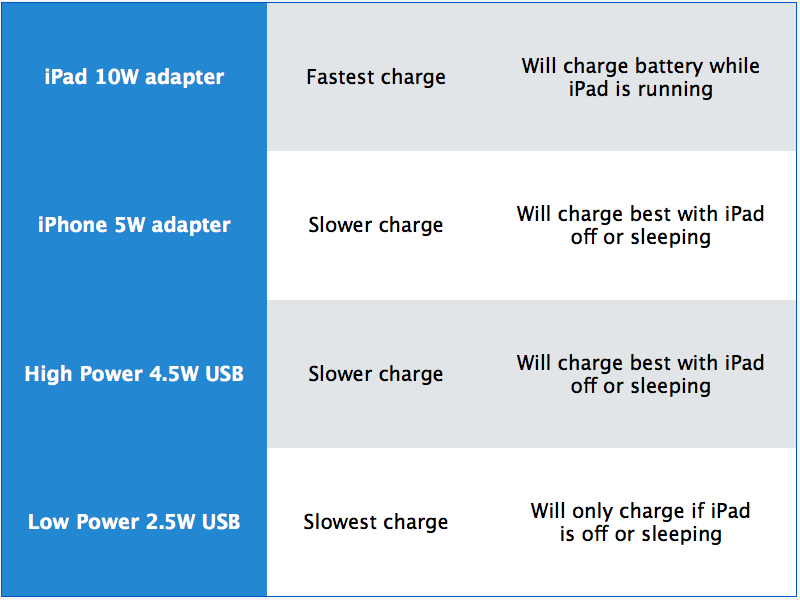
The device does demand more power to charge (and charge quickly) than the iPhone does, which is why it ships with a larger, 10 Watt adapter. It may also report that it is "Not Charging" when plugged into the USB ports on a Mac or PC.
This message, which of course can only be seen when the screen is on, means the device is using enough power to illuminate its display that there's not enough extra to recharge the battery. If you switch the screen off, it can trickle charge from USB if the port supports the "High Power" specification, which delivers 5 Watts. It will always charge fastest when plugged into its own charger.
As a variety of reviewers have noted, the device will coast along for 11-12 hours while playing movies, even without dimming the screen from its rather bright default setting.
Compared to the existing iPhone and iPod touch, iPad and its iPhone 3.2 firmware presents a virtual keyboard that's significantly easier to use, although it still isn't going to please touch typists.
It's better primarily because the keys are larger and easier to hit, but they're still virtual so you have to watch the keyboard as you type. It's okay for entering a paragraph or so, but you won't want to type in long documents by touching out letters on the screen. However, after some iPad typing, returning to iPhone text entry feels extremely cramped.
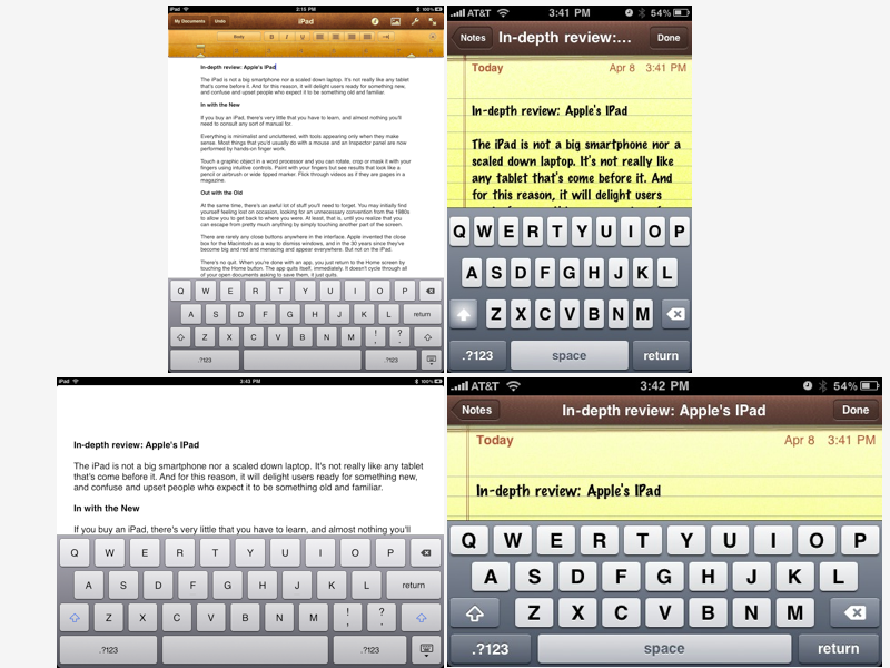
In portrait mode, the virtual keyboard of the iPad takes up much less of the screen in comparison to the iPhone, but in landscape orientation, it consumes nearly the same ratio (as shown below).
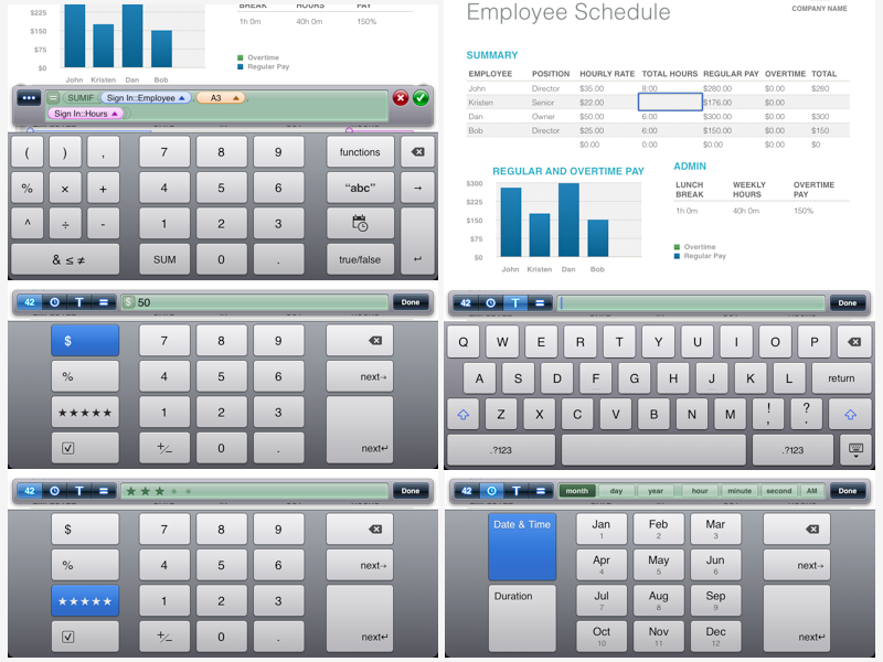
To demonstrate the versatility of the virtual keyboard, iPad apps can now present custom keyboards that are suited for a specific task, such as those used in Apple's own Numbers spreadsheet, which adjust depending on whether the current cell is a formula, a date, text, or a number.
Apple has also extended the iPhone OS' copy and paste system of text selection to add new functions you might want to do while entering text, such as looking up a word's definition in the dictionary (a feature supported in specific apps such as Apple's Pages word processor), or replacing the word with a related one from the system dictionary.
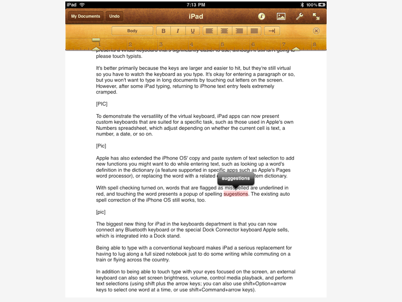
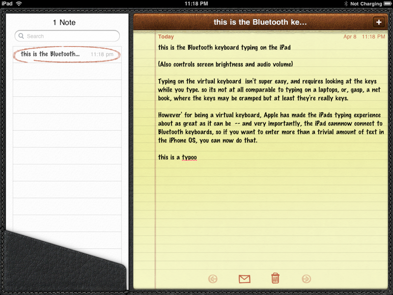
With spell checking turned on, words that are flagged as misspelled are underlined in red, and touching the word presents a popup of spelling suggestions (shown below). The existing auto spell correction of the iPhone OS still works, too.
The biggest new thing for iPad in the keyboards department is that you can now connect any Bluetooth keyboard or the special Dock Connector keyboard Apple sells, which is integrated into a Dock stand.
Being able to type with a conventional keyboard makes iPad a serious replacement for having to lug along a full sized notebook just to do some writing while commuting on a train or flying across the country.
In addition to being able to touch type with your eyes focused on the screen, an external keyboard can also set screen brightness, volume, control media playback, and perform text selections (using shift plus the arrow keys; you can also use shift+Option+arrow keys to select one word at a time, or use shift+Command+arrow keys).
An external keyboard is also great because you can invoke a variety of handy keyboard shortcuts, including Command+X/C/V to cut/copy/paste without using your fingers, or use Command+Z or Command+shift+Z to Undo/Redo operations. Not all familiar operations have a keyboard equivalent though; Pages doesn't currently support key combinations for setting bold or italics, for example, although this is only a limitation of the app itself.
If you make a text selection from the keyboard, you (somewhat confusingly) can't always touch the screen to select an operation like copy; touching the screen often resets your selection. In other words, you'll need to select and perform operations from the keyboard, or from the screen using touch but you can't always mix back and forth.
This appears to be a bug, as in some apps (like Mail, but not Pages), when you "select all" using Command+A, it will pop up a Cut/Copy/Paste button you can touch, but in most apps, when you make a partial selection using arrow keys and shift, it won't allow you to touch the selection to pop up options; instead, it will reset the selection.
Once you associate a Bluetooth keyboard, iPad apps no longer automatically show the virtual keyboard. To go back to normal operation, you have to power your external keyboard off. However, you can display the virtual keyboard when using an external keyboard by hitting a function key (the pre-iPad Apple Bluetooth keyboard will do this when you hit the eject button; Apple's iPad keyboards have a specially marked button for displaying or dismissing the virtual keypad.)
Apple's iPad-specific keyboard also includes buttons for the Home screen, screen lock, and initiating Spotlight search and its Picture Frame mode. I couldn't figure out how to trigger any of those special features from a standard Bluetooth keyboard using any combination of keys.
If I haven't stressed it enough yet, being able to both type and perform copy/paste and undo features from an external keyboard open up iPad to an entirely new class of uses over the previous iPhone OS devices.
It's great to know Apple only reserved this trick for iPad just to show it off, and will deliver it on its other mobile devices as well in iPhone 4.0, once the exclusive novelty period wears off.
On page 3 of 10: iPad hardware: Bluetooth networking; iPad hardware: WiFi networking; and iPad hardware: video output.
Jump to a different section
iPad hardware: Bluetooth networking
Outside of new keyboard support, there's not much else to say about Bluetooth features on the iPad. It supplies the same Bluetooth 2.1 + EDR specification as the iPhone; the upcoming version 3.0 of the standard is set to pair its networking stack with the radio technology of WiFi for faster speeds, but Apple makes little use of Bluetooth's potential features within the iPhone OS anyway, and would apparently have little reason to be at all interested in Bluetooth 3.0.
There's no support for other Bluetooth profiles that the iPhone doesn't already support (such as its A2DP stereo headphones and regular mono headsets), nor any obvious new features outside of those already introduced in iPhone 3.0 (such as the multiplayer gaming feature for discovering nearby players without needing to be on the same WiFi network).
There's no Bluetooth file sharing or printing on iPad, for example, although there's reason to believe that Apple may add support for printing in iPhone 4.0, given that its iWork support documents note that "printing directly from iPad is not currently available," rather than "iPad doesn't support printing."
iPad hardware: WiFi networking
iPad sports WiFi just like the iPhone, but iPad's WiFi supports fast 802.11 n networks, which are not just speedier but also deliver greater range and potentially less interference because they can be set up in the mostly virgin 5GHz band.
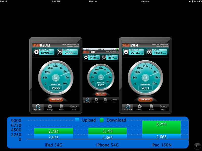
I had no problem connecting iPad to my "n-only," 5GHz Time Capsule WiFi network, although it only connected at 150 mbps signal rate (my MacBook and iMac will connect using both available bands to achieve a theoretical 300 mbps connection, as shown below). However, even at 150, the iPad is much faster than an iPhone connecting to the 802.11 a/b/g compatible network, which only achieves a theoretical maximum data rate of 54 mbps.
Future versions of the iPhone and iPod touch will likely also gain hardware support for for 802.11 n networks, but there's no way to add retroactive support in software.
Note that the WiFi iPad, like the iPod touch, does not have real GPS; it uses WiFi triangulation for Location Services, which is less accurate. The 3G version of the iPad will provide GPS just like the iPhone, because this feature is related to the mobile chipset (the 3G mobile network is used to assist the calculation of GPS information).
Some iPad users have reported weaker or spotty WiFi reception on their new device compared to their experience with other computers or mobile devices. In my testing, I didn't see any problems with WiFi reception.
However, a test of network throughput using the free Speedtest.net iPhone app showed that on the same 802.11 g network, my iPhone 3GS slightly outpaced the download (but not upload) performance of my iPad. Connecting to my faster 802.11n network resulted in a big boost for my iPad, but certainly not the 3 fold leap one might imagine possible when comparing the theoretical maximums of g (54 mbps) and n (150 mbps) networks.
In actual network performance, such as sending emails or browsing maps or the web, iPad feels much faster than an iPhone, largely because of the snappier experience provided by its significantly faster processor and RAM architecture.
Like the existing iPhone and iPod touch, iPad can output video via the same Apple composite or component video cables to present standard definition, analog video with roughly 480 lines of resolution.
However, its new VGA-connector option (exclusive to iPad) delivers PC style video at the device's native 1024x768 resolution. Existing iPhone and iPod models won't work with the new VGA cable, as they aren't designed to support higher resolution outputs than they can display. The VGA feature only supports landscape output.
iPad gets the new VGA composite video output option primarily to support video projectors, which will allow business users to present Keynote presentations directly from the device. According to Apple's store blurb, it's also designed to allow users to watch movies and Photo slideshows on an external monitor or TV (supporting VGA input).
Apps must be designed specifically to take advantage of VGA output, and developers will choose whether to simply mirror the tablet's output on the external display or present something different, as Keynote does (it outputs the actual presentation while showing separate presenter's notes on the iPad screen).
The only bundled apps that support VGA output are Photos, Videos, and YouTube. Photos currently only shows slideshows, and if you swipe ahead on iPad while playing, the VGA output remains stuck on the previous photo. Videos and YouTube only show the actual video, not any interface controls. When you play YouTube videos out via VGA, playback on iPad stops.
This means that you can't put your browser or Maps up on a VGA projector, and games won't necessarily be playable on an external display unless the developer chooses to support that as an option.
However, it also opens the potential for very interesting multiplayer games that use one iPad to control a shared output screen while each of the players see a private view of the game on their iPad (such as their hand in a card game, or their letters in Scrabble, or their individual control pad in a team-based fantasy adventuring game).
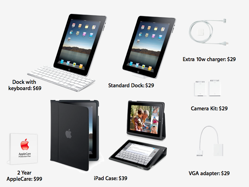
The $29 VGA adapter is currently available for purchase; AppleInsider will review it in more detail separately.
On page 4 of 10: iPad hardware: other accessories; and iPad hardware: other iPhone features.
Jump to a different section
iPad hardware: other accessories
Naked, iPad feels a bit conspicuous to carry around. The body doesn't seem to demand a cover out of fragility or potential for scratches, but it does feel comfortable inside Apple's $40 iPad Case, which looks like light duty armor in addition to serving as a way to convert the device into both a typing angle netbook replacement and an upright display. Folded close, the case looks like a thin sketchbook.
Positioned in its optional $30 dock, iPad, when paired with a Bluetooth keyboard, looks a little like a small iMac turned portrait. There's also a $70 Dock option that includes a physical keyboard, but it won't be available until the end of the month.
Apple is also offering a $30 Camera Connection Kit, which allows you to either connect your camera via its UBS cable, or to use its SD Cards with iPad directly. This package won't be available until the end of the month.
It reportedly works with "standard photo formats including JPEG and RAW," suggesting that photographers can upload their full resolution, uncompressed shots into the iPad's Photos for viewing (and editing in other apps). AppleInsider will review the kit when it becomes available.
iPad hardware: other iPhone features
A variety of other iPad hardware features are identical to their iPhone 3GS and iPod touch counterparts, such as 3G and GPS: if you get the WiFi iPad, it works like an iPod touch, with WiFi-only triangulation for Location Services; if you wait and buy the 3G version, you get mobile assisted GPS with its much greater accuracy, just like iPhone.
The 7.2 Mbps 3G support on iPad is the same as that available on the iPhone 3GS, and about twice as fast as AT&T's mostly 3.6 Mbps 3G American network (which is still faster than Verizon's CDMA EV-DO 3G network, that tops out between 2.4 and 3.1 Mbps).
iPad 3G will be faster if you can use it overseas in places where more modern 3G networks are available, and AT&T will be slowly updating its 3G service over the next couple years so that iPhone 3GS and iPad users will be able to take advantage of their innate potential.
There's no way to add 3G support to the WiFi-only version of iPad (the only version currently available for sale), as it lacks the slot to accommodate the 3G mobile mini-SIM card, in addition to not having the mobile radio hardware and the plastic window for mobile radio signals.
Other iPhone 3GS hardware features, such its accelerometer and digital compass, are identical on iPad. It also uses the same basic processor design and the same amount of system RAM (256 MB), although Apple clocked the main chip faster and is apparently using a different, faster RAM architecture. Apple also appears to have incorporated some other optimizing enhancements to the iPad's A4 SoC.
The result is that iPad is quick and nimble. Just as the iPhone 3GS made previous iPhones seem a little sluggish, iPad raises the bar again. It's doing quite a bit more (pushing 5.12 times more pixels, and running more sophisticated apps), but feels quicker across the board.
On page 5 of 10: iPad software: iPhone OS 3.x features and changes; 1) There's an entirely new set of Human Interface Guidelines for iPad; 2) There are some interface tweaks and new features; 3) There are several conspicuously missing apps on iPad; 4) Finally, there are features that still just missing in general; iPad software: Human Interface Guidelines & App Design; and iPad software: Human Interface Guidelines & Documents.
Jump to a different section
iPad software: iPhone OS 3.x features and changes
Apple released iPad with iPhone OS 3.2, an incremental expansion upon the current 3.1.3 release used by the iPhone and iPod touch. AppleInsider profiled the core features of IPhone 3.0 in our review of the iPhone 3GS.
There are four categories of things that have changed between the last year's iPhone OS products and the iPad:
1) There's an entirely new set of Human Interface Guidelines for iPad.
The new HIG sets iPad apart as a larger format platform for apps. These guidelines shape how existing iPhone apps (such as Mail and Calendar and Mobile Safari) scale up as iPad apps, and how Mac OS X desktop apps (such as iTunes and iWork) can become native, streamlined iPad apps.
2) There are some interface tweaks and new features.
Some of these tweaks will likely make it to the iPhone and iPod touch via a forthcoming iPhone OS update. For example, iPad's expanded text selection and copy/paste system now offers spell checking, dictionary definitions, and other app-specific features. And of course, there's the new Bluetooth keyboard support.
3) There are several conspicuously missing apps on iPad.
For example, while it has a built in mic and support for mic-incorporating headphones, there's no bundled Voice Memos app (there are third party options). Similarly, Apple left off support for Voice Command (perhaps because its value is tied primarily to calling your contacts, even though it can also be used to navigate your iPod music playback.)
There's also no Compass app (but there is a digital compass, and it works in Maps). There's no support for Nike+, which wouldn't make much sense anyway, of course. And finally, there are no widget apps brought forward from the iPhone, such as Calculator, Clock, Weather and Stocks.
4) Finally, there are features that still just missing in general.
Some of these will be addressed in iPhone 4.0, which Apple presented on Thursday. Those features include such things as background third party apps, app organization into Folders, enhancements to Mail such as a unified inbox, Exchange improvements, and Game Center features.
The sections below will look into each of these four aspects of change relative to the previously existing iPhone and iPod touch.
iPad software: Human Interface Guidelines & App Design
In plotting the move from the small 3.5" screen of iPhone and iPod touch to the much larger canvas of iPad, there are several things Apple might have done. It could have simply made the iPad a way to run lots of existing iPhone apps on the screen at once, each floating like a window on a 1990's PC desktop. Fortunately, it didn't do that.
Instead, while iPad allows users to run the huge existing library of iPhone apps, Apple developed an entirely new expansion to its iPhone Human Interface Guidelines. This resulted in making a new tier of iPad software that is highly preferable to running the existing iPhone apps designed to run on a small screen. Once you get a taste of iPad apps, you won't really want to use iPhone apps on its big screen.
While many iPhone games are still completely playable and even look pretty good after being pixel doubled to fill the screen, users will definitely want to find iPad-specific software to get the most from their new device. And there's lots to choose from in the App Store.
Apple's HIG for iPad does not attempt to simply make iPhone apps bigger. In fact, the overall design of apps is changed significantly to make iPad apps feel more like desktop apps, rather than scaled up smartphone apps.
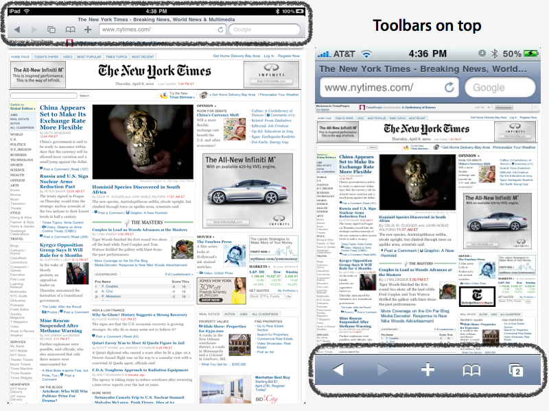
One example is toolbars. Mail on iPhone presents simple lists of accounts, mailboxes, and emails. Individual emails are presented on the screen with a toolbar at the bottom. On iPad, there's not only enough space to split the screen to show both your mail list and the email detail, but the HIG also specifies that the tools should be at the top.
Similarly, apps like Safari now present not just their toolbar on top (as shown below), but also use their menu bar to present new features, such as a Bookmark bar similar to the desktop version of Safari. On the other hand, iPad's Safari incorporates an iPhone-style, multiple page tabbed browsing system rather than trying to present desktop-style tabs, which would eat up a lot of screen real estate.
iPad software: Human Interface Guidelines & Documents
Apple's iWork apps illustrate HIG principles for working with documents. On iPad, documents are part of the application, not something you search for in the file system yourself. Rather than saving documents manually, the app saves work as you do it, keeping a record of everything you do so it can be progressively undone later.
You get can documents in and out of iPad apps in a number of ways. One is email; you can QuickView documents from Mail and then open them using another app right from Mail. You can also export iWork documents to Apple's iwork.com service, although this isn't yet working flawlessly.
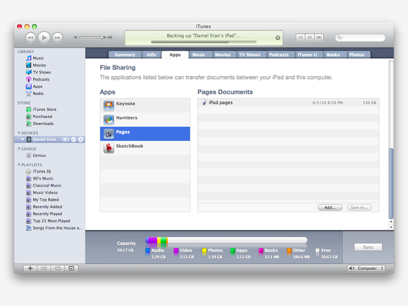
Thirdly, you can use Apple's "File Sharing," a feature exposed in iTunes (hidden within a syncing iPad's "Apps" tab, shown below) to copy documents to and from specific apps.
The way Apple designated iPad to work with documents sheds light on how the company expects users to work with iPad: it's not a standalone computer designed to replace your notebook. It's a highly mobile tool for working on the go, requiring a uplink tether to move content back and forth.
Being able to email documents out from the iPad is pretty convenient, but there's still no way to wirelessly share files from the iPad directly without packaging things in an email. However, if you interview lots of office workers, you'll find that's exactly what they do now; many people simply can't figure out file shares and wireless networking, but they do understand the idea of emailing an attachment. And so that's what the iPad does.
In addition to apps like iWork that primarily create documents, there's also apps that work with media files, such as your photos. These apps browse through your photo library with a Media Browser rather than having you search your images as a list of files.
On page 6 of 10: iPad software: Human Interface Guidelines & Flexible Orientation; iPad software: new tweaks and features; and iPad software: conspicuously missing apps.
Jump to a different section
iPad software: Human Interface Guidelines & Flexible Orientation
Another aspect of the iPad HIG is its insistence that the device has no default orientation. There is no up nor any left end; it's however the user wants to hold it.
iPad's iPhone OS 3.2 introduces a Home screen that can flip sideways and upside down. Apps are supposed to work however the user desires, although some can pick a fixed orientation, such as how Keynote only works in landscape, or how CBS's app only works in portrait.
If you don't like the headphone jack being on the "top," just twirl it around and its now on the bottom, and your screen adjusts for you. This is so slick its completely invisible. It's also a very new idea, something that I've never seen in a consumer electronics device.
iPad software: new tweaks and features
In addition to the overall structure imposed by iPad's HIG, the new iPhone OS 3.2 incorporates a variety of new little tweaks and features across the system and within apps.
Apart from the aforementioned text selection features, there's new support for custom virtual keyboards suited to a particular purpose (as demonstrated by Apple's Numbers spreadsheet) and custom finger gesture recognition.
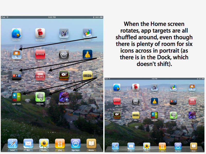
Users can change their Home screen background (and as noted earlier, flip the Home screen into a landscape orientation. One annoying thing is that Apple swaps apps around on the page between the two orientations. It does not need to do this, as the six icons in the fixed Dock indicate. This is a pretty flagrant violation of the HIG principle of not shifting the location of expected user interface targets).
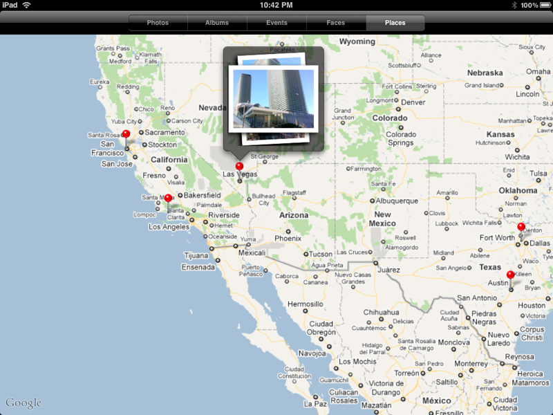
A variety of bundled apps get new features: Photos supports iPhoto 09's Places feature, presenting photos by their geotagged location. iPod can create and name new playlists. YouTube now supports 720p video playback. Maps now has support for Google's terrain layer, along with a simplified user interface for finding directions.
iPad software: conspicuously missing apps
Some apps on iPhone that did not make it to the Home screen of iPad are missing for obvious reasons: there's no SMS or Phone; there's no real need for a stand alone Compass (that app was largely a show off thing for iPhone 3.0; most people only use the digital compass within Maps or augmented reality apps); and it makes no sense to go jogging with Nike+ and an iPad strapped to your chest.
But there are an array of other handy little apps that also didn't make the cut. Their omission possibly suggests that Apple excluded them because it has a new strategy under wraps for widget-style apps like Calculator, Clock, Weather and Stocks.
The idea that iPhone 4.0 would introduce a new model for running multiple concurrent apps which included a way to overlay a dashboard of widget features above the primary application (much like the original Macintosh's Desktop Accessories) did not get fleshed out or even implied. In Q&A, Jobs even sidestepped the idea of widgets on iPad.
While users can perform most calculations or check weather or stocks using a Google search from Safari, the across-the-board omission of all widget apps is hard to explain unless you assume that Apple still has a Plan B in progress, and simply decided that including the old iPhone versions would look cheap and upgrading them all to a sharp, full screen interface befitting iPad would take too much time and effort.
If the company is gearing up to deliver an alternative way to present foreground applets that enable users to look up this kind of information, set a timer, or perhaps even chat over IM or play streaming Internet radio, it would certainly explain why there's currently nothing in that empty space right now.
It is apparent that iPhone 4.0 will offer things that Apple didn't detail in its initial unveiling; for example, developers have noticed an iChatAgent that could only be useful to a bundled Instant messenger app. We'll have to wait and see about widgets. And iPad users will have to wait a bit longer, as iPhone 4.0 will ship around June, but its iPad version won't be delivered until "the Fall."
On page 7 of 10: iPad software: other notable details; Calendar; Notes; Maps; Safari; Mail; Photo; Videos, iPod, iTunes and App Store; and YouTube.
Jump to a different section
iPad software: other notable details
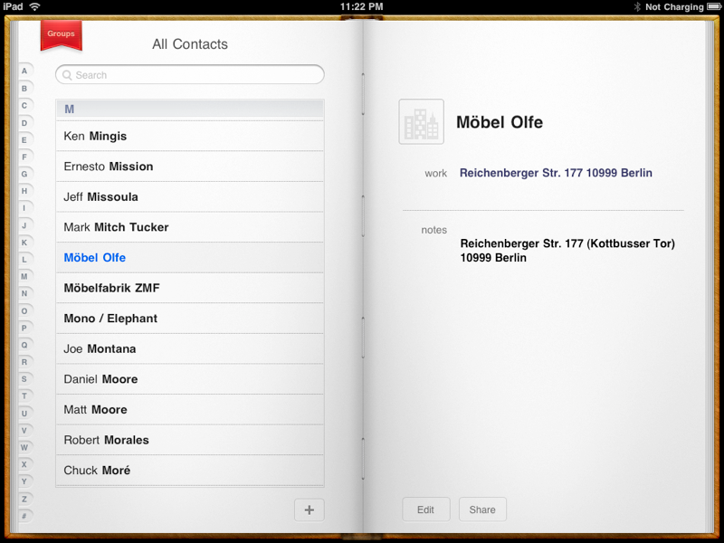
Contacts: Rather than being a simply listing like iPhone, the Contacts app for iPad presents a nice looking interface that shames Mac OS X's Address Book, both in visual appeal and actual usability. You can slide though the alphabet, touch a bookmark to page over to your contact groups and then back to your contact listings, and you actually see the contacts' photos.
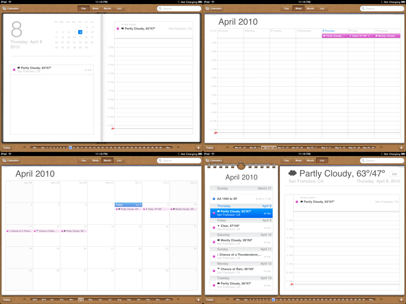
Calendar: Like Contacts, Calendar presents a rich display that borrows a lot from the Mac OS X Calendar. But it also adds "touch to inspect" controls to your events in the calendar that make it a snap to edit. And when you edit, you get a familiar iPhone-style entry editor, with date and time spinners. Again, you also get a slider control that lets you quickly navigate through time.
Notes: More room to type, with a nice looking navigation list of your synced notes. Takes advantage of iPhone 3.2's spell correction, which highlights unrecognized words and offers suggested alternatives at a touch.
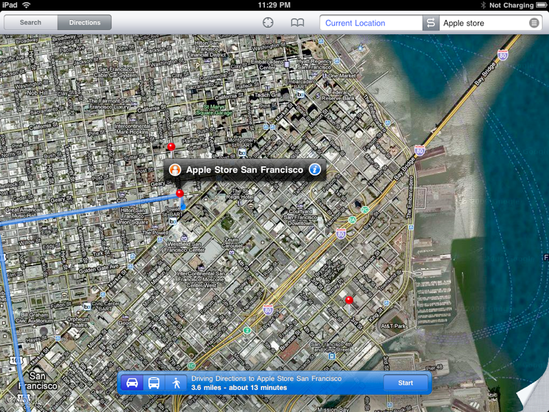
Maps: The user interface shrinks down into a thin toolbar strip, leaving a vast area open to multitouch perusal. Setting up point-to-point directions is fast and easy. Doesn't yet support Google Maps Navigation, but this could likely be part of iPhone 4.0.
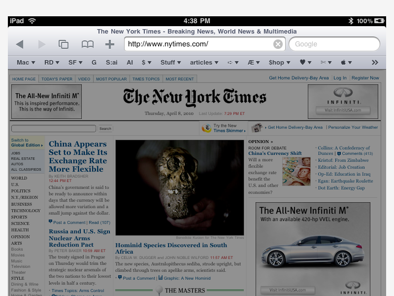
Safari: Again, a mix of iPhone's simple bookmarks and history lists, an alternative to tabbed browsing that lies between iPhone's and desktop Safari's Top Sites. synced links to your desktop Bookmarks Bar (shown below), and a vast expanse of area devoted to the content you're browsing.
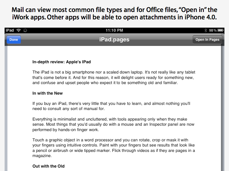
Mail: More of that familiarity of the iPhone with a redesigned interface sporting a simple toolbar on top and lots of room for viewing your content. When you receive emails with attachments, Mail will Quick Look view them in place, and can offer to open Office/iWork documents with iWork apps (as shown below). iPhone 4 will extend this feature to other third party apps that open documents.
Photo: Apple remade this application for iPad to show off pinch and hold gestures, making a fun and fast way to find and show off your photos. You can also browse pictures by iPhoto 09's Faces and Places (show below), as well as by album and event. There's also a handy interface for selecting a batch of pictures you can then either copy to the clipboard or send in an email via the touch of a button.
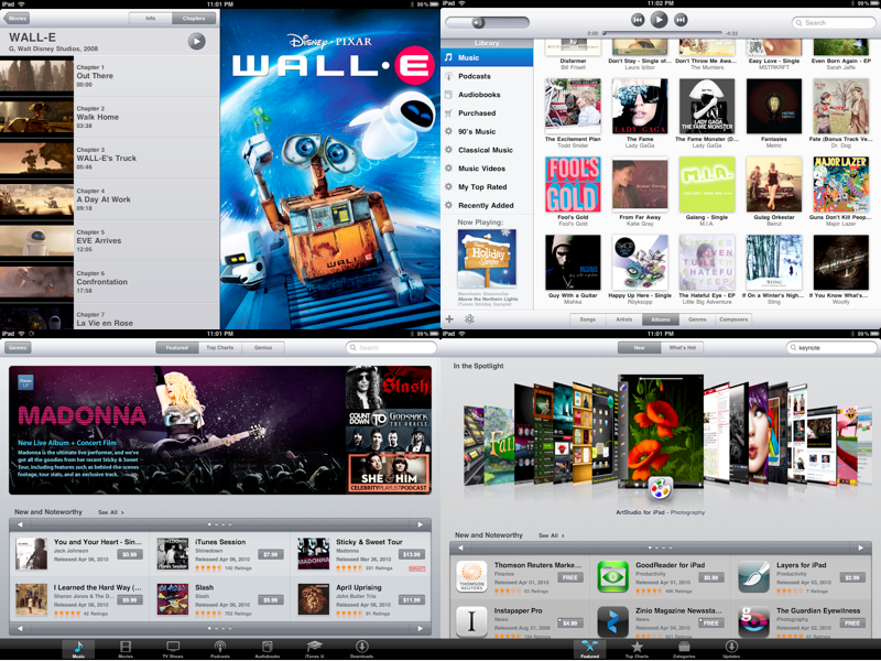
Videos, iPod, iTunes and App Store: Well this is confusing. iTunes is actually the iTunes Store, which is somewhat understandably separate from the App Store. At the same time, iPod actually looks like the desktop version of iTunes. But unlike the iPhone version, it only plays music. If you want to watch your movies, you have to launch the separate Videos apps. This seems a little confusing. Why not one integrated app?
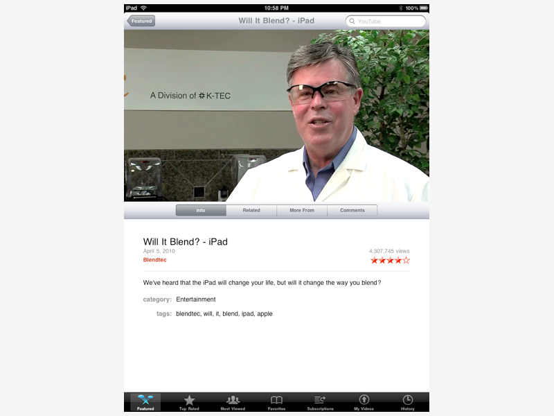
YouTube: Apple's client for Google's YouTube service emphasizes logging in as a user and viewing your videos, subscriptions and favorites. These features were available in the iPhone app, but the new screen real estate on iPad makes it easy to present more options, as well as more videos, larger and in high quality.
On page 8 of 10: iPad overall impressions; iPad's exclusive period of little competition; and Comparisons to previous Apple products.
Jump to a different section
It feels strong and solid, it's highly portable and not unreasonably fragile. It plays all kinds of media, browses news and information effortlessly, creates artwork and serious business documents. It's a computer without the hassle part.
It's stripped down and missing some expected features (if you were expecting it to be a PC laptop). It aims at doing 80% of everything extremely well and just ignores most of the other 20% that you probably don't need to do anyway. It's not trying to be everything; it's trying to be really good at what it can do best.
This is clearly some great engineering, but who will want to buy it? Apart from early adopters ready to snap up iPad just for its newness, it's not yet obvious how the general public will respond to it.
It's clearly not designed to replace MacBook sales, although it gives Apple an alternative to the netbook category (and its price point) that it can sell without losing money. Some users seem upset that its not a phone. Others don't understand why there are any limitations at all compared to a desktop PC, apparently also forgetting the inherent drawbacks of $400 netbooks.
The reality seems to be that iPad is the new generation of systems Apple wanted to introduce earlier, but chose not to. Rumors floated about a "Safari Pad" concept product designed half a decade ago that never made it to market.
For Apple to create something really new, it realized it needed to sell users on the idea gradually, first shrinking the technology down into a smartphone, where Apple could sell it against the sad array of smartphones that existed at the iPhone's launch in 2007. There was already a functional market for smartphones, while tablets have never been successful.
Once volume adoption of the iPhone helped bring costs down, Apple reincarnated it as a handheld music player in the iPod touch. But the dream remained fixed upon a larger scale device that could serve a variety of demands from education to health care to business to consumers at leisure.
Only with a successful App Store in place with billions of downloads under its belt and 185,000 titles in its library could Apple go to media and print publishers and expect them to buy into a completely new platform. Nobody would have supported Apple before it had laid all of that foundation work.
iPad's exclusive period of little competition
At this point, Apple doesn't just have a sharp looking tablet computer, but really a full strategy that feels a lot like the original launch of the Macintosh, but with a lot more in place to support it.
iPad seems exciting to the progressive fringe of technical enthusiasts, and confusing and limited to those who hoped to just pack their PC and all if its 1990's legacy into a screen and just continue dealing with the problems that are at least familiar to them: malicious viruses and spyware; file system spelunking with its potential for unsaved data loss; phone-home authorization of their operating system, and so on.
A variety of iPad alternatives will make it to market this year, many of them sporting simpler resistive screens that require a firm push rather than responding to touch; Intel's less efficient Atom processors that Apple rejected but most other PC makers can't because Windows can only work with the x86 architecture (Apple compiled Mac OS X to run on ARM to deliver the iPhone OS); a variety of industrial design limitations; and an absence of the App Store and its profile among developers and content publishers.
If Apple had faced any real competition to the iPod, it might be easier to imagine that the iPhone and even the iPad might also meet a credible match within a year or two of their release. Instead, it appears that Apple has defined itself a high end market that will force competitors to work a lot harder in their efforts to deliver similar technology products.
As they scramble to do so, Apple will enjoy a brief period of having the only real tablet anyone wants to buy. Whether it can convince the broader market that it actually needs a portable system that costs $500 and is much simpler to use than a PC is a gamble that's hard to bet against, but not yet proven to be a done deal.
Comparisons to previous Apple products
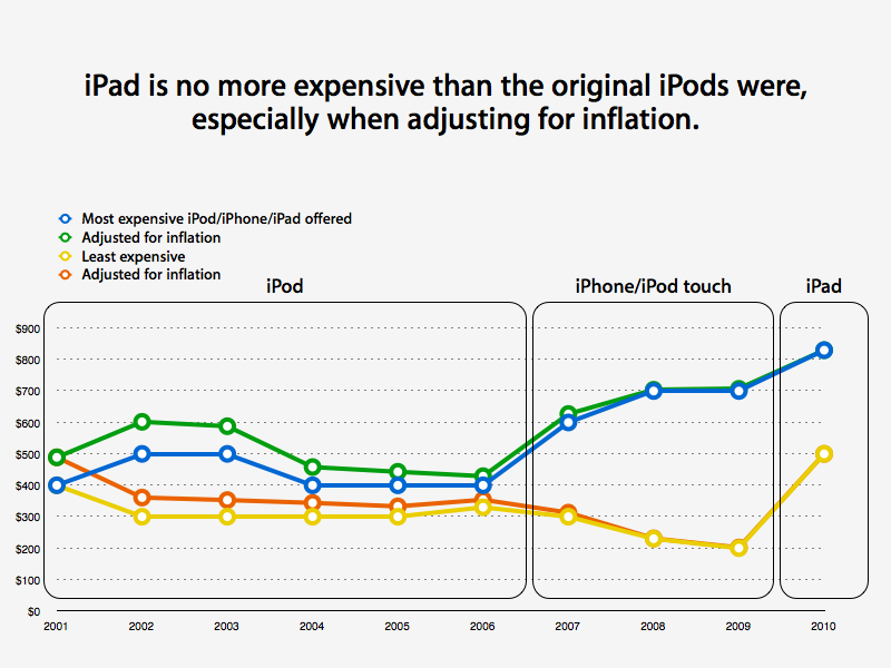
Nearly ten years ago, Apple convinced people to pay just $12 less than the iPad (adjusted for inflation) in order to own the first 5GB iPod music player. The next year, Apple floated an even more expensive 10GB iPod model (priced at $499, or $591 in today's dollars).
Just two years ago, Apple was selling the 16GB iPod touch for $399 and the 32GB model for $499. Anyone who fears that Apple won't be able to sell the much larger and more useful iPad for the same price without being subsidized by a mobile contract has apparently forgotten Apple's ability to sell things.
iPad is fast and fun to work with. It feels like a simplified way to do most of the fun stuff you do on your computer without any of the overhead and bother of windows and files and pointers and all those technical details under the surface.
The worst part of the iPad experience is that once you get used to it, it's hard to go back to the tiny screen of the iPhone. It's addictive. Sure, there's also some comfortable familiarity with working on a full sized notebook or desktop, and there's lot you can do on a Mac that you simply can't on iPad.
On page 9 of 10: Things not to like; and Which iPad is for you?
Jump to a different section
What's not to like about iPad? For starters, its the size of a small journal, so it's a little harder to carry around unless you usually carry a bag of some kind. It's not like an iPhone or iPod touch that just drops in your pocket.
The WiFi-only version loses a lot of functionality when you're outside of a hotspot. It's not just Maps and Safari and YouTube and Netflix that stop working; certain games wouldn't play.
Starting the iPad-specific Aurora Feint 3 without an available network makes the title refuse to launch, and losing a connection at any time kills gameplay. This is a really bad design for an iPad game, particularly one that is just a glorified shape matching puzzle. Given that lots of people are going to opt for the less expensive WiFi-only model, apps should know better than to assume and demand a perpetual network connection (unless their entire purpose is to stream data from a server).
On the other hand, there's a lot of richly worthwhile productivity apps (from Apple's own iWork apps to a variety of touch driven musical and photo editing or painting apps) that are fully functional without a network connection, making iPad more useful off the network than an iPhone often is.
If you were hoping iPad would serve as a mobile platform for Flash games like Farmville, you're going to be outraged to find that Apple is not only refusing to put Flash on it, but is also cutting off Adobe's prospects for porting existing Flash content into native apps.
If you use websites like Google Analytics that make use of Flash visualizations, you're also going to be seeing a lot of dead boxes with blue Lego tombstones. Apple is doing everything it can to turn Flash coders into HTML5 developers. This is great in the long term, but will be a transition issue for people with some particular need for a website that still uses Flash.
If you have problems with a limited feature set, you're going to hate iPad. It scrapes the difficult edges off everything derived from the desktop. Pages' footnotes and end notes are lost, tracked changes are all accepted and lost, 3D charts are reduced to 2D, Keynote's presenter notes and embedded audio files are stripped, and so on.
This is something like Microsoft's Pocket Office / Office Mobile, which similarly strips down desktop features for use on mobile devices.
In order to take advantage of the features announced in iPhone 4.0, including multitasking and a universal mailbox, iPad users will have to wait until the Fall. This seems like a wait, but it will still likely be sooner than Microsoft's Windows Phone 7 and Courier, and Google's Chrome OS, none of which will deliver a comparable set of features.
iPad also has a few irritating little omissions. You still can't add an attachment to email; if you want to email a photo, you have to do it from Photos or copy and paste. Why isn't there an insert graphic button?
And if you have lots of photos on your iPad, scrolling through them to get to the newest one at the bottom is a pain. There's no searching by date, no recent pics, and new pics (such as screen captures) aren't automatically put in Albums or Events, so you have to scroll through all your pics individually.
No doubt such little annoyances will eventually be refined away, but overall, there seems to be a lots situations where there is one primary way to do things, and you often need to adapt to learn how you're expected to do it rather than there always being the button you want right where you'd expect it to be. Of course, this is a far cry from the experience of many tablet devices, where there doesn't seem to be either a set way or an intuitive way to very many things at all.
The most annoying thing about iPad is that it will change your base expectation about computers. I now find myself trying to flick at the screen of my MacBook or attempting to touch a text field on the display so I can start typing. Once you get used to touch, the mouse feels archaic.
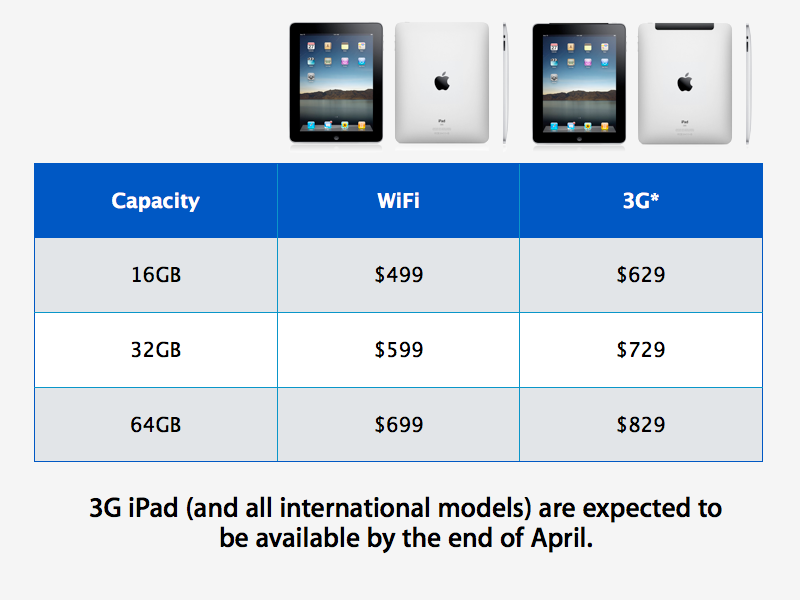
Apple has started iPad pricing off at a very reasonable $499 for the 16GB, WiFi-only model. Before you spend more money on storage, consider how much extra content you actually will want to carry around.
Once you buy it however, there's no way to add more storage, so spending another $100 for an extra 16GB or $100 more for another 32GB might be worth the extra cash throw down.
The 3G option is an extra $130, and transforms iPad into an always on device, at least wherever AT&T is always on in the US.
However, that 3G option isn't something you can add later, and may add enough resale value to make it worth getting, even if you don't plan to pay for wireless service all the time. Fortunately, you don't have to, as the service is pay as you go, with no contract. It costs $15 per month for 250MB, and can be upgraded to unlimited service for $30.
All things considered, Apple has managed to clearly position it between the Mac and the iPhone and iPod touch with clever aplomb. What remains to be seen is how users will respond to Apple's new lineup, whether they will continue to buy up iPads at an iPhone-record setting pace, and whether those sales will translate to a drop in MacBook sales, or conversely, whether the iPad will attract more new PC users in the Apple Store.
There doesn't seem to be much fence sitting about the iPad; users either talk about it enthusiastically or seem to be completely opposed to its new form factor, its focus on doing a limited number of things very well, and its refusal to run things like Flash, Silverlight and Java, which nobody seems to have cared much about in a mobile setting until 2010.
Right now, iPad is the future, and has vast potential to become increasingly valuable as Apple tunes its OS and third parties create new apps. The pace of new iPad-specific apps is astounding, and includes lots of valuable titles that can be obtained for free. AppleInsider will be looking at a roundup of great apps separately.
On page 10 of 10: The Wrap Up; Rating; Pros; and Cons.
Jump to a different section
The verdict on the iPad: you probably don't need it (considering that the category was just invented out of thin air), but you may want one enough that its fairly moderate price may not prove to be an obstacle.
It's fun to use. It suggests great potential as a general way to create documents (most of the graphics for this review were created in Keynote on the iPad, and the text was entered using Pages. It works.
It's a captivating games machine. I like playing iPhone games casually, so having an even more immersive experience with more sophistication is all that much better.
It's a great movie and TV player. And because it isn't a TV, the networks don't have any problem putting their programs up for free (they can't do that for Apple TV because they'd be bypassing their cable partners).
It's solid and attractive, and doesn't feel very fragile, at least for being a state of the art tablet computer with a face of glass. You can casually throw it in your backpack or at the couch without worrying that you're going to dislodge something, things you wouldn't want to do with a notebook and its fragile optical disc and magnetic hard drive.
It's not tied to AT&T or some other provider, but the 3G version gives you an always on WWAN option that's nice to have. If you have the luxury of WiFi most places that you work and relax, iPad will keep you wonderfully connected.
The downside: you might have a hard time convincing yourself that you need something between your iPhone or iPod touch and your notebook or desktop computer. IPad is a lot easier to use outdoors. It's less fragile, it's very hands on and feels super natural as you work on it.
If you pair it with a keyboard, it's far more useful for writing or doing heavy email. But regardless, you can probably still get more work done with a full powered notebook, at least until its battery runs out in a 2-3 hours. The best thing about iPad is that it keeps working for a really long time.
If you travel a lot, if you have time to relax, if you enjoy new technology, and if you're open to unlearning old ways of doing things, you'll probably really enjoy it. You'll enjoy it even more as it blossoms with new iPad apps and the upcoming iPhone 4.0.
If you're hoping to use it as a replacement for your MacBook, or if you really want it to be something other than what it is, or if you'd be happier paying a bit less for a more conventional netbook loaded with lots of USB ports and the ability to run Flash, then you'll likely hate the iPad. But you knew that before you started reading this review.
Pros:
Strong, clean, attractive design
Natural touch interface is simple and elegant to use
Lots of great apps already available, more coming
Familiar features of the iPhone, enhanced to use its bigger screen
Bluetooth keyboard makes a great pairing for getting work done
Makes a great mobile tool that works with your computer
Fast 802.11n wireless networking
Reasonably priced hardware and 3G service with no contracts
Great potential as a gaming machine
Cons:
Early adopters will wade through several software updates
Focus on HTML5 makes Flash a temporary issue for those who need it
Some familiar features missing or require relearning how to do things
Not equipped to do video conferencing
