Usability guru Jakob Nielsen published his findings (via Daring Fireball) from a qualitative study that tracked four users' experiences with the recently released tablet. According to the report, Amazon's proprietary Silk browser for the Kindle Fire is "clunky and error-prone," while magazine reading is "not much better."
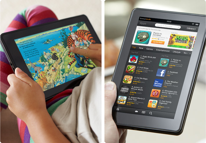
"The most striking observation from testing the Fire is that everything is much too small on the screen, leading to frequent tap errors and accidental activation. You haven't seen the fat-finger problem in its full glory until you've watched users struggle to touch things on the Fire," he said.
During the test, one user spent "several minutes" trying to log in to Facebook because he kept accidentally pressing the wrong field or button. The study found that Fire users are better off opting for mobile versions of sites, which feel "luxurious" because they're designed for 3.5-inch mobile screens.
Participants in the study had between 1.5 and 2.5 years of experience with touchscreen devices — half were Android users while the other half used Apple's iPhone. Nielsen also pointed out that the study wasn't meant to advise consumers on whether to purchase a Kindle Fire, rather the study's goal was to "discover design guidelines for companies" that may have Kindle Fire users.
But, his observations on the device, which drew from both personal use and the usability study, found the Fire to be a "heavy object" that was "unpleasant to hold" for long periods of time. He also disagreed with the lack of physical buttons for page turning. Other issues that Nielsen had with the Fire included the lack of a home screen button or volume buttons and "bad UI design in many areas."
"For reading fiction, the older Kindle design wins," Nielsen wrote, though he did find that the Fire beat out older Kindle models when it came to reading magazines and light nonfiction. However, Nielsen went on to point out that the magazine reading experience on the Fire "could be good but actually is miserable because the content isn't designed for the device or for interactive reading."
Nielsen also took issue with screen updates being too slow on the Kindle Fire. "Scrolling can feel erratic and there's a huge lag in response after pressing command-buttons," he wrote, noting that the poor performance was a surprise to him and may be caused by "sloppy programming."
"If I were given to conspiracy theories, I'd say that Amazon deliberately designed a poor web browsing user experience to keep Fire users from shopping on competing sites. Amazon's own built-in shopping app has great usability, so they clearly know how to design for the tablet," he wrote.
Nielsen extrapolated the Kindle Fire usability results to mean that 7-inch tablet interfaces in general "have either a glorious future or will fail miserably." He believes that service and content providers will need to design specifically for 7-inch devices in order for them to succeed, since repurposed designs offer a "terrible user experience." As such, he recommends that the 7-inch form factor be treated as a "new platform."
"Furthermore, these mid-sized tablets are so weak that suboptimal designs — that is, repurposed content — won't work. Optimize for 7-inch or die," wrote Nielsen.
7-inch tablets may face an uphill battle as a result, since magazine publishers, websites, application programmers and other providers will only design for the form factor if there is a critical mass of millions of users. According to him, rapid sales of 7-inch tablets would drive a "virtuous circle" that would support a "rich ecosystem of 7-inch-optimized services," but sluggish sales of the form factor would create a "vicious circle" that would cause the platform to "either die or be reduced to serving poor people who can't afford a full-sized tablet."
With expected Kindle Fire shipments of 3.9 million units this holiday season, Amazon may be on its way to building the base it needs. Though Apple will maintain a sizable 18-month head start with its 9.7-inch iPad, analysts predict Amazon will surpass its other rivals to quickly assume the No. 2 spot in the tablet market.
The results of the Kindle Fire usability study contrast Nielsen's findings for the iPad. He wrote that, based on similar testing of the iPad, "full sites work quite well on 10-inch tablets."
For its part, Apple appears to have discovered similar results to Nielsen's study in its own usability tests. Late Apple co-founder Steve Jobs revealed last year that the company had performed thorough research into the ideal size.
"Apple's done extensive user-testing on touch interfaces over many years, and we really understand this stuff," Jobs said in a quarterly earnings call. "There are clear limits of how close you can physically place elements on a touch screen before users cannot reliably tap, flick or pinch them. This is one of the key reasons we think the 10-inch screen size is the minimum size required to create great tablet apps."
Jobs went on to predict that 7-inch tablets would be "Dead on Arrival." In fact, a number of 7-inch iPad competitors have flopped this year. Research in Motion's PlayBook became the most recent casualty when the BlackBerry maker announced last week that it would take a $485 million charge due to unsold Playbook inventory.
Apple management has indicated that it believes the Kindle Fire will actually attract users to iOS and the iPad. According to them, users will "gravitate to more feature-rich experiences," analyst Mark Moskowitz noted them as saying last week.
Ben Reitzes of Barclays Capital also reported the company's top brass as having said that the Kindle Fire would "fuel fragmentation" because it represents another platform. "The more fragmentation, the better, says Apple, since that could drive more consumers to the stable Apple platform," Reitzes wrote in a note to investors last month.
 Josh Ong


-xl-m.jpg)


-m.jpg)


 William Gallagher
 Amber Neely

 Malcolm Owen

 Andrew Orr





-m.jpg)





101 Comments
I saw videos of people using them when it was first released. It operated like pure garbage and the usability was extremely poor, with the interface being very non responsive and inaccurate.
I don't care if it costs ten dollars. If something is bad, then it's bad, regardless of how little it costs. It also doesn't matter how many they may happen to sell. That is not going to magically transform garbage into something good. Garbage X 3 million is 3 million pieces of garbage.
People who say that they like it, clearly have very low technical standards, as to what they expect from their devices.
Even on my iPad, viewing a normal (non-mobile) website, I sometimes zoom in just to be sure I hit the right button. I just don't know how 7" would be practical, though I guess it depends on what particular sites you visit.
Garbage X 3 million is 3 million pieces of garbage.
People who say that they like it, clearly have very low technical standards, as to what they expect from their devices.
Some poster here, you-know-who, is claiming that the Kindle Fire has excellent build quality, better than the iPad2 since it "doesn't slip" and "doesn't have the LCD pooling issues".
It's sad that it is almost 2012 and most electronics manufacturers still don't "get it" and are churning out this plastic that will just clog landfills. Where is Greenpeace now on this issue? HP, Dell, BB, Nokia, RIM, Samsung, now Amazon, just plastic chunk after plastic chunk. The aluminium and glass design is... just... breathtaking, really. Apple is still miles ahead of anyone else. PS3 and Xbox360? Good for gaming but still yet more plastic chunks.
My wife bought one. It lasted a week and was a total frustration in its usability. From our family's experience with using one, I would have to agree with all the points in the study.
We returned ours to Amazon and my wife bought a regular Kindle Touch instead.
Doesn't matter. The iHaters, trolls, and whiners will just sing the same old song. "just wait till <insert yet another future OS update here> comes out. Then, it will be kewl!"
This usability study comes to no surprise. Typical bottom-barrel tactics and a waste of resources. I'll bet that Bezos knows most will be an impulse-buy, and they will end up gathering dust in some desk drawer or filling some landfill.
Shame on them for manufacturing utter garbage.