The launch of iOS 7 has seen major apps pushing out updates in order to bring their services in line with the new look of Apple's operating system, with Pandora, Gmail, and Amazon's Kindle App all issuing updates on Wednesday.
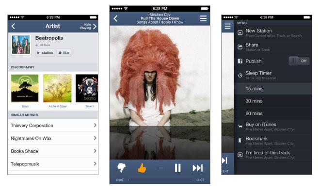
The latest update for Pandora brings the Internet radio service to version 5.0 on iOS. The update brings the ability to add variety to stations, view previous liked and disliked tracks, and to view track lyrics to the iPad, bringing that version to parity with the iPhone version of Pandora.
Version 5.0 also has a redesigned interface meant to bring it in line with the flat aesthetic of iOS 7. Gone are the assorted textures and gradients that have marked previous versions, traded out instead for a minimalist look reflected even in the app's redesigned logo.
The update also allows users to simply swipe to explore further tracks without interrupting the music. iPad users can also take advantage of a third pane, allowing them to find new artists and tracks.
Version 5.0 of Pandora for iOS is available as a free download in the App Store. The 22.3MB download requires an iOS device running iOS 5.0 or later.
Gmail gets flat icon, better Google app integration
Google, too, has updated part of the look of its Gmail app to better reflect the changes in iOS 7. The app now has an updated icon that is more in keeping with iOS 7's flat aesthetic. More importantly, Google has improved the attachment experience within the Gmail app. Users can now open larger image thumbnails into a full-screen viewing experience.
The update also brings improved integration with Google's other iOS apps, continuing a trend Google has been pushing for some time now. Google Drive and Google+ links now open directly into their respective apps, keeping users tightly integrated within Google's micro-ecosystem on iOS. Users can disable this function in the in-app settings.
Version 2.4.1 of Gmail for iOS is a free download in the App Store. It weighs in at 9.4MB, and requires a device running iOS 6.0 or later.
Kindle app goes flat, gets collections
Amazon has flattened version 4.0 of its Kindle app, bringing it into the new era of iOS design. The new Kindle app has a sharper look to it, carrying over many of the navigation cues that mark other aspects of iOS 7: thin fonts, thin lines, and so forth.
Amazon has even adopted the translucency effects that mark Apple's Control Center and Notification Center menus. These effects, Amazon says, "keep constant connection between customers and their content."
The update also includes the ability to organize Kindle content into collections with a few taps, as well as a number of slide-out menus in Library and Reader that combine key controls and are easily accessible.
Version 4.0 of the Kindle app for iOS is a free, 19.7MB download available in the App Store. The download requires an iPhone, iPad, or iPod running iOS 6.0 or later.
 Kevin Bostic


-m.jpg)

 Amber Neely
 Andrew Orr

 Sponsored Content

 William Gallagher






16 Comments
Ironic, considering Apple doesn't appear to have done the same with their very own apps, such as iBooks, Find My Friends, iWork, etc... Yet, that is. (Oh, and has anybody successfully airdropped between their iOS7 devices and a Mac yet?)
GMail kept old design. Especialy keyboard. Dnk why left old one. Chrome uses iOS7 keyboard. Weird
Um...screenshots?
I update my iPhone but not my iPad and my iPad looks so old now. iOS 7 isn't perfect by any means but I think some of the complaining is completely hyperbolic and ridiculous. It took me maybe 10 minutes after install to figure everything out and most of that time was spent choosing wallpapers. I have yet to come across an app or interface where I couldn't figure out where to tap. Oh and iTunes Radio rocks. Plays a much better selection of tunes than Spotify radio. With Spotify I constantly get repeats. I'll keep using Spotify because of the on demand feature but I'll be using iTunes radio to discover new music for sure. Hopefully it will get an offline feature in the future. Knowing that iOS 7 is just the beginning I can't wait for iOS 8. :)