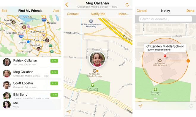
The stitched-leather look of Apple's Find My Friends app for iPhone and iPad is now a thing of the past, with a new update on Tuesday eschewing skeuomorphism for an iOS 7-style flatter design.
The updated https://itunes.apple.com/us/app/find-my-friends/id466122094?mt=8">Find My Friends
The only changes to Find My Friends appear to be its appearance., opting for a simpler look. Apple's release notes make no mention of any other changes to the application.
The friend-tracking application is the last major holdout among Apple's mobile software offerings to come in line with the company's new design sensibilities. Apple changed direction with the launch of iOS 7, abandoning a penchant for lifelike recreations of textures and objects that was favored by former mobile software chief Scott Forstall.
Last week Apple also updated iBooks and iTunes U with flatter designs for iOS 7. All three applications feature simple white icons against orangish-yellow gradient backgrounds.
39 Comments
About time!! This was one of the most hideous looking apps. The faux leather was ridiculous and unnecessary. I use this app a lot to keep track of my kids and was eagerly awaiting this update.
This had always been the worst looking app since it first launched during the height of skeupmorphism era. I'm just glad it's Forest-all gone.
[quote name="sog35" url="/t/160805/apples-find-my-friends-app-updated-with-new-look-for-ios-7#post_2437318"]I like the leather. I'm keeping the old version [/quote] Ok Steve.
Clock faces are skeuomorphic, digital readouts are not. Which do you find easier to quickly tell time? Both have their place.
[quote name="akqies" url="/t/160805/apples-find-my-friends-app-updated-with-new-look-for-ios-7#post_2437307"]This had always been the worst looking app since it first launched during the height of skeupmorphism era. I'm just glad it's Forest-all gone.[/quote] Yeah but it's a bit sad. It wasn't all Forestall's doing. Steve was a big part of the apps looks and feel and although the leather wasn't completely appreciated by all, much of the bold words, shading, and easy to read segmentation of a "clickable" button and options were very intuitive and nice to use. I like iOS 7 but some of the floating blue words, blend-into-the-background calendar and contacts sections aren't as easy to read and see. Sure we are all getting use to this "light minimalistic" look and feel, but I remember it being much easier to appropriate myself and use the phone with the older iOS style. Example...have you received a phone call while on the phone (call waiting) in iOS 7? Well I have and each and every time I have to carefully read the two lightly shaded boxes and be careful to choose the correct button that answers and DOESNT hang up on the previous caller. In Steve's iOS I never had to even think. Just look and boom! It just stood out clearly and easily to be selected. I to this day don't know where that button is on either iOS ....but I know on Steve's iOS that it was instantly made clear which option to choose. Contacts aren't nearly as easy to see. If you have someone in your contacts list with tons of information… Various phone numbers… Emails… And addresses. It's just a long list of blue world words with the white background. In the previous iOS it was very segmented and shaded with bold words, dark lines and sections, and it was easy to read choose the choices that you need. Jony Ive and the team… Need to keep In mind that this is not a computer and it doesn't always sit on your desk in the same environment and in the same lighting. It's a mobile device that you carry with you in all sorts of environments. On the move and on the go. It is a small screen used in the bright sunlight or could be a bright screen in the darkness. These are all factions and more that could make it difficult to read some of these iOS 7 designs.