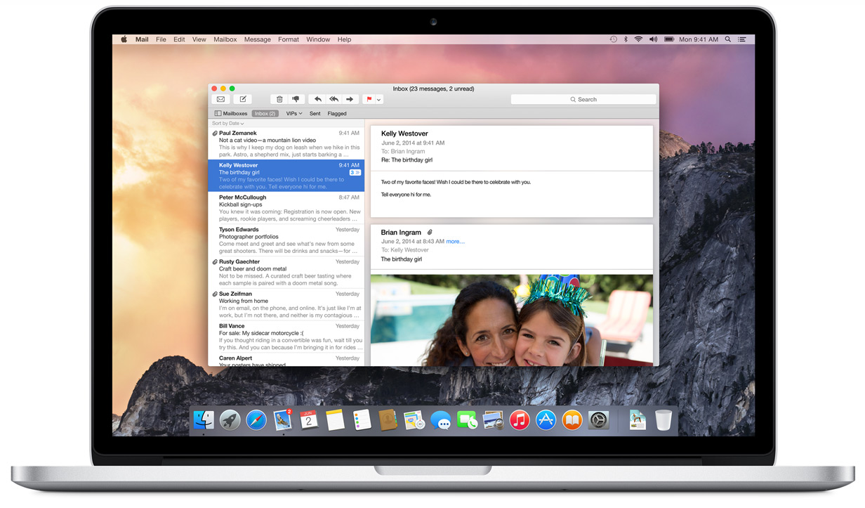
Apple on Monday posted to YouTube a promotional video showing off the graphical changes OS X 10.10 Yosemite will deliver when the operating system launches this fall.
Titled "The New Look of OS X Yosemite," the short minute-long clip highlights a few major changes made to Apple's upcoming OS, including flatter iconography, retooled system text and transparencies. Apple CEO Tim Cook first presented the clip at the Worldwide Developers Conference keynote last week.
The clip starts out with Yosemite's new "traffic light" window buttons, which are now devoid of skeuomorphic shading. Aside from the graphics tweak, the familiar green button previously assigned to enlarge Finder windows is now a toggle for full-screen viewing.
From the video's annotations:
We reconsidered every element of the Mac interface, large and small. The result is something that feels fresh, but still inherently familiar. Completely new, yet completely Mac.
Yosemite's new dock is also featured, with a run-through of icon changes made to Apple's standard apps like Safari, Mail, Calendar, Notes and more. A few select apps are shown off in detail, including Mail, Messages and Calendar, each featuring extensive use of transparencies that Apple says adds depth to the desktop OS.
AppleInsider is taking an in-depth look at Yosemite, as well as the upcoming iOS 8, in a first look series highlighting the operating systems' most anticipated features.
 AppleInsider Staff





 Malcolm Owen
 William Gallagher
 Thomas Sibilly
 Wesley Hilliard
 Marko Zivkovic









17 Comments
I was a little ambivalent about it at first (like I was with iOS 7), but I'm really starting to warm up to the UI. It appears that the interface has been tightened up, with even more cruft removed, that is designed to get out if the way. As with iOS 7, it's about the content, not the UI. It also appears to have been designed with a consumer that is more tech-savvy in mind, and better able to pick up subtler navigation cues than consumers of the pre-iOS era.
[quote name="Quadra 610" url="/t/180532/apple-posts-os-x-10-10-yosemite-highlight-reel-to-youtube#post_2548085"]I was a little ambivalent about it at first (like I was with iOS 7), but I'm really starting to warm up to the UI. It appears that the interface has been tightened up, with even more cruft removed, that is designed to get out if the way. As with iOS 7, it's about the content, not the UI. It also appears to have been designed with a consumer that is more tech-savvy in mind, and better able to pick up subtler navigation cues than consumers of the pre-iOS era.[/quote] At first my productivity was lower but I've come up to speed. The new Spotlight is definitely more useful for me. I do wish I could make the transparency less transparent but perhaps I won't need to once I can enable Dark Model.
The nicest change for me is the fact that they've got a different colour for the iTunes logo. I'm often finding I click iTunes instead of App Store because the logos are a similar colour.
The design style is outstanding, I especially like the Finder icon
The nicest change for me is the fact that they've got a different colour for the iTunes logo.
I'm often finding I click iTunes instead of App Store because the logos are a similar colour.
Yes, that is annoying.