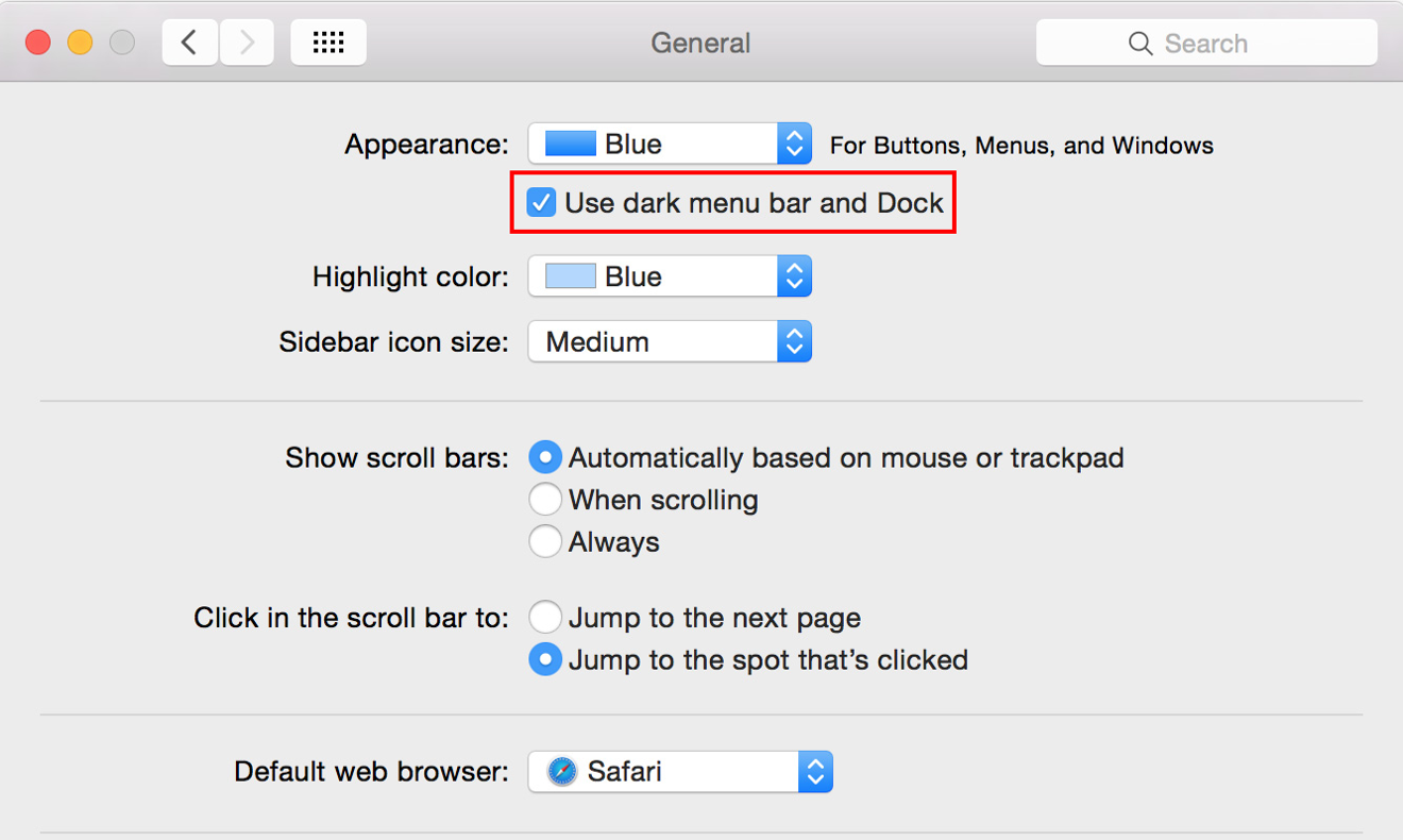
While a seemingly minor addition, Apple's inclusion of a so-called "Dark Mode" in OS X Yosemite, which basically flips the translucent menu bar and dock from light gray to black, answers the call of many longtime Mac users.
The feature can be toggled on and off by visiting the General pane in System Preferences. As seen in the screenshot above, a new option titled "Use dark menu bar and Dock" appears just below the "Appearance" drop-down menu.
Clicking on the button activates dark mode to tone down the light gray translucent menu bar and Dock placeholder, as well as drop-down menu backgrounds.
Flipping the switch changes black text and menu bar iconography to white, but unlike beta versions of Yosemite, no weight is added to OS X system fonts. For some, the white-on-black motif may be hard to read. If you don't find the look appealing, toggling off the "Use LCD font smoothing when available" option in the same General menu pane will help thin down the characters, but be aware this is a universal change, meaning black text will also appear less bold.
First-party menu bar iconography is also shifted from black to white, but most third-party apps are left unchanged. Because most menu bar icons come in black, or at least feature black borders, Apple's system applies a sliver of white on the bottom edge of each graphic. The result is a slightly embossed look that, while not optimal, is a decent stopgap until developers roll out in white icon assets.
Those looking to further tune their desktop layout can play with traditional settings and display options to better suit the dark mode look. In our experience, swapping the usual Blue aesthetic in System Preferences > General > Appearance for Graphite tones down Yosemite's bright, bold color palette. Among other UI assets, Graphite changes the "stoplight" window pane control colors to gray for a sleek and less intrusive experience.


