Apple will implement a number of user interface changes to iTunes when version 12.4 sees release later this year, including modifications to user interface navigation designed to address complaints of software feature bloat.
According to MacRumors, which received screenshots of the purported iTunes revamp, the improved media management and playback app will bring only minor user interface tweaks.
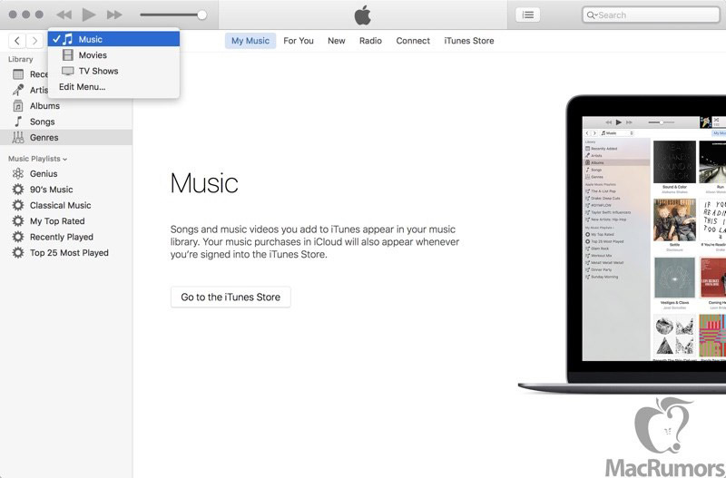
Most prominent among design modifications appears to be a persistent sidebar for easy access to albums, artists, tracks, genres and playlists. Similar in function to existing iTunes content navigation sidebars, like the Playlists sidebar, the upcoming version supports user customization and drag-and-drop menu editing.
Moving up the content hierarchy, a new dropdown media picker will help facilitate quick switching between music, movies, TV shows and other content stored both locally and in the cloud. Like the current iteration, which features small icons for each content type, the new media menu can be customized to display commonly used categories while hiding others from view.
Menus are also being simplified in iTunes version 12.4, according to the report. Along with a redesigned "View" menu that seemingly mirrors options offered in the "media picker," Apple is adding new navigation options, and removing extraneous selections, to make the menu bar system easier to use.
Finally, the iTunes mini player is said to gain minor graphical adjustments like a relocated "Up Next" pane that sits to the right of the playback window.
Judging by the leaked images, iTunes 12.4 will carry superficial UI adjustments meant to assuage user complaints, not the system level changes some users have been waiting for. Originally designed to handle music and iPod syncing, iTunes has become a one stop shop for iOS device syncing, movies, TV shows, apps, podcasts, iBooks and, most recently, Apple Music streaming services.
In February, Apple SVP of Internet Software and Services Eddy Cue and SVP of Software Engineering Craig Federighi teased plans for an iTunes revamp, saying concerns of feature bloat would be addressed in part by a new streamlined design. A definitive launch timeline was not revealed at the time, but MacRumors sources claim iTunes version 12.4 is expected to launch within a few weeks.
