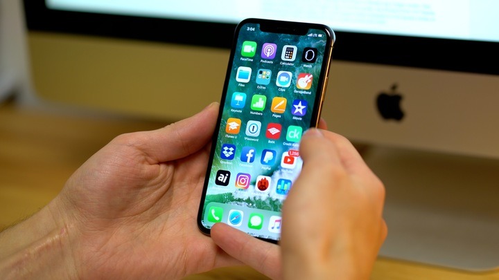
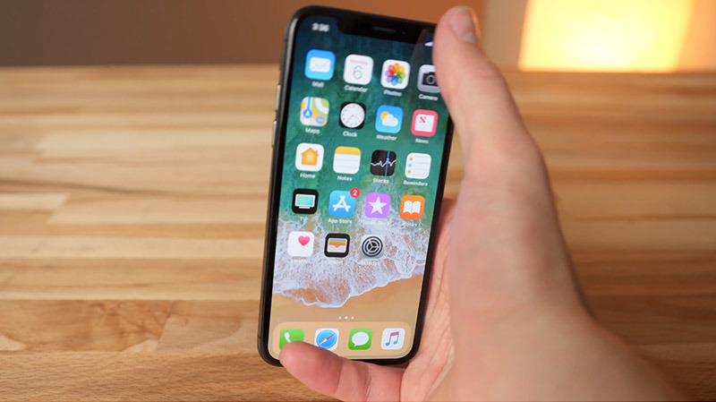
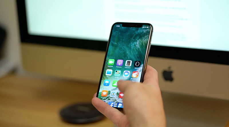
The iPhone X is hands down the best iPhone ever made. I knew that the second I laid my hands on it when I flew down to Cupertino a few days before it launched. That said, it's not perfect. AppleInsider lists five shortcomings of the otherwise stellar iPhone X in this video.
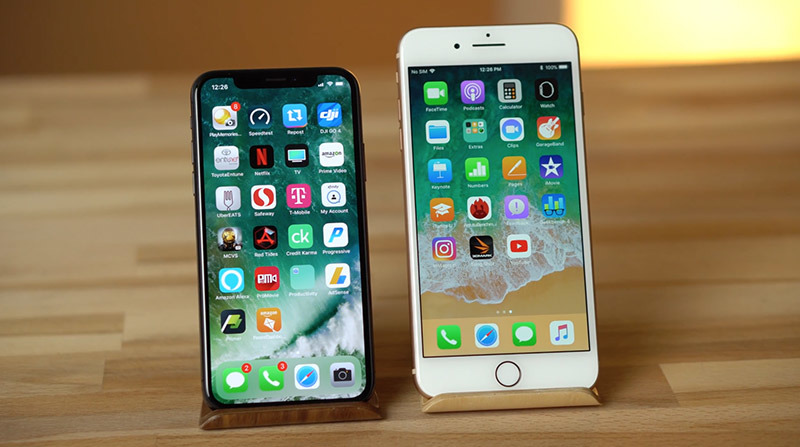
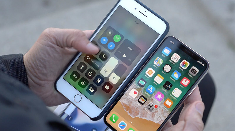
Going from my iPhone 8 Plus, which was always slightly unwieldy and uncomfortable to use, I can say that Apple has finally got the size practically perfect with iPhone X.
The X is now wrapped completely in stainless steel and glass, giving a luxurious feel and added weight that exudes premium quality.
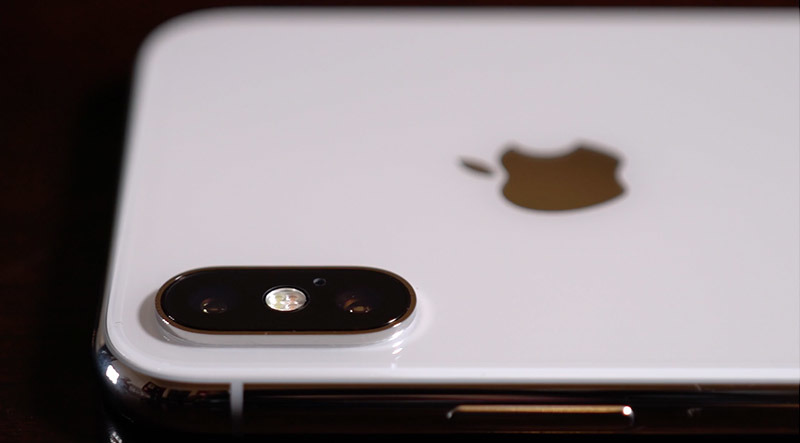
The back of the iPhone X offers to cleanest design ever seen on an iPhone. Although the camera bump is large, it now houses the microphone and flash, and I think that for the first time ever, it's now perfectly proportioned. Apple has completely removed the manufacturers info — in most regions — leaving the simple and clean iPhone text on the back of the X, as well as iPhone 8 models.
The X's edge-to-edge OLED display honestly makes all previous iPhone displays seem ancient. Going back to an older model feels constricting, like you're in a box, but with the iPhone X, you just feel free. You almost forget that the screen is just one of many parts that come together to make up the flagship device.
Apple's Super Retina display is incredible. The colors pop like never before, and it's noticeably brighter than any previous iPhone. The most recent iPhone 8 just looks desaturated and dull in comparison.
Despite all of that, there are a few things that really started to bug me about the iPhone X.
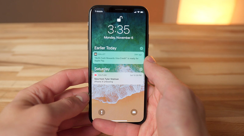
First, Face ID. Although Apple's facial recognition system works better than I imagined it would, with a load of added features like attention awareness and a more intuitive Safari Autofill, it really bugs me to have to swipe up to get to the home screen.
Authenticating via Face ID is an undoubtedly slower process than Touch ID. With iOS 11's Notification Center available at all times, I don't care if I miss a notification on the lock screen, I can just swipe down to view it.
I used to be able to unlock my iPhone 8 when it was laying flat on a table, but now I have to either hover my face over it or pick it up. A wireless Qi charging stand fixes this issue, but I'm not always at my desk.
It's also annoying that you can't register more than one user with Face ID. My fiancée uses my phone all the time, and Touch ID on makes it really convenient to do so. Now, however, she has to enter the phone's passcode.
The second thing that bugs me is something that the iPhone X shares with the 8 — the glass back. Although it looks amazing and feels really solid, premium, and grippy in your hands, it slides off of almost everything. I don't like to use cases, so it may not be an issue for you, but when I place the bare iPhone X on a surface that's not grippy and decently flat, it gradually starts sliding off.
I used to set my iPhone on my leather wallet at work, but the iPhone 8 and X eventually slide off and crash onto my desk. Thankfully I've got a wireless charger to place it on now.
I've since learned to compromise by no longer placing it on my lap, but I wish I didn't have to.
The next thing that bugs me is the new gesture for accessing Control Center. You have to pull down from the top-right corner of the display, and even with my large hands, it's still very uncomfortable with one-handed use.
A better option might be swiping down along the right side of the screen. Siri Search would still work find when swiping down from the center.
Apple does offer Reachability mode, but the gesture for that isn't convenient. It's uncomfortable to swipe down with your thumb when the trigger point is at the bottom of the display, and I find myself constantly messing the gesture up if I don't swipe in the perfect spot.
Double tapping the home bar on the bottom of the screen might be a fix that Apple could implement.
The fourth thing is the screen size. Although the iPhone X has a larger screen specification, Apple measures on the diagonal. So even though it has a 5.8-inch screen, the iPhone 8 Plus' 5.5-inch display actually has more screen space, with 12.93 square inches compared to 12.8 square inches on the X. That also doesn't account for the rounded corners and notch.
While watching a standard 16:9 YouTube video in full screen on the iPhone X, the notch gets pretty distracting and the top and bottom of the video get cut off as well. If you decide to watch it in 16:9 letterboxed mode, the size of the video shrinks to 10.88 square inches, making it more comparable to the iPhone 8, which gets 9.43 square inches of video screen space.
As a result, the 8 Plus with a 12.93-square inch viewing area is actually better than the X for watching videos.
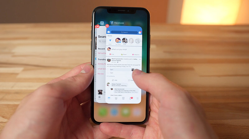
The fifth and final thing that bugs me about the iPhone X is that you can no longer swipe up in multitasking view to close apps. All a swipe does is bring you back to the home screen.
Instead, you have to hold down on an app in the app switcher and wait for an icon to pop up before closing apps. It makes no sense because any other device running the same iOS 11 software still allows you to swipe to force close.
Fortunately, three of the above annoyances are software based, so there's still hope for Apple to fix them in a future update or at least give us the option to choose how we want the GUI to work.
 AppleInsider Staff
-m.jpg)

 Malcolm Owen
 Amber Neely
 Andrew Orr
 Wesley Hilliard
 William Gallagher

 Sponsored Content






60 Comments
I agree with some of these and disagree on others. 100% agree on control center. I love control center, especially in iOS 11, but it is awkward st best to reach one handed. Which brings us to reachability which I both agree that the motion is too exacting but also think the swipe down to pull the screen down is more intuitive. I love the way Face ID works and love the lick screen. It’s nice to have the notifications hidden until I look at the phone. Enough people agree with your point that I think they should maybe give an option to turn off the swipe requirement. As for the app switcher, I believe they’ve made that slightly more difficult in an attempt to discourage people from closing apps. Apple always says it’s not necessary in iOS. I always close Facebook and have discovered that if I just pause for a second when I make the gesture to open the app switcher I can then swipe up to close it. It isn’t one continuous motion but it works pretty well. As for the physical features, wireless charging necessitates a glass back and a nearly bezel less design gives you an odd display ratio. I will gladly take the trade off. I love the size of the phone and the screen.
Accessing control centre is my only real gripe with the X but I am used to it now.
Coming from an SE, I am blown away with how good the X is. I just find it to be so buttery smooth. It has surpassed my expectations.
The reachability is a good feature, but needs better implementation. The control center is cumbersome to get to. Instead of swiping up for home screen maybe they can use the power button in unison with the Face ID.
My issues are with iOS 11 and the glitch software. Sometimes I find that even after you hold down to close apps the apps won’t let you close them. You have to hit the power button and then go back in. Also I find my phone freeZes and the only solution is to activate Siri to tell it to open another app.
Face ID feels glitchy when used by non Apple apps.
I also dont like that it is uni directional. You have to hold your phone upright just to log in. What if I pick up my phone in landscape because I want to watch a video or read an article or play a game. I wonder how they will address that with the iPad
i came feom a 6s and I find I like the all encompassing screen much better. I even found my battery seems to be better when not doing heavy use.
They should add the ability to open the screen with a wink. Authenticate > unlock > wink > open
Eek -- the story mentions "I knew" in the first-person, but the byline is attributed to AI staff. Is there a specific author we should associate with the first-person lead?