The long-time To Do app was updated on Wednesday with redesigns to its core features to add power yet simplicity — with promises of a forthcoming Web version.
On the surface, the new OmniFocus 3 for iOS brings a fresh design and new features but underneath there is also the most radical shake-up of the app since it was launched a decade ago. It's practically a philosophical change to how OmniFocus works yet the difference will appeal to both new and longstanding users. It just might take some getting used to.
OmniFocus is still one of the strongest apps for using David Allen's hugely effective Getting Things Done or GTD method of productivity. With this new version, however, it takes a step away from that system by replacing GTD's Contexts with Mac- and iOS-like tags.
Previously, you could enter a To Do task and give it one single context to describe where you needed to be do it, what tool you had to have, or who you should be with at the time. So if your task is "Call Rachel about the tax lien" then you could have a context called Phone or one called "Rachel".
When you find you've unexpectedly got half an hour's wait for a train, you could tell OmniFocus to just show you what phone calls you can make.
This idea of Contexts works and it has worked fine for the 10 years of OmniFocus's life. However, it took some effort because you could only have one Context per task and so you had to choose wisely.
For instance, imagine Rachel is a colleague at work. There will be some tasks that are so important you need to phone her right now but there will be others that you'll just mention to her whenever you meet. However, if you've given them some a context of "Phone" and some, say, "Office", then you have to remember to look in two places for everything you want to say to her.
If you've been smart and just created a "Rachel" context, that's great but you can no longer tell which ones are urgent.
Tags
Then, imagine that the pair of you share an assistant named Gurpeet. Sometimes you'll want to discuss a task with Gurpeet, sometimes with Rachel, sometimes with them both.
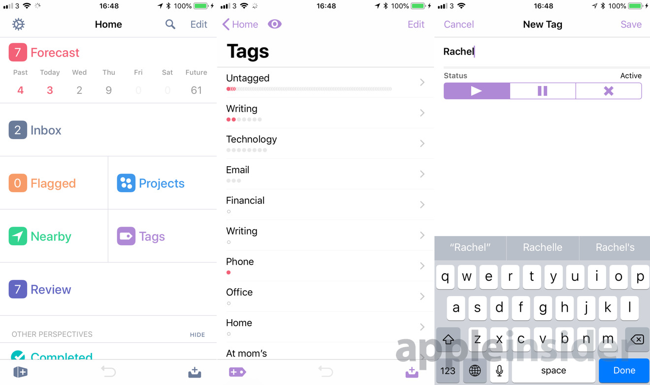
Under the new tagging system, you could write a To Do labelled "Talk to Rachel about the tax lien" and give it one tag called "Phone", another named "Office" and another named "Rachel". Add one called "Gurpeet". Add "Urgent" too, if you like.
Use a tag for any way that you're likely to want to search for a task later. There is no limit to the number of tags you can use: OmniFocus has gone from a single Context to as many tags as you can handle.
That is an issue, though — you can so easily create new tags that you risk overwhelming yourself with them. You might create a tag called "Invoices" and another called "Invoice". "Clients" and "Client" or "Customer". Without any limits constraining you, there also aren't any limits helping you.
This could all be handled better, too. As it stands, if you did create a new tag named "Rachel" today and then next week forget, there's nothing at all to stop you creating another identical tag. You can indeed have two or more tags of the same name.
OmniFocus is very, very good at predicting what you want as you type. So if you're entering a new task and you tap on Tags, OmniFocus will display every matching tag the moment you start typing "Rachel". But, that same intelligence should be available when you create tags in the first place.
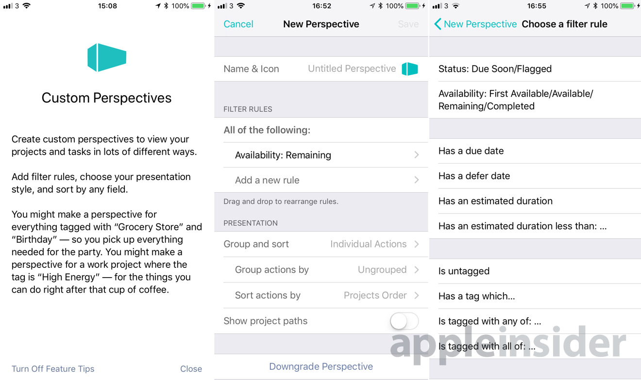
You can easily use OmniFocus without any tags at all, though, and actually to get the very most out of them you need to buy OmniFocus Pro. This lets you create what are called Perspectives: custom ways of looking at your To Do tasks. They're like saved searches for things you do often.
So with that example of your colleagues and a shared assistant, you could create a Perspective that lists all the tasks to do with them. Then you could have that Perspective be a single button in OmniFocus that means the information is always only one tap away.
Perspectives
Perspectives are among OmniFocus's most useful features and the new tagging system already makes them more powerful. It will get better still: the company says that it's going to add to this feature. The most useful addition will be an Or function: the ability to show all tasks that you've tagged Rachel or Gurpeet but not both.
As it is, you can already get lost in the weeds with too many tasks and with the ability to construct Perspectives with not only rules but nested ones. If the replacement of contexts is one philosophical shift in how OmniFocus works, though, there is another and it applies equally to the Standard and Pro versions of the app.
This new version explicitly sets out to offer you more powerful features - and then to hide them. So, while you can go crazy with tags, you don't have to and moreover you don't need to know anything about tags until you want to.
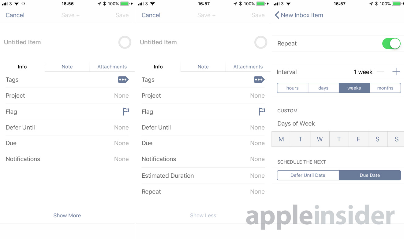
Similarly, OmniFocus has a new system for entering repeating tasks and by default you don't see any of it. Most tasks you do in life don't repeat so the standard form for entering tasks doesn't even mention repetition.
When you want to repeat something or actually just want anything more than the basic To Do entry form, you tap a Show More button at theft of the screen.
This adds extra rows information including Repeat. Even then, what it says is Repeat None. You have to tap on that and then tap a slider button to reveal a swathe of options.
That actually feels like one step too many — it's great that the features are tucked away until you want them but having to positively choose by tapping Repeat and then again by tapping a slider seems unnecessary.
Once you've done this, though, it's now both possible and particularly easy to set up repeats like "First Thursday of every month".
The Omni Group calls this hiding of detail until you need it "progressive disclosure" and refers to screens like the To Do entry form as a Flexible Inspector. At any point you can enter a new task or look at an existing one and choose how much detail you want to see.
All of this does make OmniFocus both powerful and sufficiently simple that it's fast to use when you're entering one new task or you're looking up the detail of one existing one.
Usually, though, you're looking at the bigger picture. Sometimes you'll want to make changes to a whole set of tasks and often you will just want to see what the rest of your day looks like.
OmniFocus 3 for iOS brings two new enhancements to help with both of these. If something's come up and you know you can't do these 27 tasks until next week, you can tap each one to select it and change the date for all of them at the same time. You've always been able to do this on the Mac but it's new to iOS.
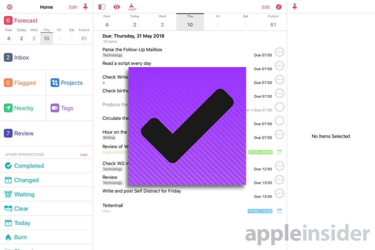
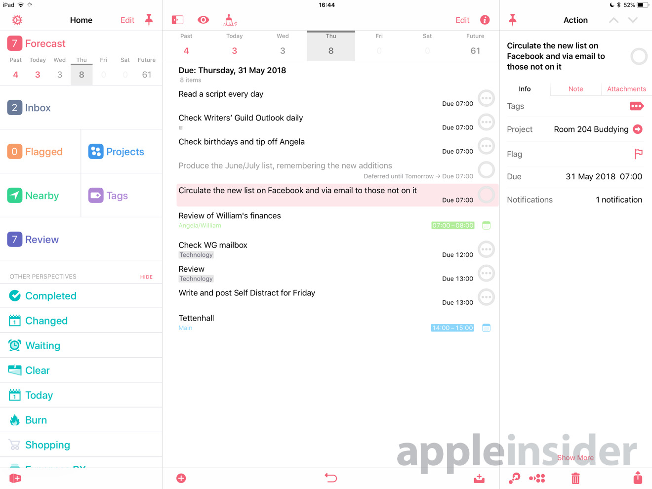
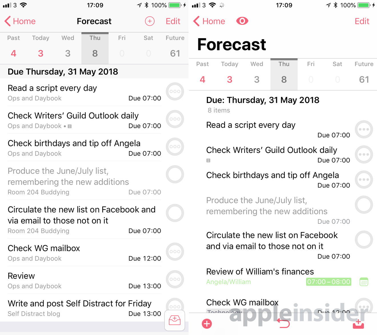
Similarly, you can now better glance at everything due today and get a feel for how things are looking because the Forecast view has changed how it displays your calendar.
To Do apps are not calendars and vice versa but it's long been a handy feature of OmniFocus that it shows you your appointments as well as your tasks. Previously this was just a little panel at the foot of the day's tasks but now events are displayed within your task list. If you've set lots of tasks for 9am Monday but there's a board meeting at 10am, for instance, then you'll see them both together in OmniFocus and know you've got to cancel something.
Alongside all of these adjustments, OmniFocus 3 for iOS has a new design which gives more space to each of your tasks. On the left is the previous edition while on the right is the new OmniFocus 3 for iPhone. Depending on your iOS device, the new version will show you two or three fewer tasks per screen than it did before. That takes time to get used to but it also has the odd effect of making a long list feel less crammed and so your day just a little less fraught.
So the new design successfully adds new or revised features while managing to stay reasonably simple. It hasn't kept every feature, though. On the iPhone, you used to be able to call up a map of where you are and it would display task you could do there. So if you had a groceries tag, it would put pins on all of the nearest supermarkets.
You can still get OmniFocus to list nearby places where you can do your tasks but the map view is gone.
Reportedly that might change but one thing that definitely will is a temporary problem that exists with the new design. This is that the iOS and macOS versions of OmniFocus currently don't match. That will change later this year when OmniFocus for Mac is updated but for a short while there is an issue to do with tags.
OmniFocus 2 for Mac still works with Contexts, it doesn't understand tags. It sees the first tag you assigned to a task and calls that its Context. However, it can't see any of the others so you can't build the Perspectives on Mac that you can on iOS. Fortunately, it may not see the other tags but it preserves them so they still appear when you're back on your iOS device.
It's also still the case that OmniFocus is solely available on iOS and Mac but that is changing too. There are still no plans for a Windows or an Android version but the company is planning to release a web edition. It won't be a full online implementation of OmniFocus, but it will give people using PCs at work the chance to stay on top of their OmniFocus To Do list.
That web version will be a subscription service and neither pricing nor availability have been announced. Neither this new OmniFocus 3 for iOS nor the forthcoming version for Mac will be subscription, though. Instead, both will available as from the App Stores as free downloads that you can use for two weeks.
During the trial, you can switch between the Standard and Pro versions at will. After that, you're required to make an in-app purchase to unlock one or either. The new Standard OmniFocus 3 for iOS costs $39.99 and the Pro version is $59.99.
If you're an existing user then you get a discount. Plus, smartly, you can buy the Standard version now and then just pay the difference when you decide to go to the Pro version.
