With a Snapdragon 845 processor, tons of RAM and a base price of $529, the new OnePlus 6 is being called the best bang for your buck smartphone on the market. But, how does its camera system stack up to the iPhone X?
For the second part of our tests, comparing the OnePlus 6 versus the iPhone X, we pitted the $579 OnePlus 6 model with 8GB of RAM against the $999 64GB iPhone X. In an initial benchmark comparison video, the OnePlus impressed with performance on par — or better — than Apple's flagship handset. Today we take a closer look at cameras, an area where Apple commits considerable resources to stay ahead of the Android pack.
The OnePlus 6 markets a dual camera system with 16- and 20-megapixel shooters, specifications that look great on paper because the iPhone X only has two 12-megapixel cameras. As with most marketing, however, specs alone don't tell the whole story. We found the 20MP sensor on the OnePlus is restricted to gathering depth data in portrait mode; there is literally no way to see an image through this lens.
Let's jump right into the comparison with a lighting situation that's tough for any camera. Seen below, the OnePlus 6 massively over sharpens the image, which looks overexposed and with a lot of noise as compared to the same shot taken with iPhone X.
Looking at the metadata, the OnePlus was set at 100 ISO, increasing brightness, but in turn introducing unpleasant artifacts into the image. In fact, we looked through all of the One+ 6's photos, and found that it's limited to no less than 100 ISO, which is a huge downside for photo quality in bright conditions.
The iPhone X, on the other hand, was at a very low 20 ISO, so we naturally see markedly less noise. In our tests, the iPhone reached a low of 16 ISO, drastically reducing noise.
We also discovered that the OnePlus 6's aperture actually shows as f/1.53 instead of the marketed f/1.7. On the iPhone, some photos were shot at f/1.7 instead of the marketed f/1.8. This makes a difference in quite a few ways, and can actually make the OnePlus 6's photos less sharp.
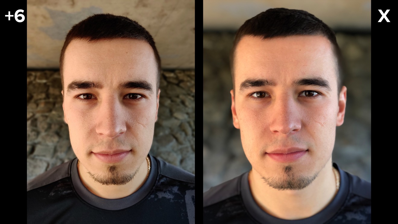
Moving on, we tested portrait modes on both models. As you can see, the OnePlus 6 uses the wide lens for portrait mode, leaving the other to collect depth data.
Overall, the iPhone did a much better job with edges of objects, whereas the OnePlus had issues in some places, like my hair. The iPhone X is also quite a bit more detailed.
Here, you see the minimum distance needed for portrait mode to work on both phones. This just shows you how much better close-up portraits look with a telephoto zoom lens.
In this set of photos, we tried to match the framing by bringing the OnePlus 6 closer to the subject. As you can see, the iPhone X's zoom lens compresses the background, which enlarges it for a more pleasant portrait photo. However, the colors on the OnePlus are much more natural, and it actually looks more detailed.
Here's another portrait photo. Shot with the OnePlus, there's more blur on the wider background and the white balance is more accurate.
This non-portrait photo however, is the opposite. It butchers the white balance compared to the X, but it is more detailed.
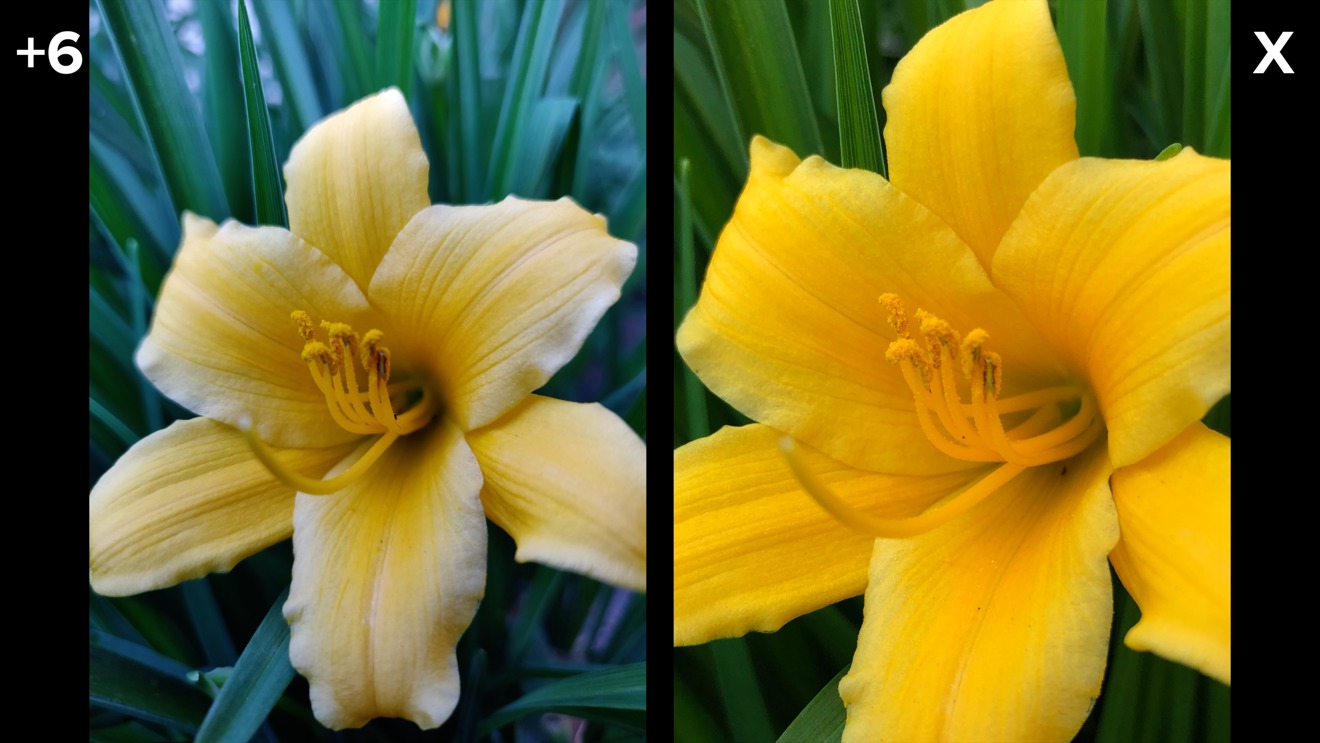
And here we tried to get as close as we could while maintaining focus. The iPhone X's photo just looks incredible.
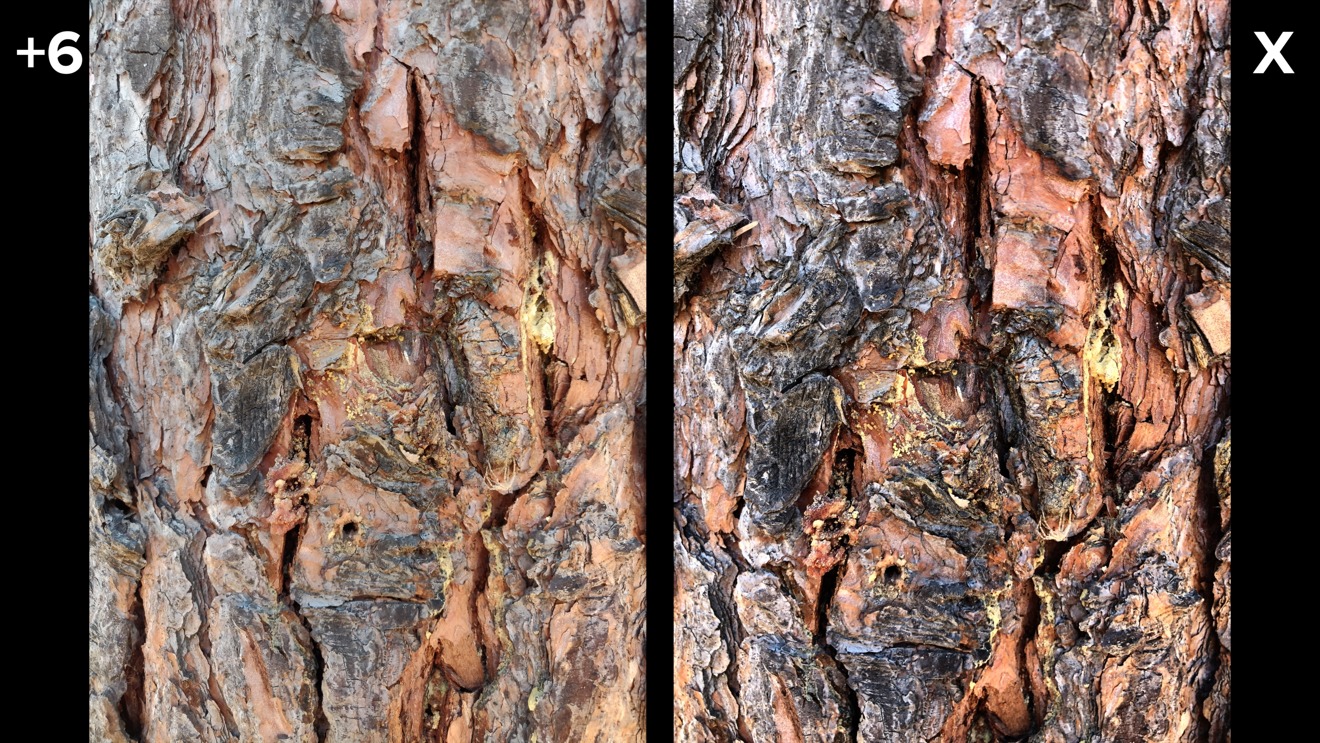
Here's a closeup photo of a tree for detail. The X's contrast is completely unrealistic, but appealing. The OnePlus churned out a photo that looks exactly like we saw in real life, despite being less detailed than the X.
Now with Panorama mode, both phones did great.
We took a couple more HDR photos, and the OnePlus overexposed again.
Now onto the selfie camera. The iPhone X goes way overboard on the contrast again, which makes shadows under the eyes darker. Detail is about even, and both phones missed the mark for white balance. The OnePlus was too cool and the iPhone was too warm.
The iPhone, of course, has selfie Portrait Mode, a feature that the OnePlus lacks.
We tested dynamic range for selfies, an evaluation the OnePlus absolutely failed. It went nuts on the sharpening, revealing every single pore on the subject's face. The iPhone doesn't look as detailed, obviously, but we'd much rather have that instead of an over-sharpened image.
Since the OnePlus 6 doesn't have a telephoto lens, we decided to see how much detail you lose when using 2X digital zoom instead of telephoto zoom on the iPhone. The difference in detail is obvious, and the OnePlus again overexposed, washing out the color in the grass. However, the white balance is spot on to what we saw in real life.
The iPhone X can digitally zoom up to 10X with its telephoto lens, so we thought we'd compare zoom detail. The OnePlus 6 can actually only go up to 8X magnification, and it tried desperately to bring out the detailed by over sharpening.
We decided to shoot against the sun. The iPhone did a much better job dealing with lens flare, so the sky looks pleasantly blue, but the OnePlus did better in terms of dynamic range.
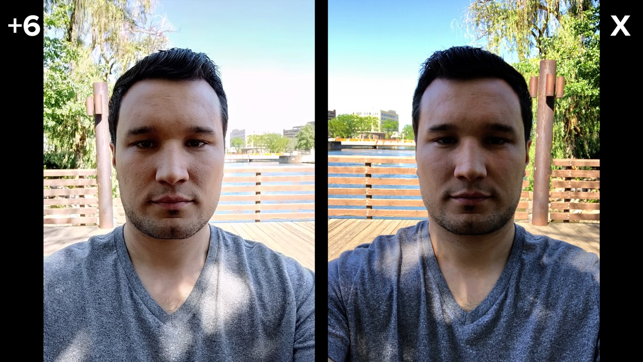
I myself took a selfie, and we can see that the OnePlus over sharpened the image. This time, the colors on the iPhone look much more pleasant. As you can see, the selfie camera on the OnePlus is actually quite a bit wider, with each selfie taken at arms length away.
Now for a low light flash photo in the office, the OnePlus got the warmth right, although it oversaturated a bit. The iPhone just looks kind of flat.
To finish off our testing, here's one to compare detail, and if you crop in, we actually see more detail on the OnePlus.
Impressions
We definitely weren't expecting the OnePlus 6 to hold up as well as it did. There were shortcomings in terms of missing features, overexposure, over sharpening, and some failed high dynamic range photos, but overall, it did pretty well. The accurate white balance was probably our favorite thing about it.
For $529, you're definitely not sacrificing too much in terms of camera quality.
