There are solid features in Microsoft's new Mac browser - and significant ones still to come - but for Edge to be a compelling browser for Apple users, it's got to offer you more than you're getting with Apple's own Safari.
On Monday, Microsoft announced that it officially released a test version of Microsoft Edge for the Mac. It's a remarkably, surprisingly solid app even in this pre-launch edition. Even that we already know that its missing a couple of key features, still you can get a feel for whether Microsoft Edge is worth replacing Safari as your main browser.
A key reason that this early version is so robust, though, is the same reason that Microsoft has made this move at all. The company didn't set out to make a Mac browser, it set out to convert its existing PC Edge into using Google's Chromium system. That gets it a solid base that happens to also give it a Mac version.
And it's what makes the Mac version of Microsoft Edge look very like the Mac version of Chrome. If you were thinking of moving from Safari and didn't want to risk a pre-beta developer version of Microsoft Edge, you could download Chrome and you would get pretty much the same feel.
Not measuring specs
This is about how Edge feels in comparison to Safari, it's not about benchmarking or measuring anything. That wouldn't be either fair or even all that useful given how unfinished this release of Edge is.
That said, you can make some broad comparisons that are interesting. For a browser that looks like Chrome, for instance, Microsoft Edge currently takes up around a third less disk space than Google's offer. But then if you're tight on space, Safari is a head-scratching is-that-really-right ten times smaller than Edge.
Safari is also less CPU intensive than either the currently-shipping Chrome or this developer Edge.
We all tend to describe our preferred browser, whichever one it is, as feeling light and responsive and fast compared to the others. The key word there, though, is feeling. If you were checking out Activity Monitor while running these browsers or if you are on a MacBook with little space, you'd unquestionably say that Safari was the lightest.
You're supposed to say that Edge is the fastest. That's a key promise from its Windows version, that Microsoft Edge will be faster than any of them. So far, we're not seeing that. We have no complaints about how quickly it loads any website we tried with it, but we haven't been knocked out either.
That speed, along with the final disk space requirement, is something we'll have to come back to when this ships. There's good reason to hope that a final release will be quicker, but there's also reason to expect that it will be bigger, too, because this version of Edge is missing a couple of features.
What's missing
There's nothing missing that you actually need in a browser, nothing that isn't working. What's missing are some extra features — but these could be what makes you decide to move to Edge.
Arguably the most appealing is a feature called Collections, which will help you save and organize material that you find on the web. It's going to be like Safari's reading list, but rather than that bookmarking kind of feature, Collections will be a research tool. You'll be able to drag images and text into it, and then share some or all with others.
Less thrilling, but possibly needed for people in corporations, is IE Mode. This will be the whole, horrible, long-forgotten Internet Explorer built into Edge so that, if you need it, you can use in-house sites that require the old standard.
Taste
Even before we get any of these, though, there is a feature that might tempt you away from Safari, and it isn't Bing. While that search engine is, unsurprisingly, promoted on the startup page of Edge, if you scroll down, you also get news. A collection of headlines and stories from Microsoft News is right there in your browser's main page.
Microsoft News is fine. We've compared it before to both Google News and the basic, non-subscription tier of Apple News.
Here it's just a little extra touch, and ultimately it's the little things that make the difference. Features are great, and are also easy to compare, but it's the feel of a piece of software that matters. That's got to be more so with browsers than with just about anything because you will spend so much time using it.
In theory, every browser should render every website perfectly, but you know they don't. This isn't a reason to switch browsers, but it is a reason to always have two on your Mac, and on your Windows box too.
Beyond that, though, every browser does render every website in a different way. The buttons and controls are different and if you're used to seeing a site in Safari, it is noticeably different when you try it in Firefox.
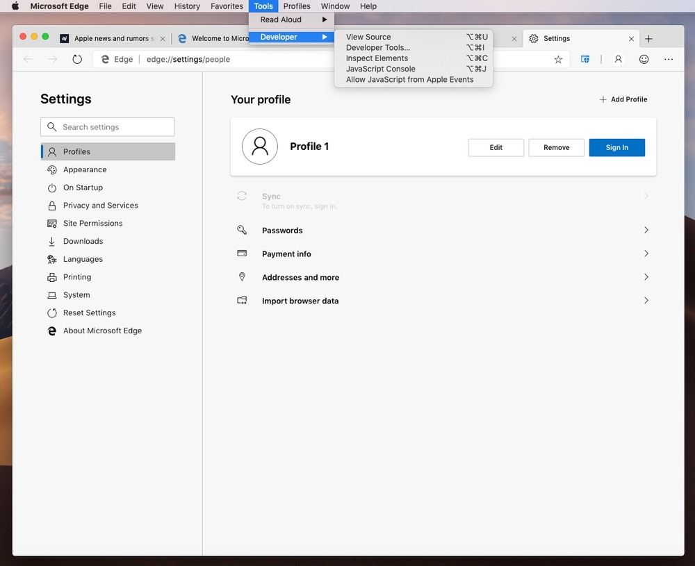
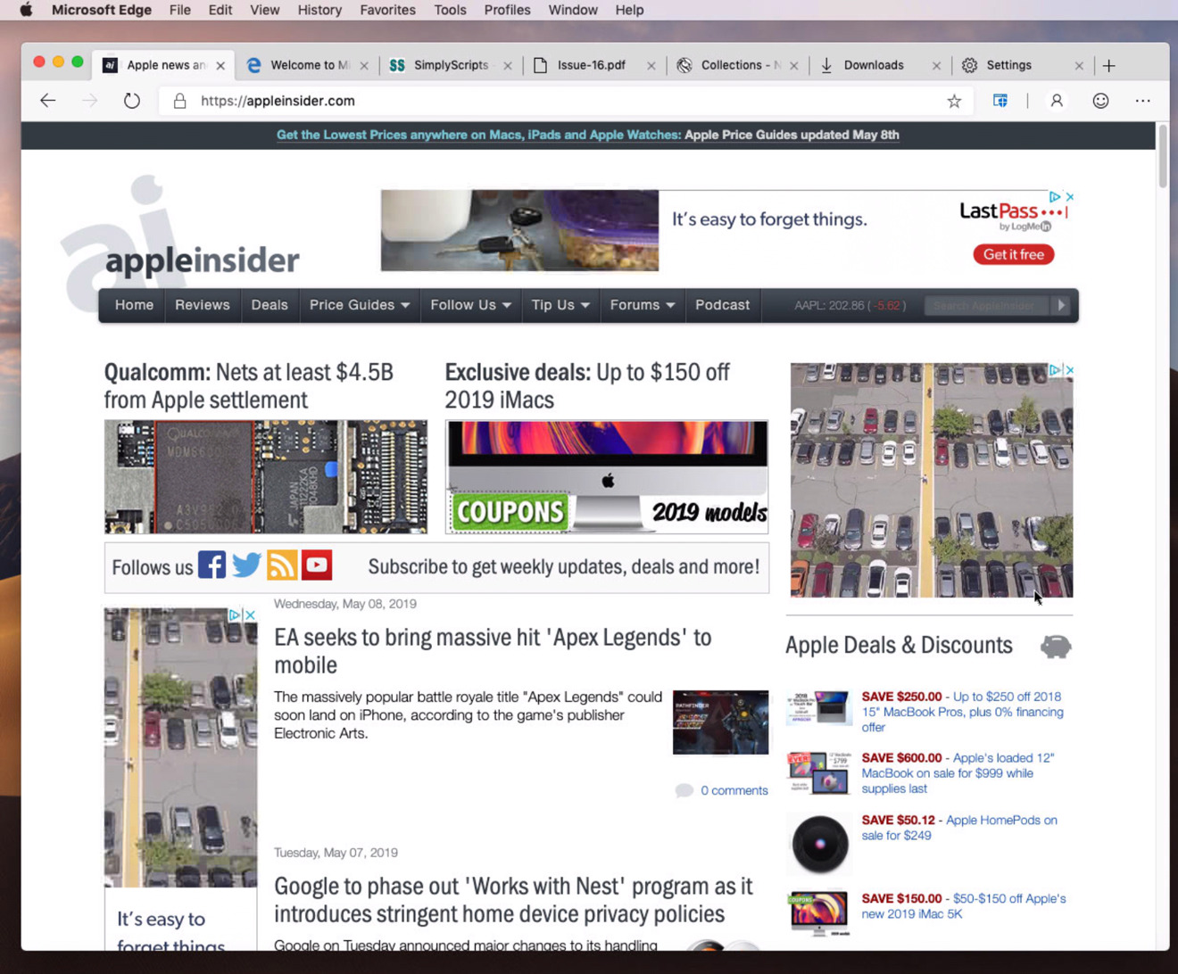
Microsoft Edge displays its settings in a web page.. Separately, you can always see the source code for any site you visit.
We would never argue that the color of a button or the shape of a slider is vital, but we will always maintain that overall this look and feel is extraordinarily important.
In which case, the look and feel of Microsoft Edge gives away its origins. This is a very Chrome-like browser, but it's also a rather Windows-like one.
Where every Mac app has its preferences in a separate kind of window, Edge — and Chrome — have all their settings on a web page. It looks like a web page, it takes up a tab, it is shown in the main window of the browser. The only difference is that instead of beginning with http:// and being a remote website, it's a local one whose name begins edge://.
You're not very likely to type edge://settings/appearance into your browser tab, but you could.
Maybe if you're a more technically-minded person, maybe if you're spending a lot of time adjusting settings, you'd find that faster and friendlier than clicking through buttons and tabs. And you can easily imagine a situation where you create TextExpander snippets to make entering them fast and convenient.
We did get a peculiar issue when we wanted to search the web having just been in a settings window. Edge attempted to search for "local curry restaurant", but prefixed it with edge:// for no reason that we could fathom — or, actually, reproduce that often. This is a very early beta, after all.
Safari
This look and feel makes Edge seem about the same as Chrome to us. It's lighter than Firefox, though we just tend to get exasperated by how we launch Firefox because a site isn't working just right in Safari and we have to schlep through its constant updating.
Edge feels more full-featured than Safari, yet that's just an impression we get from how many settings are thrown at us. In another very Windows-like move, Edge comes with choices for how your tabs look and because the options are there, you must be shown them and you must be shown them immediately. Unable to really judge how the different tabs look until we used them in anger, we picked one in a shrug and haven't gone back.
There are more useful, and oddly less in your face, options to set up profiles where your Office 365 account is linked to your browser, but we've muddled through with Outlook online on Safari without issues.
Then Edge, and Chrome, also make more of a meal about downloads. It's as if Safari expects you to download something now and then, where Edge thinks you're in this to do a lot. So where Safari has a download icon, which only appears when you've actually downloaded something, Edge presents a download manager.
To swap or not
Intellectually, we know that it's going to be the forthcoming Collections feature that should sway us. That's the part that has the most use, that makes Microsoft Edge the most different from Safari.
And yet those of us who happen to prefer Safari to, for instance, Chrome, already know that we aren't really that likely to make the move to Edge, either.
It's good that we have the option, though we have to be aware that it's practically an accident of birth that means we get a Mac version of Edge only because there's a Mac version of Google's Chromium system.
Keep up with AppleInsider by downloading the AppleInsider app for iOS, and follow us on YouTube, Twitter @appleinsider and Facebook for live, late-breaking coverage. You can also check out our official Instagram account for exclusive photos.
