Amazon on Monday unveiled a revamp of its Alexa app, complete with a redesigned user interface and additional instructions on how best to utilize the virtual assistant.
Rolling out over the coming month on iOS, Android and Fire OS, the updated Alexa app puts a focus on personalization, reports TechCrunch.
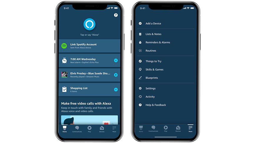
Of note, it appears Amazon is no longer pushing Alexa as an all-encompassing platform and instead presents the product as a service. For example, third-party skills have been removed from the home screen. Instead, users find a large Alexa button to trigger the assistant, below which is a list of suggested actions that are curated based on past usage.
Suggestions might also feature frequently accessed controls or management options for currently active devices, like Echo speakers or Echo Buds. Replacing the old Alexa button, which was previously located in the center of a toolbar at the bottom of the screen, is a repositioned control for media playback.
Joining the Play button are quick links to connected devices, Amazon's communications tools, a "Home" button and a "More" category. App features like Reminders, Routines, Skills and Settings are now located in the catchall "More" section.
The redesign speaks to Amazon's evolving Alexa philosophy. Previous versions of the app sought to create a virtual home hub of sorts within iOS, offering immediately relevant information like the date and weather at the top of the page. By removing that information and rearranging feature access — particularly skills — the app now caters to actual consumer habits, not an aspirational design forwarding Amazon's strategy to market Alexa as an app platform.
Amazon expects all users to be granted access to the revamped Alexa app by the end of August.
 AppleInsider Staff


 Andrew Orr
 Wesley Hilliard

 Oliver Haslam
 Christine McKee
 Amber Neely




1 Comment