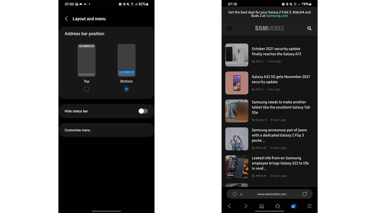
Forever the innovator, Samsung this week decided it was time to add a tab bar to the bottom of its first-party mobile browser — months after Apple introduced a suspiciously similar option to Safari with iOS 15.
Rolled out in a beta version of the Samsung Internet app on Tuesday, "Focus Mode" allows users to reposition the browser's URL bar to a more accessible spot near the bottom of the screen. As SamMobile reports, the rearranged user interface enables easy thumb access to important UI elements, even on Samsung's larger smartphones.
Perhaps unsurprisingly, Apple at WWDC in June debuted a nearly identical feature for Safari called the Tab Bar. What is surprising is Samsung's willingness to ape the layout after witnessing the intense blowback that Apple received from developers and users over a months-long iOS 15 beta testing period. Then again, some users prefer the new design.
Initially set for introduction as the default view for Safari in iOS 15, the Tab Bar collects all browser tabs and the URL navigation bar into a single entity for display at the bottom of iPhone's screen. Users can swipe left or right to open different tabs or tap on the bar to access an address and search field. Other vital tools like tab controls, page navigation and share sheets are also within thumb's reach.
Early testers rebelled against the new Safari design, saying that the layout was overly confusing. Perhaps the Tab Bar was too much of a departure from the traditional page header that has been in wide use since the dawn of the mobile web; forcing users to retrain muscle memory established over years or decades is no easy task. In any case, Apple listened to the feedback and walked back its Safari changes over the waning iOS 15 beta rounds.
The Tab Bar was ultimately relegated to a settings option when iOS 15 saw release in September.
While Samsung is often ridiculed for its facsimiles of Apple designs, Apple also does its fair share of borrowing. As noted by The Verge's Dan Seifert, footer bars were in use on Windows Phone and extensively tested in Google Chrome long before Apple's iteration.
Safari in iOS 15 also introduced Tab Groups, a website organization tool that, as its name suggests, lets users group related sites into customizable tabs. Like the Tab Bar, Tab Groups have been deployed in other leading browsers for some time, but Samsung chose today to integrate that particular feature into its app.


