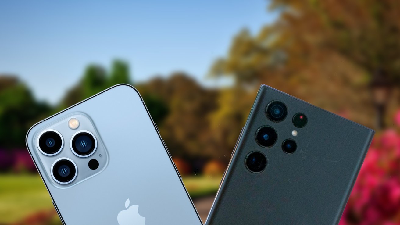
In this battle of the flagships, we compare Apple's iPhone 13 Pro against Samsung's brand new Galaxy S22 Ultra to test which camera setup is best.
For this comparison, we took both devices out on the town for a weekend to test in several real-world scenarios. While each had its strengths, users will likely walk away with a favorite.
iPhone 13 Pro versus Galaxy S22 Ultra: The camera hardware
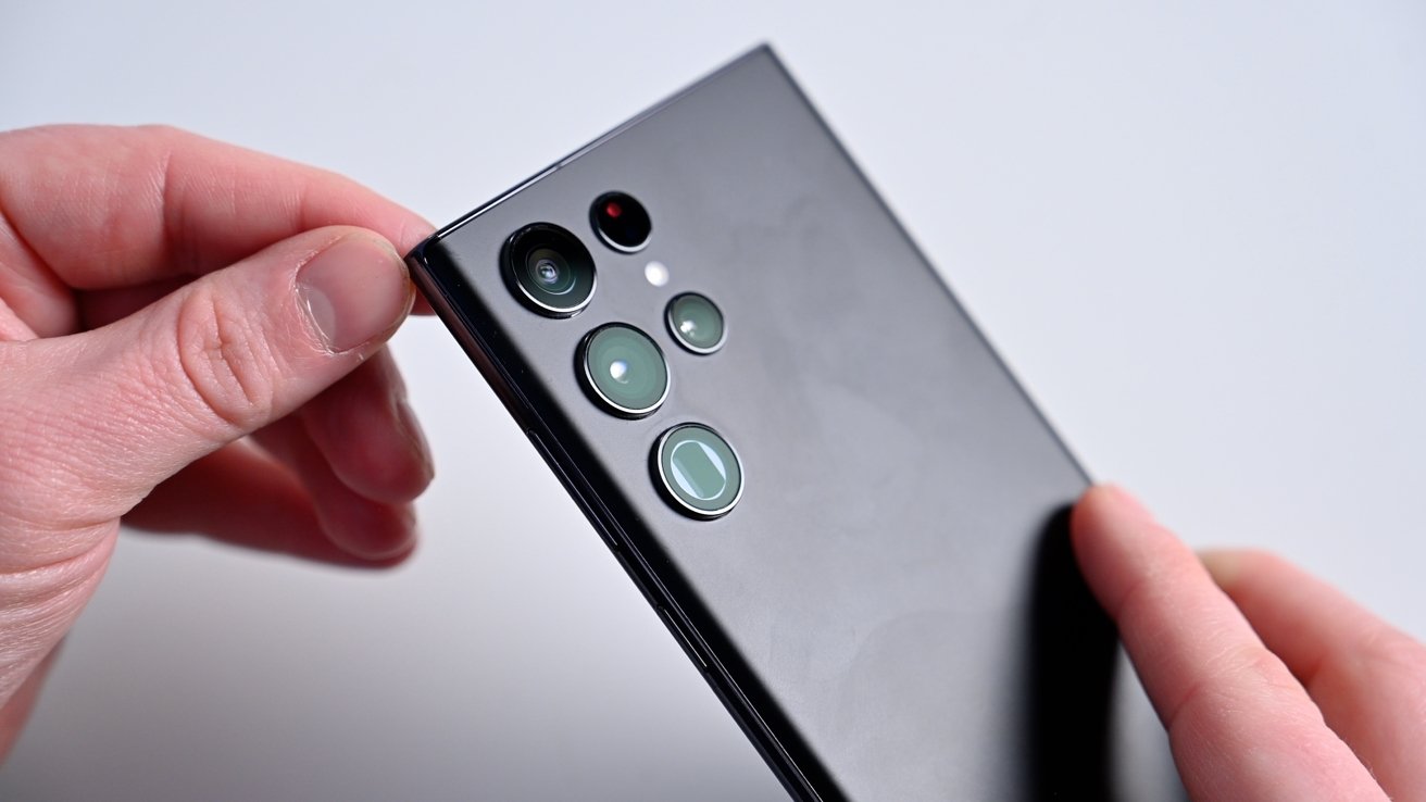
On the Galaxy S22 Ultra, Samsung packed in four cameras, including a 108MP wide-angle lens, a 12MP ultra-wide-angle lens, and dual 10MP telephoto lenses. That's a 3X zoom telephoto lens alongside a 10X zoom telephoto lens.
The iPhone 12 Pro and iPhone 12 Pro Max had different systems, with the larger model getting extra benefits like a larger sensor. With the iPhone 13 Pro and iPhone 13 Pro Max, Apple kept camera systems the same, with both including a 12MP wide-angle lens, a 12MP ultra-wide-angle lens, and a 12MP 3X telephoto lens.
Digging in further, it's a mixed bag of tradeoffs with the hardware on both devices. At first glance, Apple is losing the resolution war, opting for the 12MP sensor versus Samsung's 108MP wide lens. But Apple does have a faster aperture of f/1.5 versus the Galaxy S22 Ultra's f/1.8.
A faster aperture has a wider opening, allowing more light to hit the sensor. As we get into the sample shots, you'll see how Apple exceeds in low-light performance. We see a similar compromise on the ultra-wide lens where Apple has an f/1.8 versus Samsung's f/2.2.
With the telephoto lenses, Samsung trumps Apple's with a 10X optical zoom option, but both of Samsung's lenses are 10MP to Apple's 12MP.
iPhone 13 Pro versus Galaxy S22 Ultra: Sample photography
In this first shot, this spinning rooftop vent was shot at 10X zoom. This is 2/3 of Apple's maximum digital zoom on the iPhone 13 Pro. It is still in the optical zoom range on the Galaxy S22 Ultra.
Compared to our iPhone, you can see the added definition that the S22 Ultra has. Some parts of the iPhone image have been so overly smoothed that it's missing some of the bolts that held it in place.
We tried it both with and without portrait mode for this interior shot. We preferred portrait mode from each phone, though they had some minor issues.
The iPhone presented a more eye-catching image, while the S22 Ultra fell a bit flat and lacked contrast. His face was a bit rosy from the cold winds, which is better represented by the iPhone's image.
The S22 Ultra struggled to separate the background from the subject for the portrait effect, though the iPhone also seemed to have issues with some of the hair.
While still indoors at the bar, both phones had issues with this low-light shot. The iPhone has overexposed the image while the S22 Ultra was unreasonably dark. Because it's so dark, it had additional noise around the chairs and shadows.
As we took to the outdoors, both photos looked similar with the wide lens. They looked equally crisp with plenty of detail. The iPhone looked a bit washed out, possibly due to direct light hitting the sensor. This causes the black tile work to look a bit blue with a haze over the right half of the image.
When we scope into 15X zoom, you can see the differences. The iPhone boosted the image's contrast, but the Galaxy S22 Ultra is far sharper. It looks much more accurate, and the phone doesn't need to artificially sharpen the edges around the bricks.
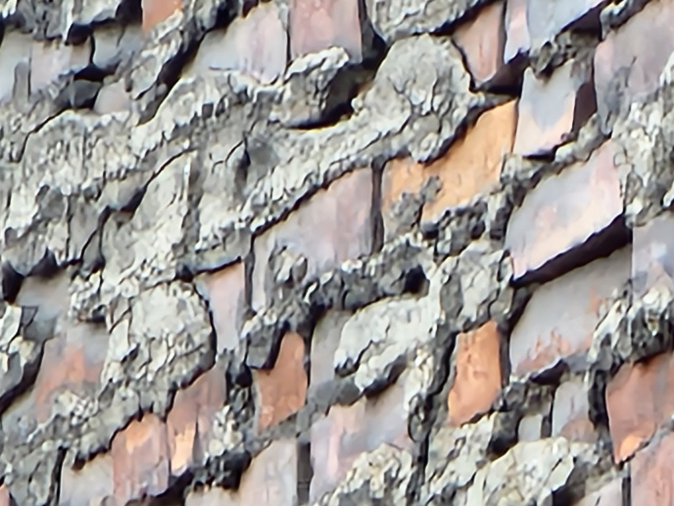
The above photo was shot on the Galaxy S22 Ultra at 100X digital zoom. The photo is largely unusable, and you can see how much digital modification has occurred. The edges of the bricks had to be sharpened drastically, and the texture was smoothed into oblivion.
It's great to have this as an option, and there is only so much you can do at such intense zoom levels, but don't expect the same clarity or realism.
This interior shot in the basement of a brewery was a tricky shot. It was very dim with a few accent lights from above. When you get into the details, you notice how much better the iPhone did in the dark.
The barrel's front was too smooth in the image, and the detail disappeared on the Galaxy S22 Ultra shot. The iPhone also managed to pull more detail from the metal bars underneath. They were more uniform and had fewer artifacts.
The imagery had similar issues under the barrels. The iPhone image had less noise and more detail. The bands around the barrels were almost blurry for the Galaxy.
The iPhone again excelled in the lower light situations in this concert shot. The all-seeing eye within the hand is sharper with more difference between colors. The Galaxy image was flat, and the knuckles on the hand blended together. The Galaxy also had more noise.
Here, iPhone once more had a hard time with zoom. As Ryan Lacey of Gaelic Storm played percussion, iPhone wound up with a wildly altered image. There's no definition if you look at his undershirt or the collar on his flannel. The Galaxy S22 Ultra captured much more detail.
On the other hand, Steve Twigger looks much better on the iPhone shot. It wasn't as zoomed in and showed off the phone's low-light capabilities once more. You can see the veins on his arm as he plays, and there's much more detail in the strap of his guitar.
Finally, both photos looked solid in this shot from the Van Gogh exhibit in Cleveland. Where the Galaxy S22 fell short was with the highlights. If you look at the "C" in "Cleveland" you'll notice the lack of brush strokes and the blown highlights, which holds true for areas in the right of the photo as well.
Both are exceptionally capable
At this point in evolution and for this much money, any smartphone from the big players will undoubtedly be good. But with price points north of a thousand dollars, it's ok to be critical of the details.
The biggest takeaway is that the iPhone excelled most in low-light situations, while the Galaxy S22 Ultra couldn't be beaten when it came to telephoto shots. Everything in between was a wash, with some photos favoring the iPhone with others favoring the Galaxy S22 Ultra.
Which is most important, is a decision we'll leave to you.
