Based on what we've seen, odds are good that you're not in love with the redesigned Photos app in iOS 18. While the old version isn't returning, here's how to make it more like its beloved former self.
With iOS 18, Apple undertook the daunting task of redesigning the Photos app. While the app was loved by many, it hadn't changed in a while and Apple wanted to prep it for the future.
This modernization didn't go over well. The redesign decision has been a controversial to say the least.
The new Photos app compared to the old one on the right
Even months after launch, many users complain of confusing design, missing features, and a general dislike of the app.

The old version isn't coming back. There are some things you can do to restore your Photos experience closer to what you had, though.
How to fix the Photos app in iOS 18
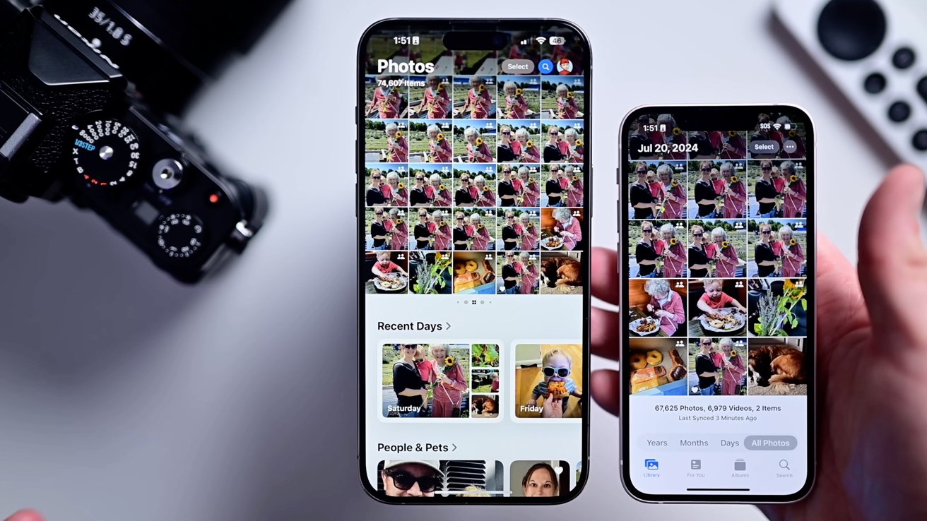
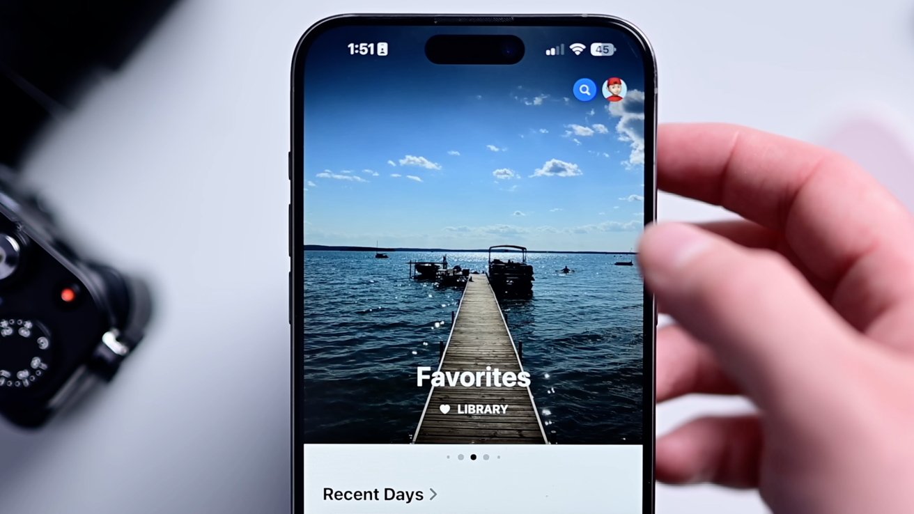
The new app has a singular interface, ditching the tabs. Scroll up to see your full gallery and down to see various collections of images and videos.
Adjust the gallery view to show recents
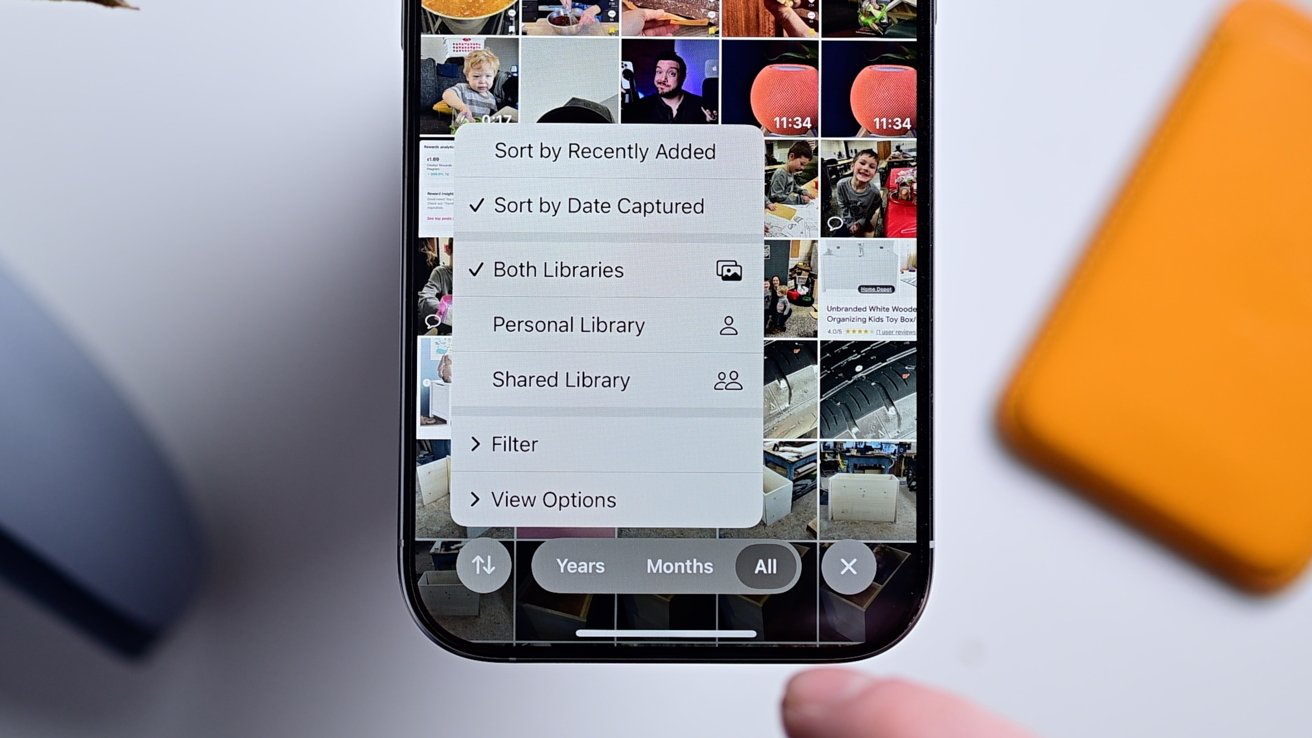
The first thing you can do is adjust the gallery view.
- Tap the up/down arrows in the lower-left corner
- Instead of sorting by "Date captured," sort by "Recently added" so you see all your new images first
- We'd also recommend considering showing screenshots in this gallery view too
That will allow you to see all your images, as they're added, including the screenshots. There are other options there too you can explore that may make sense for you.
Hide and reorder sections in the Photos app
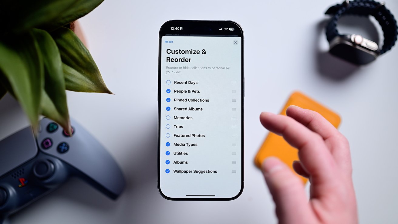
The next option is to remove the unnecessary sections of the app.
- Scroll to the bottom of the Photos app
- Tap the large "Customize & Reorder" button. Apple really wants to make sure you see this!
- Uncheck any of the sections that you don't want to see in the Photos app
- We'd suggest hiding Featured Photos, Recent Days, and Wallpapers to start
- You can also reorder the sections by tapping, holding, and dragging on the right side of each section while in this edit view
- Tap "Done"
One of the ways that we found to vastly improve the usability was a reliance on the Pinned Collections section. It's a new category that lets the user decide what is shown there.
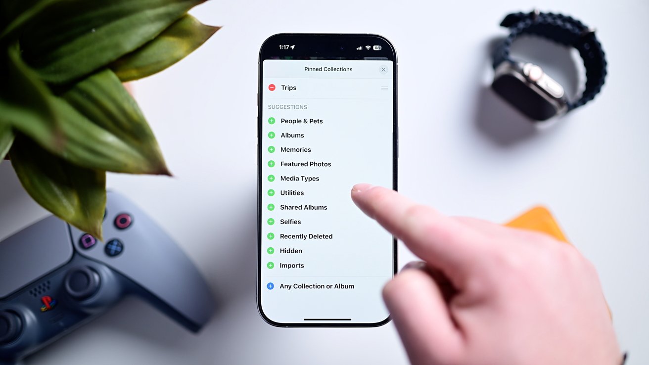
Add collections to the pinned view
- Make sure Pinned Collections is enabled in the edit view outlined above
- Tap Modify on the right side of the section in the Photos app
- Tap the + button on any collection you'd like to add and the - on any section you'd like to remove
- Below the list of suggestions, you an tap + Any Collection or Album
- This gives you 100% control on anything you'd like to add from a gallery of you, your partner, and kids, all of your screenshots, your hidden photos, and more.
Apple has been listening to user feedback
As hard as it is to believe sometimes, Apple does listen to user feedback and we've seen this quite a bit with the redesigned Photos app.
The old featured carousel was axed before release
During the original iOS 18 beta phase, Apple took a drastic step of parring back its ambitious design and removing features, like the cycling carousel at the top. All based on feedback it received.
As we mentioned, iOS 18.2 also added more quality of life improvements and changes.
When viewing a collection, you can now swipe to go back to the main view versus forced to tap the arrow in the top-left corner.
And, videos immediately play full screen with just a tap to dismiss the controls, just like before.
Videos can be scrubbed frame by frame once again. Plus, you can view the scrubbing time on a nanosecond-level in the timeline.
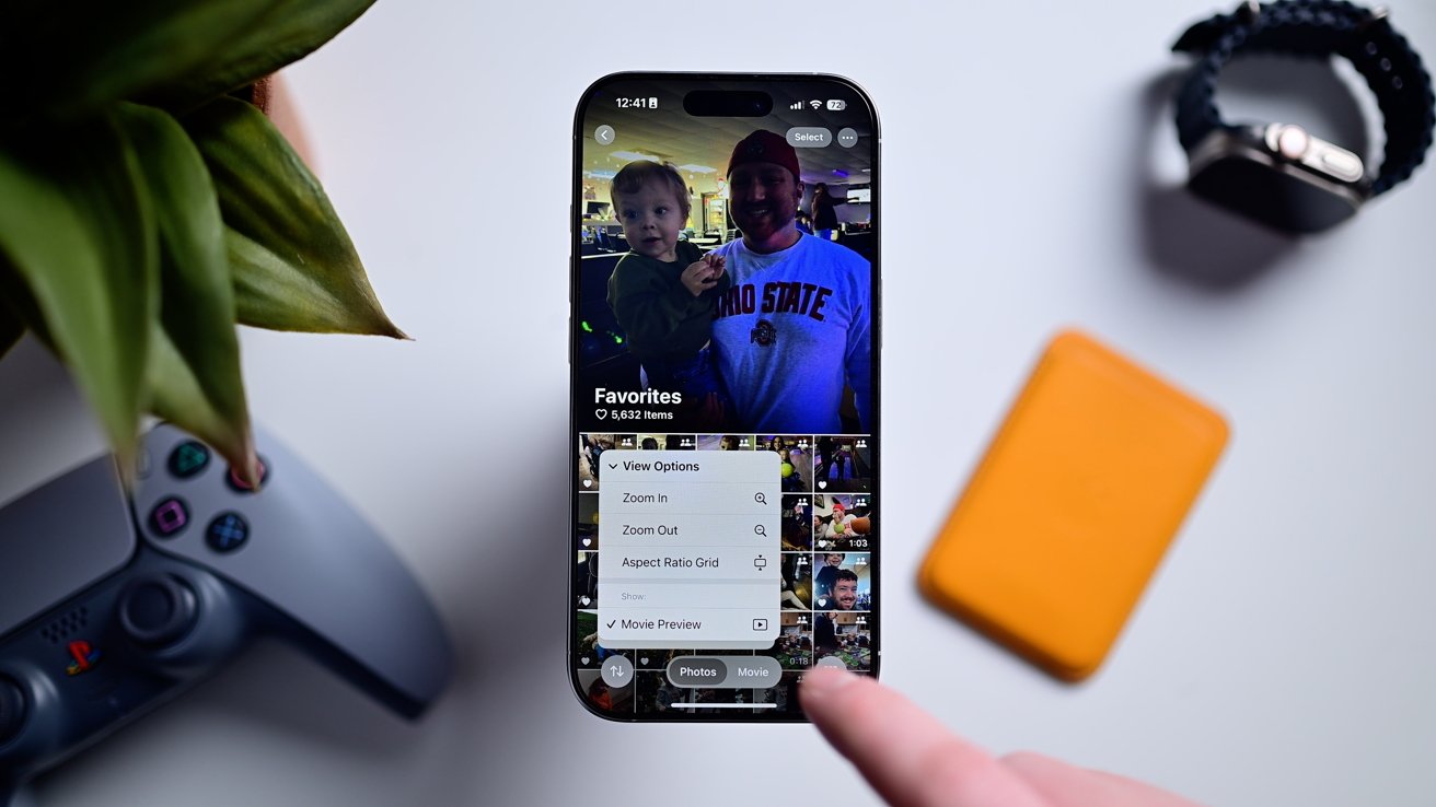
Hide preview videos
When viewing any collection, there is a movie preview playing at the top. With iOS 18.2, this can be disable to show a standard gallery view.
If you have more suggestions, you can also file feedback with Apple. Just visit feedback.apple.com and let them know.
The change has definitely been a drastic one, and making it better requires a little bit of time, but it's getting better. You just have to give it a chance.