Hardware orientation
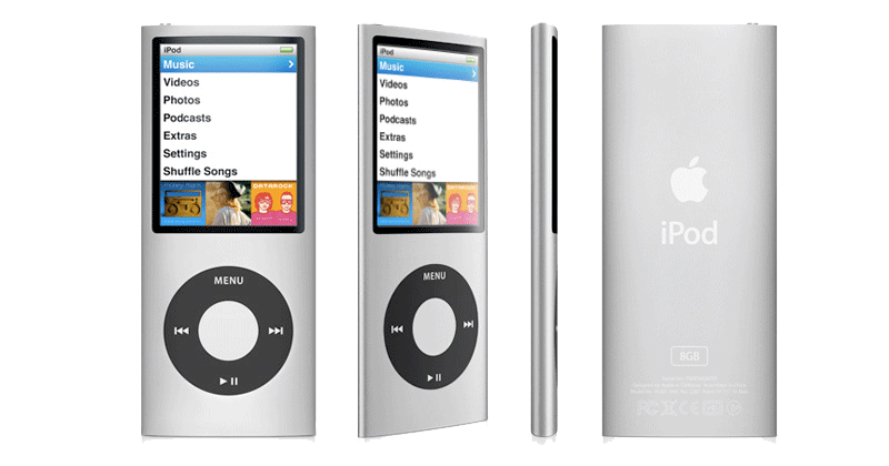
The most obvious difference over previous nano models is the 4G's return to a tall orientation. Last year's thin square model gave the nano line the full video playback features of the previous full sized iPod, including support for video games, by putting a reduced size but full resolution iPod video display into a new square case. In our review, we called the 3G iPod nano "a 5G video iPod in a nano-thin shell." This year, Apple delivered the 4G iPod nano as an enhanced version of the full sized iPod in a more conventional tall nano form factor.
In introducing the new model, Steve Jobs said that users didn't prefer the compact square form factor, so the new nano uses the same display in a dual orientation format, with menus presented in a tall portrait view, and videos and Cover Flow features that work in the horizontal landscape orientation. The new change brings obvious comparisons with Microsoft's flash based Zune models introduced last year; however, that design didn't sell well at all for Microsoft, no better than the original Zune. With the new 4G nano, Apple delivers a number of design improvements that address fatal flaws in the Zune.
The first is a coherent physical interface. The Zune presented a 'squircle' touch controller with no labels and two external physical buttons above it, one for play and pause and the other marked with a back arrow. When held sideways (a mode arbitrarily determined by the video being played), the touch controller reconfigured how it worked, but the physical buttons didn't (and couldn't obviously). This changed the layout and the relationships between the buttons, making them frustratingly unintuitive for everyone but the most determined users, and doing absolutely nothing to boost Microsoft's sales.
The 4G iPod nano, like earlier iPod models, presents the familiar iPod click wheel that always works the same. Its buttons are clearly labeled, and the most common feature, scrolling up and down or across (in Cover Flow) is performed by running your finger around the circle. Held sideways, the click wheel continues to work as expected.
Apple's hardware experience really shines with the 4G's software integration. While it makes sense for a direct feedback virtual interface to change, such as the touchscreen of the iPhone and touch does when held sideways, changing the way physical buttons work between orientations is not the correct behavior. For example, if you hold your hand sideways while using a laptop trackpad, you don't want the computer trying to account for your body position and movement and changing how the mouse moves.
However, when playing certain video games, the new 4G nano presents a screen indicating that controls are remapped for compatibility. A contradiction? Not really, as when playing back music the device works the same in both orientations, but when converting into a horizontal games machine, it enters a mode that makes sense for the given game.
Hardware form factor
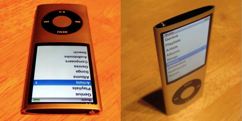
Apple also applied its slick industrial design savvy to enhance the new 4G nano. It returns to a iPod Mini-like metal tube design similar to the second generation nano, except that rather than being a flat oval, the latest design pinches the long edges to a smooth corner, which results in it feeling even thinner than it actually is. Not that that was necessary; the new nano is already the thinnest ever even in advance of the svelte tapering illusion of smallness.
There are two side effects of the new case being thinner at the edges. The first is a slight curve over the glass face of the screen. In seeing the leaked design specs, we worried that this would result in a TV tube-like distortion, and other critics have suggested that this will cause excessive glare, as the glass could catch light from additional angles.
In actual use however, neither turned out to be the case. First of all, unlike a CRT tube, the nano's LCD screen is of course perfectly flat behind the curved glass. In order to see any "Coke bottle" distortion, you have to hold it at a very unnatural angle. Even from an extreme angle where you can start to see the roundness of the glass, the screen still remains clear and readable.
As for glare, while it's easy to position the nano screen in a way to pick up glare on purpose, we found that whenever we saw glare, making a very slight change to how we were holding it made it easy to remove any glare at all. In comparison, the glossy screens on MacBooks and most modern PC laptops do have a problem with glare, and there is often no way to escape from the glare without completely repositioning yourself to put the offending light source behind you. That kind of glare problem is simply not present on the new 4G nano. The only way to experience distortion or glare with the new 4G nano is to hold it at an awkwardly acute angle while being willfully obtuse.
In fact, the only problem we could imagine with the new shape is its two rounded but still butter knife sharp corners on both ends of the player. If you hold it like a stopwatch, the corners can be pointed enough to be uncomfortable in your palm. This time next week, there will no doubt be a class action lawsuit charging that the 4G nano's corners are at least as dangerous to unattended children as a spoon or perhaps a pencil. Of course, many nano users will have the device inside a case or arm strap, so this issue is also hard to get worked up about.
On page 2 of 4: Accelerometer features; Speaking of Genius; and Software Interface
Another feature Apple is using on the nano to set it well past aspiring competitors is an accelerometer. Just as with the iPhone and touch, if you hold the new nano sideways you'll enter Cover Flow mode automatically; the feature is navigated by spinning around the circle on the click wheel and clicking the center to select.
The other feature of the accelerometer is "shake to shuffle." While playback is rarely affected by bumping the device, if you give it a deliberate shake, you'll hear an electronic tone and a random new song will begin playing. This feature can be turned off in settings if you don't like it.
Another use of the accelerometer is in playing new games that take advantage of it. Apple includes a tilting Maze game to show the feature off. Despite all the critics moaning about how Apple has lost its edge and excitement at this (and every previous) iPod event, the company continues to lead in various innovations, some small and some significant, but usually always marked by an understated simplicity that reveals a certain genius.
Speaking of Genius
A recurring theme of Apple's "Let's Rock" iPod event was the Genius feature, which was outed as a marketing name by industrial spy leaks, but not really revealed in any detail. Rumors specified a Genius Playlist and Genius Sidebar without explaining what they would do, and didn't anticipate the Genius feature on the iPods themselves.
In iTunes 8, Genius is the new marketing name of two features. The first, Genius Playlists, is an automatic playlist generator that works a bit like Party Shuffle, except that rather than intelligently picking out your favorites, it selects music that "goes well with" a song you have selected. This is genius for users who have a song in mind and can't really quantify how to construct a series of smart playlists to select other songs like it. Genius Playlists uses algorithms developed by Apple to find similar music, and requires users to upload metadata up to the iTunes Store in order to get regular updates that progressively make the system smarter at finding similar music based on the millions of aggregate associations of participating users.
Opting into Genius Playlists also activates the Genius Sidebar, which is essentially a renamed iTunes Mini Store. Apple gives iTunes away for free in order to encourage users to use its iPods. It also encourages iTunes users to buy content from the iTunes Store. In order to make the entirely optional store more prominent, Apple introduced the Mini Store as a sidebar that popped up in iTunes 6.0.2, offering users suggestions of related music they might want to buy. The web collectively freaked out that Apple had turned this feature on "without permission" in its software, and that it was anonymously delivering information about the user's music library back to Apple in order to make the feature work better. Apple promptly made the system opt in a few weeks later.
Genius Sidebar is the next iteration: you still get to opt in, but Apple now offers more carrot to lead you toward giving the company prominent advertising space next to your music library. In exchange for giving up a strip of the iTunes interface to the Genius Sidebar, Apple will create Genius Playlists for you from your own music. Unsurprisingly, the Genius Playlist feature works better when used with purchased music that has complete and predictable metadata on it.
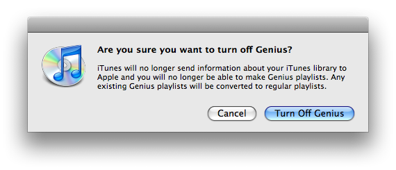
If you turn on the Genius features and decide you don't like the deal, you can opt out by turning Genius off, which converts your dynamic Genius playlists into standard playlists and stops exchanging data between you and Apple's iTunes cloud (below).
To ice the deal, Apple has also added 'Genius Playlist to go' features to its new iPods, including the 4G nano, the new 2G touch, the second-gen iPod classic, and the existing iPhone, iPhone 3G, and the original iPod touch. Earlier classic models do not support the Genius Playlist features, despite mistaken rumors that suggested this might be in the works. The new 4G nano uses a revised software platform that puts it ahead of the iPod classic and earlier iPod models, and of course, all of the iPhone and touch models support the same software, so adding forward support for the new Genius feature was easy for those models.
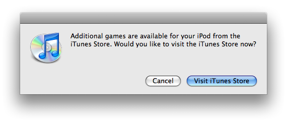
If you think Genius is a blood boiling outrage of epic proportions, you will no doubt be particularly enraged by the offer Apple throws up to check out new games when you plug in a new iPod to sync it (below). Oh the humanity! Apple is clearly in business to make money, and expects users who download iTunes for free to occasionally at least consider browsing its wares.
Software Interface
Last year's non-touch iPods got a new software menu interface that presented animated graphics on the right half of the wide screen. Now that the 4G nano has a tall screen, it has moved this animated album art to a strip below the menus. Apart from this rejiggering, the new nano works very similar to the previous model. Again, nothing has changed with the iPod classic's form factor, and so predictably, nothing has changed with the iPod classic software. As we predicted last year, the iPod classic is only being kept around for users who want more storage than flash RAM can currently, affordably provide. There's no hard drive based touch or iPhone, and the classic itself looks ready to retire in a year or two.
The big difference with the new 4G nano is that when you hold it sideways, it goes into Cover Flow mode automatically, which you spin through with the click wheel. This works exceptionally well; it's both very rapid and smooth with no hesitation.
This very visual presentation of your music library puts emphasis back on album cover art, and works identically to the view on the iPhone, except that you control things from the click wheel rather than via direct touch. Because the 4G nano's controls amount to spinning and clicking, you don't need to think about orientation of the player and how the controls might be changing or not, it just works.
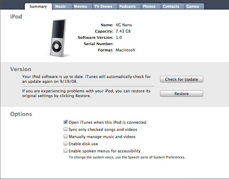
For visually impaired users, the new nano supports audio controls that are activated in iTunes. Turning the "use spoken menus for accessibility" feature on (below) copies menu audio files to the device so users can hear navigation as they use the device. The voices are generated by the desktop system, allowing users to customize the voice used as desired.
The new nano software also sports an optional audio crossfade feature, which blends one song into the next during playback if you like that sort of thing.
On page 3 of 4: Recording software and mics; Audio In Killed the Video Cable; Photos, Nike+, Radio Remote, and iPod Games; and What ships in the box.
Another change across the new iPod models is audio recording. Along with the new 4G iPod nano, the classic and 2G touch (but not the original touch) also gain audio recording, although this requires a mic, which is not included with any of the models. Apple plans to release two sets of headphones with an integrated mic and volume controls next month: a standard $29 earbud pair and a premium dual driver in ear set for $79.
Until then, if you want to play with audio recording you'll have to settle for iPhone headphones, which correctly function both as an audio input, headphones, and as a pause button (single click) or a skip button (double click). Three clicks start the song from the beginning, or if you are really fast, go back to the previous song, although timing rapid triple clicks requires some snappy finger action.
This explains why Apple's forthcoming mic-equipped headphones are not listed as compatible with the iPhone; the iPhone wasn't designed to respond to triple clicking. The new headphones will handle this for you by sending a triple click to navigate. All this clicking is communicated over the mic conductor, which adds another wire between the iPod and the headphones.
Rather than offering a lot of complex options for audio recording, the new iPods automatically record in mono when you use a mono mic (like the integrated one on the iPhone headphones), and use stereo when you use a stereo mic (as with a third party dock connector mic). They also only record in Apple Lossless, so if you want to work with the audio later, you might need to transcode it into another format, which is simple to do from QuickTime. The new recording app will also let you mark chapters in your audio recording file for easily referencing portions of the audio capture.
Audio In Killed the Video Cable
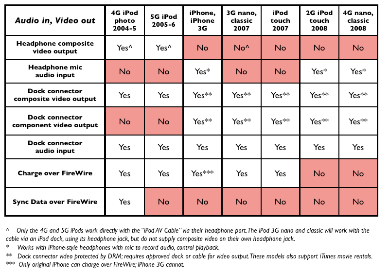
In order to use audio input without a dock connector dongle, you'll need an iPod with a four conductor headphone jack. As we explained last year, iPods used to use the fourth conductor for video (the first three are used for audio: right, left, and ground). Apple changed this with the iPhone, reassigning the fourth conductor to audio input to allow for an integrated mic. All of the subsequent iPods began relying on the dock connector to export video rather than the headphone jack; now, new models (those just released, not the 2007 models) use the fourth conductor exclusively for audio input.
This rearrangement of video output and audio input has the net effect of forcing modern iPods and the iPhone to use a dock connector for video, but enables the iPods to now handle audio input from the headphone jack, a significant enhancement over requiring a dock connector dongle to provide audio input. After all, far more users are going to want an audio recording feature on the go than a mobile video output system.
Given that video output is more likely to run the battery down than audio input, it also makes sense to bond video out and power into a single clumsy cable. The writing was on the wall that this was going to happen, leaving us to feel comfortable in criticizing conspiracy theorists who demanded that Apple was making the change solely to hurt users and take away their cheap or even do it yourself video cables.
At the same time, it has since been proven that during the audio/video headphone jack move, Apple introduced a video output security system that prevents third parties from making dock connector video output cables and devices without joining the Made for iPod program and paying fees. in addition to "monetizing" its iPod ecosystem and taxing the Chinese cable duplicators, it also appears that this video output DRM is related to movie rentals, as only last year's or newer iPods (including the iPhone, the classic, 3G nano, and touch) can play back video rentals. None of those models support headphone composite video output. This was a move to appease the studios.
Photos, Nike+, Radio Remote, and iPod Games
This years nano supports all of the mini apps and photo features that were introduced last year, including TV-out photo slideshows when used with a dock connector video cable. The photo viewer now takes advantage of the accelerometer to automatically shift the view from tall to wide as you reposition the unit while stepping through each photo. Photos look excellent on the screen and display is extremely fast, making the new 4G nano a really nice way to show off your photos.
The new nano remains compatible with the existing Nike+ receiver that plugs into its dock connector; unlike the new 2G touch, the nano doesn't bundle a transmitter into the device itself, likely because it is an entirely metal case with no existing wireless features. The new nano provides subtly enhanced Nike+ software when using the separately sold transmitter.
The new nano doesn't power over FireWire anymore, just as the latest iPhone 3G. It also relies on the external Radio Remote for users who want to listen to FM radio or pick up broadcast TV audio at the gym. It and the classic are the only modern iPods that support the Radio Remote. The new nano also now supports a radio tagging feature for selecting a song that is playing and using that information to buy it later from iTunes, although it seems unlikely that an iPod user would be listening to the radio to shop for song purchases.
While iPod games have played a silent second fiddle to the iPhone Apps Store, there's now a respectable selection of three dozen different titles for the iPod nanos and classics, all of which remain compatible with the new 4G nano. Note that "iPod G5" games purchased prior to a year ago will not play on the nano, and Apple didn't offer an up upgrade to buyers after revising the games to make them compatible. The nano ships with three games: the previously mentioned, accelerometer controlled Maze, along with the Klondike and Vortex games that Apple bundled with the previous 3G nano.
What ships in the box
The new nano comes in the same 'glass coffin' plexiglass case with the standard stickers, guide book, Universal Dock adapter, standard earbud headphones (no mic), and a USB to dock connector cable. There's no power adapter or dock or, in a nod to Apple's increasing environmental efforts, any other superfluous packaging. The new nano is also advertised as having a recycle-friendly aluminum design that uses arsenic-free glass, and no Brominated Flame Retardants, mercury, or PVC plastics.
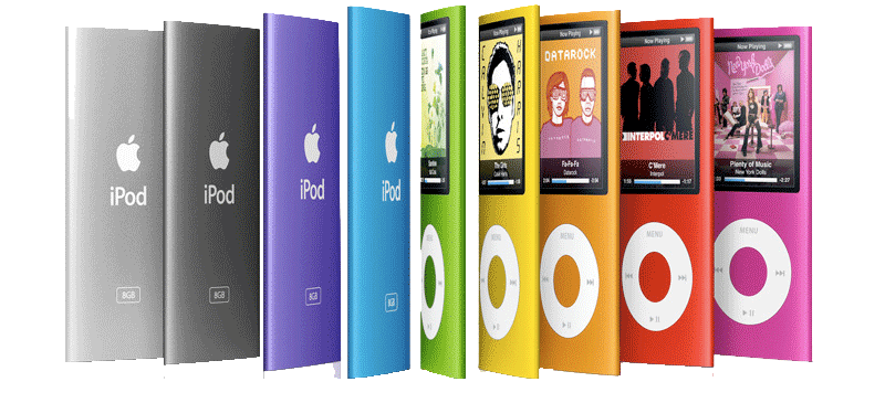
The 8GB model will retail for $149, while the 16GB model is $199. Both models come in a spectrum of 9 different colors: silver, purple, blue, green, orange, yellow, pink, (PRODUCT) RED and black. All have a white click wheel apart from the black and silver models, which sport a black click wheel. The 16GB model holds up to 4,000 songs, 14,000 photos, and 16 hours of video, and the 8GB model holds up to 2,000 songs, 7,000 photos and eight hours of video.
On page 4 of 4: Power action figures; Product Review Rundown; Rating, and Pros & Cons.
Apple tells users to expect up to 24 hours of music playback or four hours of video playback; we had no problem listening to music for 30 hours. How much you skip songs, how often you turn the backlight (and how brightly), and how loud you have it set to play back music will all obviously have an impact on real world playback times.
As for video playback, the unit lasted through two hour and a half movies and then another hour and 45 minutes, when set to about half brightness. That's again more than Apple promises, but appears to be an hour less than the previous 3G nano, which stated five hours of playback and typically exceeded that by about 45 minutes as well. Being able to watch two full length movies from this tiny device seems pretty exceptional. When playing video games, the battery is taxed significantly harder, and it lasts roughly half as long, a bit over two hours.
Product Review Rundown
With the latest 4G iPod nano, Apple has delivered a more versatile, ultra thin form factor that should appeal to a broader audience than last year's square 3G nano. It has also polished and enhanced the software, with smart accelerometer integration, a slick Cover Flow view, greater accessibility, a handy Genius function, and audio recording features that the company has seemed too hesitant to add to the iPod line until now.
What's missing? Apple didn't set up a way to have uncompressed audio transcoded on the fly to the new iPods, a feature that would have appealed to audiophiles with time to spare. It cut a few corners such as FireWire charging to make the device even smaller and cheaper. And there's no AM radio feature for people who like to listen to angry static. Finally, it delivers less battery life than last year's larger, square nano in video playback, but its more than four hours of video lifespan seems very reasonable; users who want to watch the Lord of the Rings Trilogy on a transoceanic flight can bring along an external battery pack.
It's simply hard to find much wrong with the new 4G iPod nano, which might be expected given that Apple has put another year's worth of polish on what was already a pretty cool little device. Anyone in the market for a slim, easy to use MP3 player should be extremely satisfied, particularly when they discover a handful of useful new features and twice the storage capacity at the same price as last year's model.
Rating 4.5 out of 5
Pros
Thin and compact, scratch resistant, sturdy construction.
High quality, bright, scratch resistant screen.
Great photo playback features for TV slide presentations.
TV output for movie rentals and downloads.
Includes 3 free games, accelerometer support.
Audio recording features using an iPhone-style integrated mic.
New audio menu accessibility feature.
Cons
Less battery life that previous model when using video.
More photos
High-quality fourth-gen iPod nano unboxing photos
Where to Buy
iPod nano 8GB & 16GB - Amazon.com
 Prince McLean





-m.jpg)


 Wesley Hilliard
 Malcolm Owen
 Amber Neely
 Christine McKee
 Andrew Orr

 Mike Wuerthele and Malcolm Owen







63 Comments
I'm so tempted to buy one. But for another 100 or 50, you can get the classic.
Hm.. I'll just stick with my 5G video for now.
"This year's slightly revised "maintenance mode" iPod classic and earlier models do not support the Genius Playlist features, despite mistaken rumors that suggested this might be in the works."
Apple's product page says the new classic does support the new genius feature. Perhaps you should revise the article (unless if by "maintenance mode" you're talking about a previous ipod classic model...you did not include it in the list of the ones that do support the feature)?
I have an iPhone 3G and I was really skeptical of this new design with the curved glass before it came out, but I just had to have one. First off, the full screen adds balance to the design of the player. The old skinny nano had that tiny screen on top that just looks bizarre. The 4G is full and well-balanced. The software is on track too with an excellent display scheme. Now playing is gorgeous and the drop-down menus from holding the center button are awesome. I can't stop looking at it and playing with it. Well done Apple.
(I chose blue...it was a hard choice)
"shake to shuffle." While playback is rarely affected by bumping the device, if you give it a deliberate shake, you'll hear an electronic tone and a random new song will begin playing. This seems like an obvious feature to add, which raises the question of why this hasn't been widely introduced before by anyone else.
The Sony Ericsson Walkman range has had this for over a year.
I have an iPhone 3G and I was really skeptical of this new design with the curved glass before it came out, but I just had to have one. First off, the full screen adds balance to the design of the player. The old skinny nano had that tiny screen on top that just looks bizarre. The 4G is full and well-balanced. The software is on track too with an excellent display scheme. Now playing is gorgeous and the drop-down menus from holding the center button are awesome. I can't stop looking at it and playing with it. Well done Apple.
(I chose blue...it was a hard choice)
Sounds great. Do you have an option to tilt it clockwise or is it just one way? I'm a leftie. Thanks.