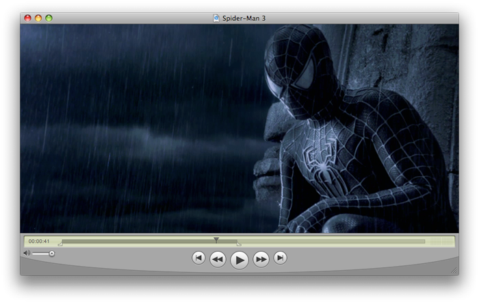
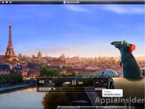
Unlike the current version of QuickTime Player 7.6 — which reserves considerable real estate for sizable, platinum-themed video controls at the base of the each player window — QuickTime X Player is said to forgo all traditional interface controls in favor of video overlay controls (like those that appear when you mouse over video in full-screen mode of the current Player software).
The only window-based interface element in the QuickTime X Player is reportedly the title bar, which is reminiscent of the iPhone's semi-transparent black glass interface while also adopting hues from the video frames playing beneath it. However, this too fades away and disappears with the new overlay controls so videos appear to float on the screen with nothing more than a deep shadow surrounding all four sides.
AppleInsider has made its best attempt to provide mockups of this reported new interface using existing Apple interface elements, based off descriptions of the new QuickTime X Player provided by people familiar with the software. In addition to the standard overlay for controlling playback, the new player is also said to offer overlay controls for trimming, editing, and viewing scenes of a video like in iMovie.
Apple has described QuickTime X as a new version of its media software due to ship with Mac OS X 10.6 Snow Leopard that "optimizes support for modern audio and video formats resulting in extremely efficient media playback."
The current window interface in QuickTime Player 7.6
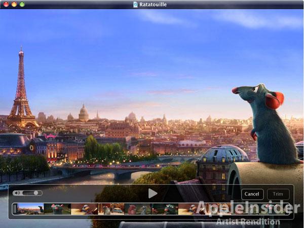
Another artist's mockup of the minimal QuickTime X Player window interface with the "trim" tools overlay.
A few other features are rumored to be baked into the new player software, such as the ability to export video clips in a variety of sizes to your iTunes library with the help of the CoreMedia framework or publish them through a MobileMe account.
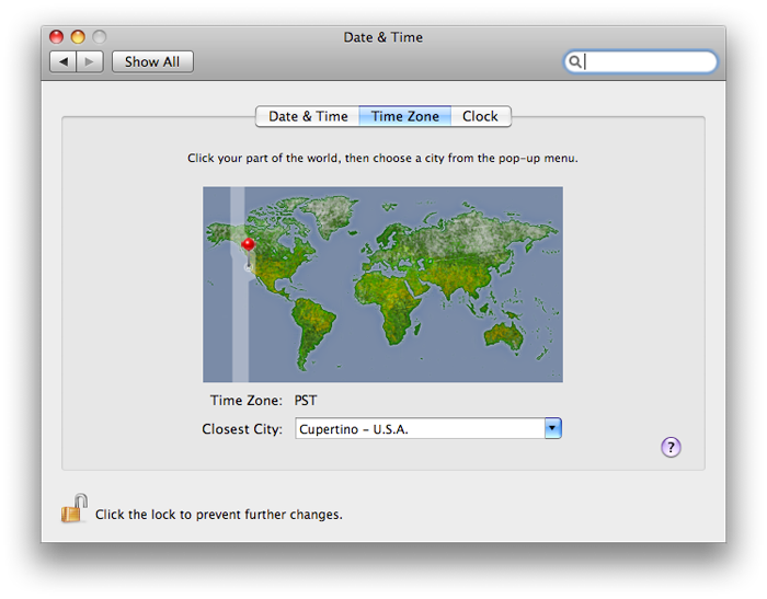
Meanwhile, those familiar with the latest betas of Snow Leopard in general say that the previously-reported addition of Apple's CoreLocation framework has been put to work in the Time Zone tab of the Date & Time panel, which attempts to pinpoint a Mac's geographic location, dropping a pin on the world map at the Mac's estimated location.
A handful of other additions and omissions are also being reported. For example, a new version of Apple's Preview app is said by those familiar with the software to include a new annotations toolbar at the base of content windows, while VoiceOver is being upgraded from version 2.0 to 3.0. Also back from early betas are QuickLook icon previews but gone is the awkward interface for drilling down into stacks under grid view that first surfaced in pre-releases of Snow Leopard distributed last month.
 Kasper Jade




-m.jpg)



 Wesley Hilliard
 Malcolm Owen
 Andrew Orr
 William Gallagher
 Sponsored Content
 Christine McKee

 Thomas Sibilly




148 Comments
Reminiscent of Quick Look. Hmm. I always loved those big friendly metal Quicktime buttons, but this is nice too. Minimalism may take some getting used to.
I was a bit worried about losing the controls but those mockups look very nice. The only issue I can see is if you are comparing movies and the distance into the movie each clip is at because the controls on background clips will disappear after a while.
As long as the editing controls are still as powerful, I welcome the change. It would be great if the Pro features did turn out to be free too. What would be interesting is if they deprecated iMovie in favor of Quicktime.
All they need is an effects window and maybe an audio track panel that sits under the movie window when active.
From what I was told by a friend who is actually working on this project. Quicktime X, will focus solely on playback. While Quicktime 7.6 will still be available for anyone who feels they still need to use those features, but there will be no further development of the old Quicktime.
Apple's new war on dedicated title bars continues, but this time even more egregiously than the Safari 4 beta.
A translucent title bar that obscures a portion of its window's contents? Completely braindead.
An "artist mock-up"? Are you kidding me? You might as well have captioned those pics "Here's some random BS that might not look anything like the real thing, but here you go anyway". At first I thought, cool new interface tweaks. pffft!