Apple's online store was temporarily unavailable overnight as the company tweaked its design, making it more touch-friendly with a quickly scrollable menu bar on product category pages.
While the main page remains the same, users can click on one of Apple's four product categories — Mac, iPad, iPhone and iPod — to see the new menu bar. For example, on the Mac page, products such as the MacBook Air and MacBook Pro are displayed first, but more content is available by scrolling to the right, including certified refurbished models, and Macs for both business and education.
On a Mac, users can see the additional items by simply clicking an arrow to the right of the menu. But on an iPhone, iPad or iPod touch, the menu is a touch-friendly element within the page, and can be scrolled to the left and right with a simple swipe.
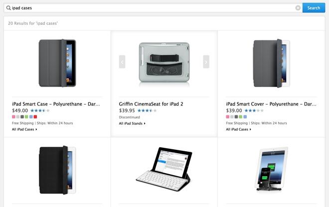
Beyond the new scrolling menus, some individual product category pages have also become easier to view and tap on a device like an iPhone. As noted by Macotakara on Friday, while products were previously displayed in a list form, they are now shown with a large product image.
For example, a search for "iPad cases" on the store returns a list of products in a grid form. Images of the individual products can be clicked or swiped through on the same page, without the need to tap on and load a separate product page.


