Apple has tweaked the phone button layout in iOS 7 beta 4, replacing the original, full-width "borderless buttons" with more obviously defined targets for answering, dialing extensions or ending calls. The new icons reduce the use of text on button labels, and allow FaceTime to go full screen.
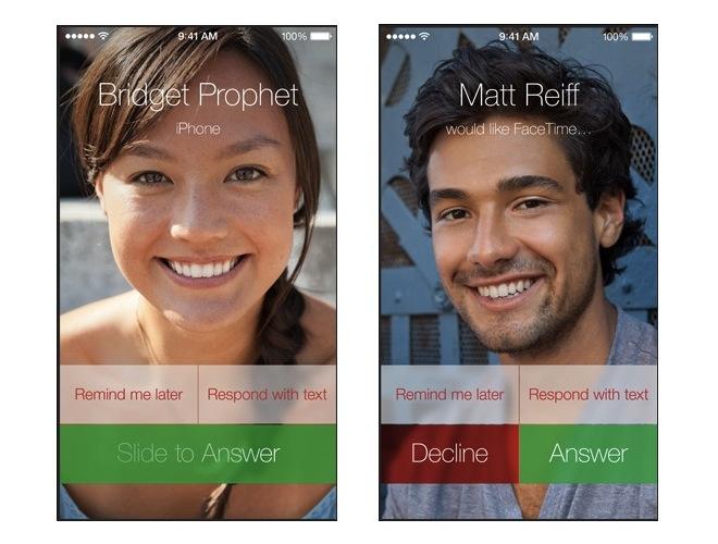
The new button appearance in developer release beta 4 diverges from the "borderless buttons" prominently featured in the original iOS 7 user interface that Apple demonstrated at the unveiling of its new mobile operating system (above).
The new appearance, introduced in the release of iOS 7 beta 4, clarifies basic tasks like answering or ending a phone or FaceTime call by toning down the more avant garde aspects of iOS 7 without going so far as to revert to the beveled, glowing buttons of iOS 6.
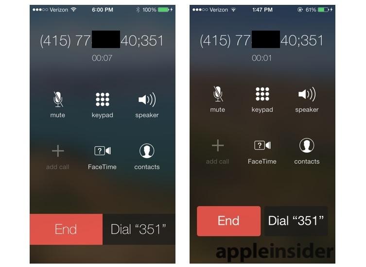
The images below, from beta releases 3 (left) and 4 (right), present call end and extension dialing buttons slightly differently, using a heavier font on more distinct buttons with subtly rounded corners.
The new appearance dials back two of the hallmark design features of iOS 7: its use of Helvetica Neue Ultra Light and full width, rectangular button regions lacking a distinct border. Critics complained about both; Apple's new design is clearer, simpler and less controversial but also appears less elegant, distinctive and sophisticated.
All of the phone buttons are repositioned slightly higher up on the screen, making them easier to target in one-handed operation. This also results in a user interface that looks and feels more like a functional computing device and less like a perfect magazine layout.
Both of the images above depict dialing a contact number that includes a semicolon and an extension. This causes the phone to dial the main number, connect the call and then offer to dial the remaining number (such as an extension or phone tree selection) once the Dial button is pressed. This behavior is unchanged from iOS 6.
Icons stand in for wordy button labels
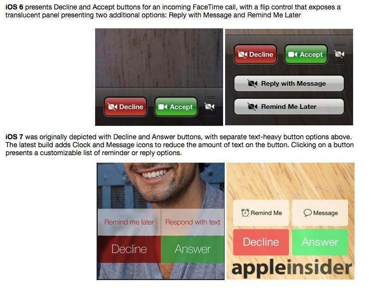
The new beta 4 build of iOS 7 also replaces text heavy "remind me later" and "reply with message" buttons presented for incoming phone or FaceTime calls (below) with new icons that simplify the complexity of the interface.
The Decline and Answer buttons in this build of iOS 7 also dial back their translucency to become nearly opaque, a third example of Apple watering down a feature it originally depicted as a core tenet of the new iOS 7 appearance, but not without good reason. Apple's new design doesn't seem arbitrary, and it's evolving in response to feedback.
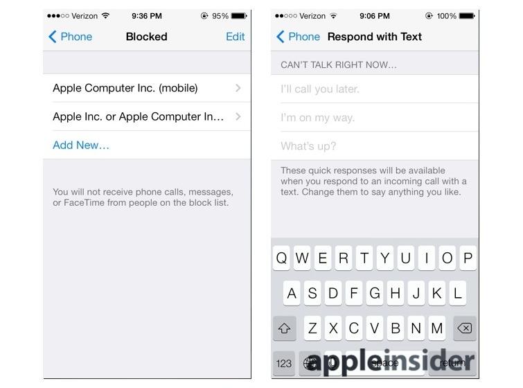
As is already the case on iOS 6, Apple provides a way, within Settings, to customize your own "reply with message" options that can be quickly sent with two button touches when you get a call you can't take (below right).
New in iOS 7 is the ability to block specific callers (above left). Simply "Add New" and you can select the contact you want to block. All of the phone numbers and iMessage/FaceTime addresses associated with that contact will be added to the list. You can then selectively remove specific ones individually.
Bigger buttons that vanish for full screen FaceTime
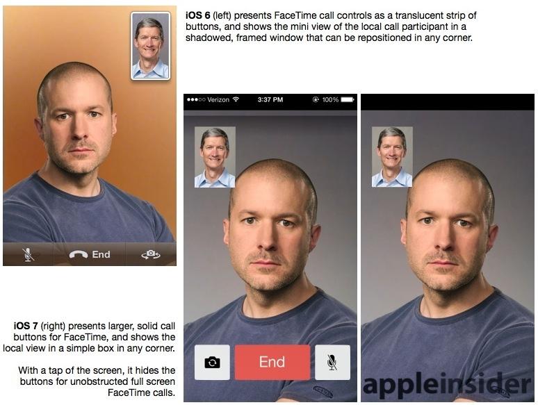
For iOS 7, Apple has also enhanced the presentation of FaceTime's Mute, End and Camera control (for switching between the front facing and rear cameras) buttons. Previously an amber translucent in iOS 6, the buttons are now presented in iOS 7 as solid, distinctively color coded buttons.
A tap of the screen causes the buttons to disappear, taking FaceTime calls full screen similar to Safari and the new Maps.
iOS 7 is expected to publicly launch in September, with support for new fingerprint scanning hardware, Activation Lock, new Camera features, Audio only FaceTime calling, Siri enhancements, iTunes Radio and more.
