Apple on Tuesday brought the revamped iCloud.com webpage, which is designed to match the style of iOS 7, out of beta, offering users a taste of what to expect when the next-generation mobile platform is released on Wednesday.
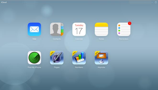
One day before iOS 7 will become available to download, Apple has revamped the iCloud Web portal to reflect user interface changes seen in the company's mobile platform. Previously in beta testing, the update brings congruity to the two UIs, offering users a seamless experience when moving from one to the other.
Most apparent is a dynamic background borrowed from iOS 7 that shows a pastel blue gradient with constantly moving blurred orbs. Other features introduced include app icons that match iOS 7 counterparts, including Mail, Contacts, Calendar, Notes, Reminders and Find My iPhone. Icons for beta versions of Pages, Keynote and Numbers are carried over from iOS 6.
It appears that Apple has rolled out the updated website to all users.
50 Comments
The moving background is hideous. It genuinely looks like something from Microsoft. And the app icons looks terrible, though they kind of get away with them at those larger sizes. I said 'kind of'. As for the web apps themselves, the colours, designs, fonts and font colours used within the apps? Astoundingly beautiful! What I do not understand, though, is why when web apps are unavailable on iOS do they look like they were designed for the iPad? With huge click targets and designs that look inherently touch based? Oh what planet does that make sense?
It doesn’t move, does it? Oh! The beta’s didn’t move.
Other than being a shade lighter, how’s it different from the bokeh included in iOS 4 and 5? You know, the ones that were released when he was alive?
The moving background is hideous. It genuinely looks like something from Microsoft.
I think it's pretty neat looking and very much something Apple would do. There are Apple TV screen savers that are almost identical.
You might receive a PowerPoint or keynote from some one else. Also I believe that they are free when you get a new iOS device.
I think it's pretty neat looking and very much something Apple would do. There are Apple TV screen savers that are almost identical.