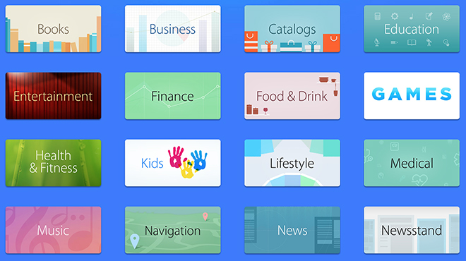
Apple on Thursday announced a new App Store feature called "Browse by Category" that allows users to navigate to different curated app collections without the need for drop-down menus.
The new feature is basically an alternative user interface to the usual drop-down category menus seen in the current Mac and iOS App Stores. Now, instead of selecting from a text list, users can choose categories by clicking or touching an icon.
As seen above, the new method is perhaps aimed more toward touchscreen device users than Mac owners, with large easy to select category graphics displayed in a grid layout. Browsing the Mac App Store via the usual drop-down method is more efficient as the traditional list view was designed for larger screens and mouse control.
The "Browse by Category" option is now a featured card on both the Mac and iOS App Stores alongside other curated collections like App Store exclusives and individual showcased apps. By effectively breaking off the Categories menu, which is still available in drop-down form near the search bar, Apple is possibly looking to boost app discovery.
The company has been pushing for more intuitive and interconnected App Store navigation for some time, though the last major change came in 2012 with the integration of Chomp-style app cards.
 AppleInsider Staff


 Christine McKee
 Marko Zivkovic
 Mike Wuerthele

 Amber Neely
 Sponsored Content
 Wesley Hilliard


7 Comments
The Number One improvement I'd like to see to the App Store is for developers to write better descriptions. I can't count the number of times I've looked at an app and come away with either no idea what it does or any sense of the benefit I would enjoy by buying it. Tell me why I want it!
Who cares about browsing interfaces? All companies who made browsing failed.
There was some loud cheering during the WWDC Keynote when Tim said they would have App trials....
Unfortunately, that was a bit premature because Tim said that developers could shoot an intro video and upload it. So, I don't think it is the real App trials that people wanted.
Still, @Lorin Schultz, the intro videos could possibly help you determine the usability and usefulness of an app.
I'm actually really impressed by how long of an article you were able to make out of, essentially, a 'new category picker screen'.
This is pathetic. If Apple truly wanted to improve App browsing and searching they would revert back to the vertical list of search results used in iOS 6 rather than the clunky horizontal search results that force you to use significantly more taps and swipes to navigate. Horrible UI "improvement".