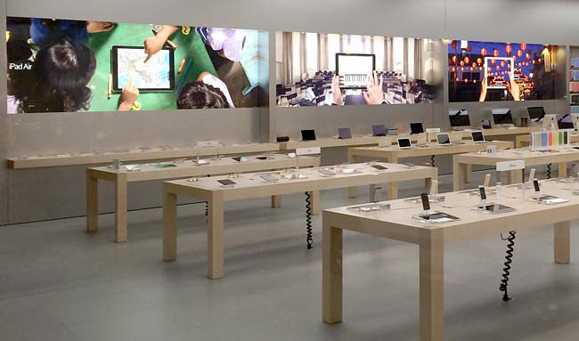
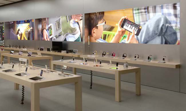
Apple Store employees around the world have been installing new light box wall graphics showing a completely different style than the usual product close-ups overlaid atop stark white backgrounds.
As seen in the above photo, the refreshed banner style is a departure from previous in-store ad installations, marking a shift in art style that also changes the mood of Apple's brick-and-mortar outlets, reports ifo Apple Store.
Whereas the previous banners created a sense of openness with their bright colors and plentiful negative space, Apple's new signage takes on a photographic style that resembles glossy print ads.
Looking closely at the wall hangings, some scenes appear to be inspired by Apple's recent iPhone and iPad television commercial campaigns. For example, the middle photo in the image above looks like it was taken from the recent "Your Verse" iPad spot featuring composer/conductor Esa-Pekka Salonen, while the picture to its right appears to be borrowed from an ad highlighting travel writer Cherie King. The banners don't looks to be actual screenshots, however.
According to the publication, Apple Store employees and customers have been posting photos of the new in-store dressing to social networks. So far, it looks as though Apple's banners are limited to the iPhone and iPad product lines.
 AppleInsider Staff





 Malcolm Owen
 Amber Neely

 Christine McKee

 Chip Loder
 Marko Zivkovic





20 Comments
I approve of this change. It takes a step in warming up Apple's otherwise clinical stores. Some of Apple's best advertising has been since the debut of the iPad, which was the first time Apple really started to showcase its products in rich, lived-in environments, bringing the connection it provides between humanity and technology into that much starker a relief.
I'd even go so far as to say that if they really plan to make home automation a tenant of Apple's product line, they should take a corner of their stores, transform it into a "cut-out" of a home (meaning furnish it, have some carpet, and make it look warm and inviting) and insert the relevant Apple tech into place in a way that customers can see exactly how they'd use it to replace their old way of doing things. Such a setup would do wonders in advertising the connection (and therefore the products) on its own, as the eye would be drawn to the complexity of the home environment within the cleaner background of the Apple Store.
I understand the idea behind the store presentation now–that everything about the store should get out of the way of the interaction between product and customer–but said interaction in the sense of home automation would require a home in which to interact.
Angela makes her first move!
Exactly, this is Angela's work !
I approve of this change. It takes a step in warming up Apple's otherwise clinical stores.
I agree that Apple needs to make their stores warmer. But they have to be careful here, because this kind of visuals is closer to general advertising than their usual visuals, which are very recognizable. They have to strike a balance in making warm yet recognizable images.
[quote name="Ken Burns Effect" url="/t/181017/apple-debuts-new-banners-in-retail-stores-showcases-iphone-and-ipad-through-photography#post_2558122"]Angela makes her first move![/quote] Seems incredibly quick to me. Then again, you may be right: [quote] Never will your objectivity be as clear or your instincts sharper than in the first 30-90 days. Cherish this time and fight the urge to overthink. [/quote] Source: http://appleinsider.com/articles/14/06/23/apples-ahrendts-offers-tips-on-transitioning-to-a-new-job-in-linkedin-post