Designers at Apple spent months time and considerable effort to create the perfect sound heard when gliding the new Magic Mouse 2 across a desk — a small but crucial element of the product, and yet another example of how the company focuses on all details.
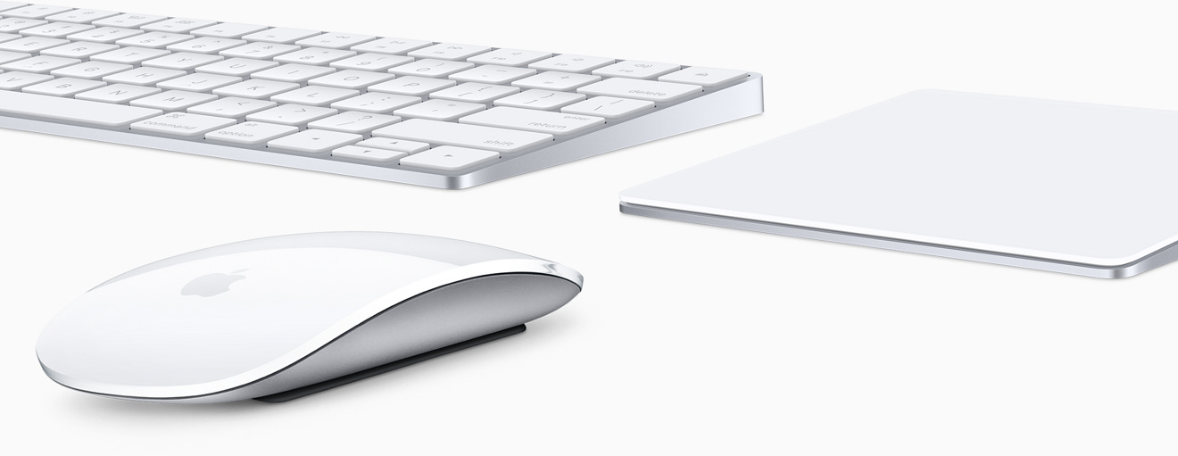
Apple gave a rare glimpse into its design process by opening up the doors to its Input Design Lab to journalist Steven Levy. The resulting feature published by Backchannel goes into detail on how Apple's latest products unveiled on Tuesday — including an iMac refresh, Magic Mouse 2, Magic Keyboard, and Magic Trackpad 2 — all came to market.
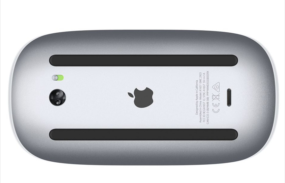
And while the new Magic Mouse 2 appears externally to have the fewest changes of the new accessories, Apple had to completely redesign the internal components to give the Bluetooth accessory a rechargeable battery. That process, though, drastically changed the sound the mouse makes when a user moves it.
By changing the foot architecture and mass of the Magic Mouse 2, the "friction characteristics of the sound" were modified, according to Kate Bergeron, Apple vice president for Ecosystem Products and Technologies. Apple's designers just weren't happy with the new sound, and spent months working to fix it.
"They all make a noise — Â the question is getting a noise we like," John Ternus, vice president of Mac, iPad, Ecosystem and Audio Engineering told Levy. "It sounded... not right."
Fixing the problem required advanced machinery inside Apple's labs capable of testing seemingly any scenario imaginable. In examples cited by Levy, Apple has machines that measure the friction a mouse will experience on different types of surfaces, and machines that can pinpoint exactly where a noise is coming from with a device.
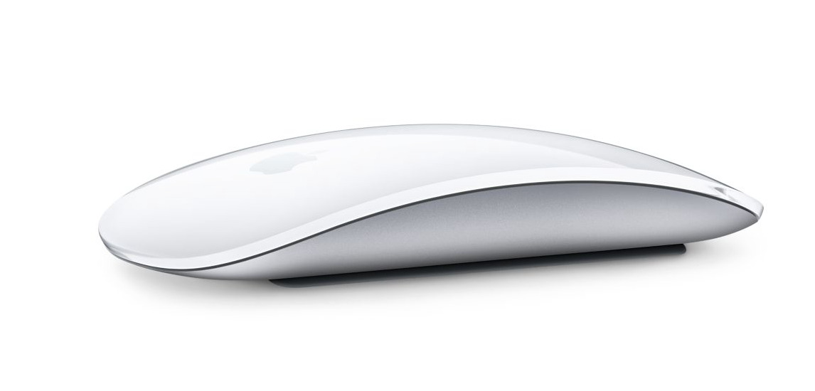
Apple found that the approach used on the first-generation Magic Mouse didn't work for the new Magic Mouse 2. The company reshaped the "high density polyethylene feet" on the wireless accessory, causing less surface contact as the mouse glides.
A similarly detailed process went into development of the new Magic Keyboard, as Apple's team revealed that one prototype of the device featured larger keys. Bergeron admitted to Levy that that design may have been "more extreme than it needed to be."
Apple says the Magic Mouse 2 features a lighter and sturdier construction, and it describes the accessory as having a "smoother glide" thanks to an "optimized foot design." Of course, that's thanks to the work of Bergeron, Ternus, and the team at the company's Input Design lab.
Magic Mouse 2 is lighter than its predecessor, and features fewer moving parts thanks to its built-in battery and continuous bottom shell. Like the previous model, it features a Multi-Touch surface, but it does not offer Force Touch input like the Magic Trackpad or latest MacBooks.
The Magic Keyboard, meanwhile, features a full-size design while taking up 13 percent less space than its predecessor. It also features a new scissor mechanism on the keys, which are adorned with Apple's new San Francisco font.
Apple says the reengineered scissor mechanism increases key stability by 33 percent while also optimizing key travel.
They are joined by the new Magic Trackpad 2, which does allow for Force Touch input on Mac desktops. All three also feature Lightning ports for recharging their internal batteries.
The Magic Mouse 2 is priced at $79, the Magic Keyboard is $99, and the Magic Trackpad 2 is $129.
 Neil Hughes




 Andrew Orr
 Amber Neely


 William Gallagher



 Christine McKee
 AppleInsider Staff

121 Comments
Having to place the mouse on its back to charge, is dumber than dumb. Here's a dumbass question: how hard would it have been for Apple to put the Lightening port on the front, so that when you had to charge the mouse, you could also use it? Steve Jobs said: design is not how things look, but how things work. https://www.youtube.com/watch?v=L7gb7rxhvEI
Obsession with details for the sake of user experience still lives on, four years after the departure of the Chief Product Officer. DNA transmission sucessful.
I am glad to hear this. The last one was a poor design with the bottom often grinding across the desk and the battery compartment popping off.
[quote name="bloggerblog" url="/t/189131/apples-renowned-attention-to-detail-led-designers-to-fret-over-the-sound-of-sliding-new-magic-mouse-2#post_2790183"]Having to place the mouse on its back to charge, is dumber than dumb. Here's a dumbass question: how hard would it have been for Apple to put the Lightening port on the front, so that when you had to charge the mouse, you could also use it? [/quote] Very hard, or maybe just stupid, or they would have done it. Or do you imagine that only you could think of it? Edit: Just unnecessary, as [B]GQB[/B] points out below.
Having to place the mouse on its back to charge, is dumber than dumb. Here's a dumbass question: how hard would it have been for Apple to put the Lightening port on the front, so that when you had to charge the mouse, you could also use it?
2 minutes for 8 hour charge.
How long does it take to find and replace batteries?
Use while plugged in would result in the inevitable 'god, how butt-ugly. Apple can't design its way out of a paper bag anymore' criticisms.
This is a perfectly fine solution, and looks great as well.
1st world problem.