When 3D Touch launched alongside iOS 9 and the iPhone 6s, part of the promise was quick shortcuts to some of the most used functions in apps. With iOS 10, people may sometimes be able to skip opening apps entirely.
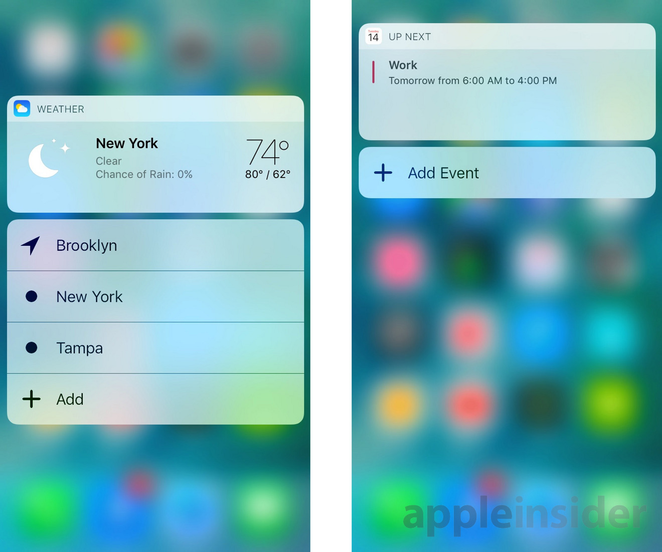
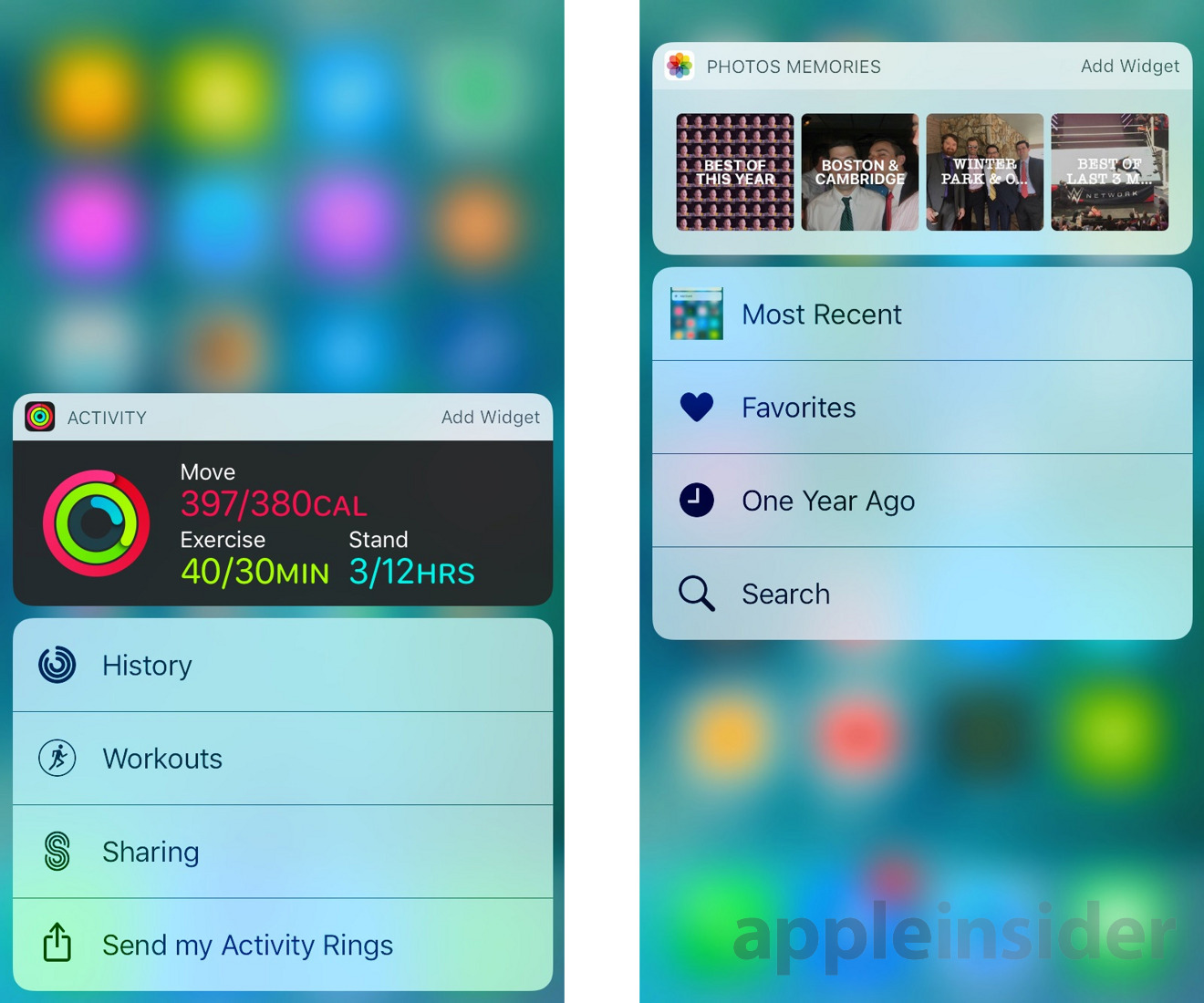
In the new OS, pressing down on a home screen icon will reveal not just Quick Action shortcuts but a widget with handy information. With Calendar for example, this translates to upcoming events. Weather will, of course, display the day's forecast.
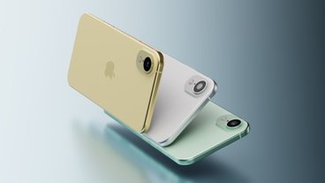
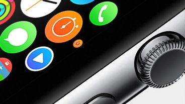
Perhaps one of the better uses of the technology at the moment is the Activity app for the Apple Watch. Its widget lets users see daily Move, Exercise, and Stand figures all at once, which like the Weather widget accomplishes one of the app's primary tasks without it being launched.
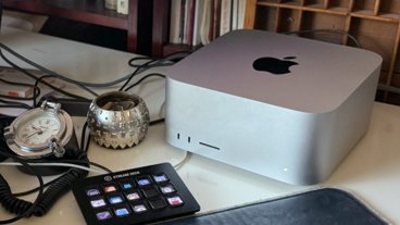
Some widgets are essentially even more direct shortcuts, like the one for News, which highlights recent headlines and lets you jump straight to them. In the same way, a Photos Memories widget can be used to hop straight into a collection.
Essentially the widgets are the same sort that appear in iOS 9's Notification Center — or in iOS 10's lockscreen and Siri search. They're important not just for their convenience on the home screen, but because they also have "Add Widget" buttons making it easy to add content to the lockscreen and Siri search.
There doesn't (yet) appear to be any third-party support for 3D Touch widgets, likely because developers will need to update their apps to include widgets in 3D Touch support. It's likely that apps will begin seeing home screen 3D Touch widget support when iOS 10 launches this fall.
 Roger Fingas




 Marko Zivkovic
 Christine McKee
 Andrew Orr
 Andrew O'Hara
 William Gallagher

 Mike Wuerthele
 Bon Adamson
-m.jpg)

5 Comments
this is what I expected when they first announced the peek-n-pop / quick actions. Hard pressing the weather icon currently then selecting a location is no quicker than loading the app then selecting a location which defeats the point - having the weather shown on a hard press however IS quicker than loading the app. can't wait to see what devs do with this in 3rd party apps.
So it's just the Notifications view in the Notification Centre now?
Make sense, but kinda funny that they started off with three poorly defined sections and slowly whittled it down to the one that it always should have been.
Also seems like this is a genuine instance where Android fans can be a bit smug about having widgets on the lock screen and dashboard for a long while already (implementation notwithstanding).
Apple implementation is always elegance and beautiful.
Sometimes it's good to be discipline and then improve it later. Just because you can add the feature, does not mean you have to. Apple has a great restraint in choosing the right time to add and modify things that work and remove things that don't, while in the same time maintain the clean uncluttered look. Google on the other hand tries too hard to add everything from the beginning which is why their Android always look like a mess.