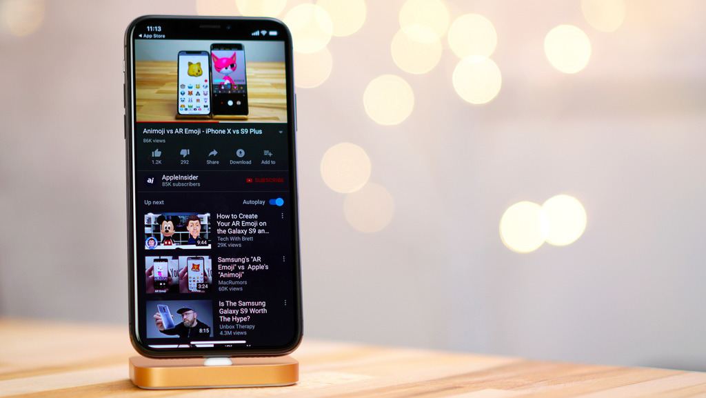
The YouTube app for iOS just received an update, bringing with it a new dark theme that could translate to an increase in battery life for iPhone X. We put the app to the test to find out.
With traditional LCD technology, applicable to all Apple device screens save for iPhone X and Apple Watch, light emitted from a backlight travels through color-changing pixels to create an image. That means the backlight is always illuminated even if sections of the screen are black.
Unlike LCDs, the pixels in OLED panels output their own light, meaning darker pixels require less power to drive than bright or white pixels. This is why dark user interfaces on OLED devices save on battery life.
To enable YouTube's dark theme, make sure you're updated to the latest version, then tap the account icon, go to settings, and toggle the option to the on position.
For our tests, we turned off auto brightness on our iPhone X, set auto-lock to "never," and turned up screen brightness to around 80 percent. After leaving the YouTube app — with its regular bright UI — open on the homepage for three hours, battery life dropped from 100 percent to 71 percent.
We charged iPhone X back up and did the same thing with the dark theme enabled. This time, the battery only went down to 88 percent after three hours, a considerable difference.
We then played a three hour video and left the iPhone X standing upright to keep the app's UI in view. With the white UI, the battery dipped to 55 percent, while the dark UI finished the same task with 76 percent left in the tank.
YouTube's dark theme is confirmed to save substantial power. We can only imagine how much better the feature would perform if the mode presented the UI as black instead of dark grey. Perhaps most importantly, the mode does not detract from the app's experience. In fact, we think it has a much cleaner look and is actually easier on the eyes than the traditional bright white.
Try it out for yourself and let us know if you notice a difference on your iPhone X.
 AppleInsider Staff


 Andrew Orr
 Amber Neely
 William Gallagher
 Christine McKee



24 Comments
Dark Mode. They were originally going to call this mode, “Color of Google’s Soul”.
Great! Maybe one day the AppleInsider app will also have dark mode when reading articles.
I want a dark mode so I can use my phone AND my computer at night. The bright screens absolutely interfere with my sleep. But I need to work.
Dark mode to read; white mode to print. As simple as that.
Dark mode. Awesomely good. Even better on the big screen.