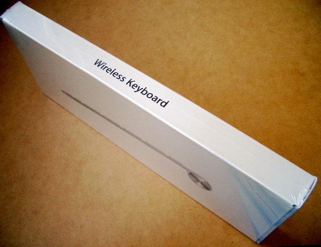
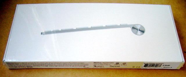
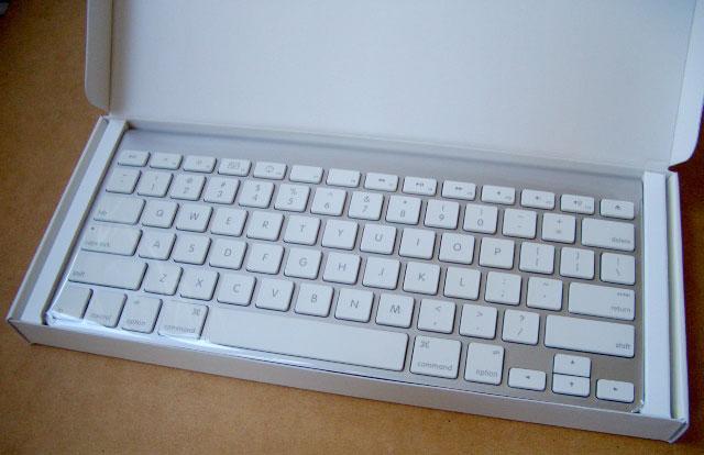
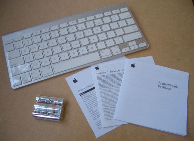
The simple box opens up to reveal the plastic wrapped keyboard, a thin user guide pamphlet, and the included pack of three AA batteries.
Physical Features and Setup
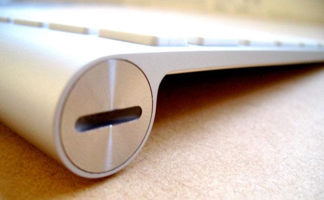
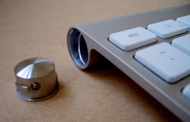
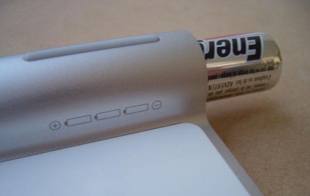
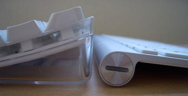
The entire keyboard is ultra thin apart from the cylindrical battery compartment (above), which also serves to raise the top end of the keyboard so that it lays at a comfortable typing angle. A metal plug unscrews from the left end of the battery compartment (below top) with a coin or the edge of a key. Drop in the batteries as indicated (below bottom) and it screws back into place and locks into position.
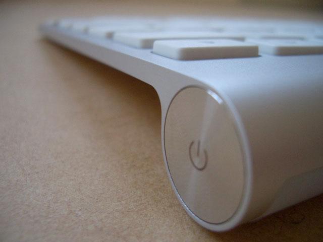
There's a power button on the opposite end of the battery compartment (below) for turning the keyboard off in order to save your batteries while it's not in use.
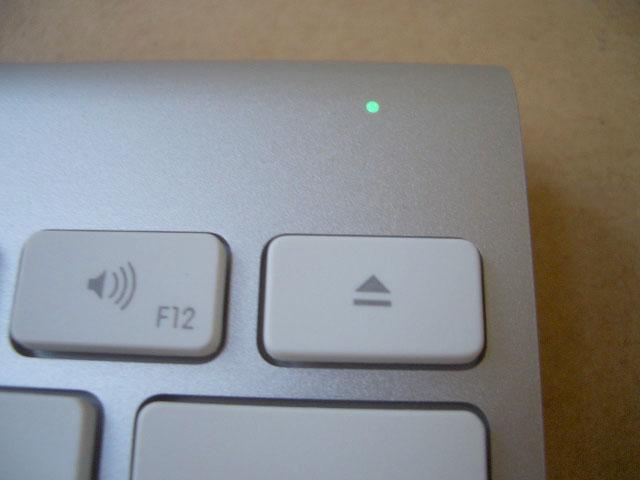
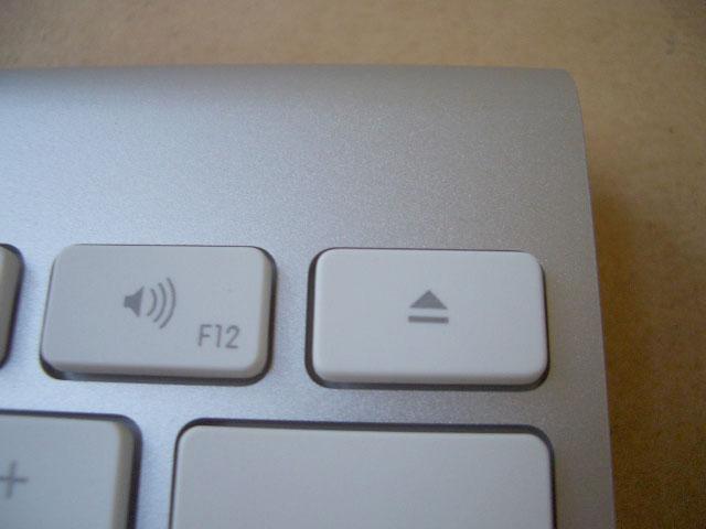
After you put the batteries in, it turns on automatically and a green LED begins blinking (below top) through an otherwise invisible window (below bottom) in the keyboard's upper right corner, indicating that it's ready to be set up with a Bluetooth enabled computer.
Comparison to Previous Wireless Keyboard
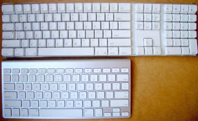
Like the previous version of Apple's Bluetooth keyboard (and every other Bluetooth keyboard), the new version doesn't have any USB ports for attaching other peripherals. The new version also drops the numeric keypad, inverted T arrow keys and other extra keys on Apple's previous wireless model to deliver a smaller profile device that is nearly two thirds the width (below), and ultra light.
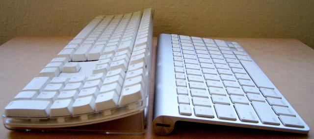
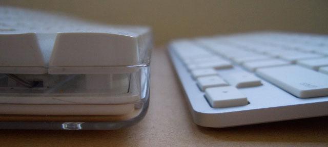
Also missing from the previous model is the bagel bits, dust bunny, and stray hair museum that Apple built into its previous keyboards. If you want a crystal terrarium menagerie for collecting gross things around your work area, you'll have to go out and buy one separately. Getting rid of that allows the new keyboards to be much thinner and lighter. Compare the side views (below top), the top edge that's half as high in the air (below middle), and the bottom edge that is about half as thick as a single key (below bottom)
Keyboard Design
Despite the fact that the new keyboard's keys are a fraction of the height of standard keyboards and have a throw action (how far they depress when hit) that is similarly much shorter, it does not have a "Chicklet" feel. Key presses still feel solidly mechanical and responsive, there's just less finger travel involved. I also found the keyboard angle comfortable. The typing angle is actually surprisingly similar to earlier keyboard, despite being much thinner. The keyboard also has a ruggedly durable feel, and is rigid enough to be impossible to flex. It's built like a solid piece of metal.
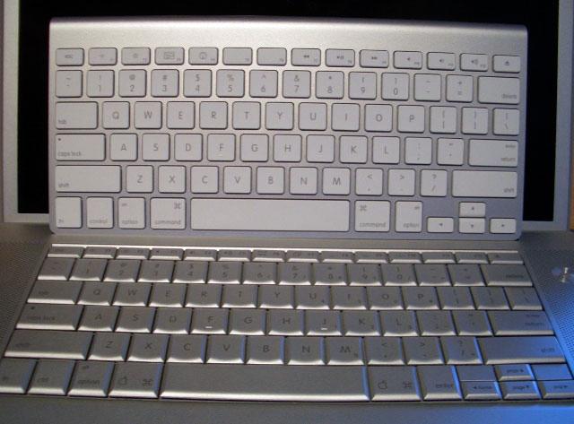
The new Bluetooth keyboard is the same size as a MacBook Pro's (below), and has a nearly identical key layout, apart from putting an option key on both sides of the space bar, rather than an Enter key on the right end, as the MacBook Pro does. The actual key design matches those found on the consumer MacBooks; it sports white keys with rounded square edges rather than the Pro's beveled, metallic colored keys. In addition to the unique look, the white keys have a bit more of an audible tap to them, while the MacBook Pro keyboard is softer and has a nearly silent key action. Besides noticing the differences, I don't have a preference for either key style, and didn't really notice the differences while using them.
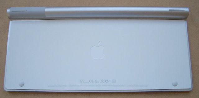
The back of the keyboard is glossy white plastic (below), with two nub feed on the front edge. The cylindrical portion has two rubberized edges on either end. That means the keyboard rests on plastic and rubber bumps, making it unlikely for the metal edges to scuff up your desk surface as it slides around.
On page 2 of 2: Bluetooth Pairing; The F Key Mystery; What's Missing?; and Rating.
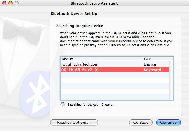
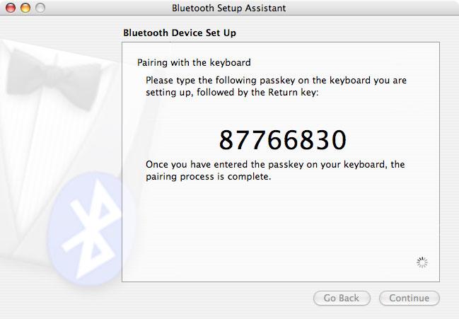
With the green light flashing, the keyboard is paired the same as any other standard Bluetooth keyboard. Under Mac OS X, the keyboard shows up as a device under the "Setup Bluetooth Device" assistant (below top), and you are prompted to type in a pairing number (below bottom). Once pairing is completed, the keyboard just works. It can be turned off by holding the power button down, which lights the LED for about four seconds and then turns off the LED to indicate the keyboard is now off. Turn it back on, and it automatically begins working without having to pair it again.
Keyboard range appeared to be limited to about 20 feet in my testing, although Apple says 30 feet on its website. As with any Bluetooth device, usable range will depend upon sources of interference such as metal objects or other wireless devices, including cordless phones and WiFi. When trying to type from a distance, keys seem to stick down like thiiisssss before it loses signal completely. In normal operation, the keyboard worked well, but Bluetooth does not work for long distance wireless, such as typing to a presentation PC from across a large auditorium.
The F Key Mystery
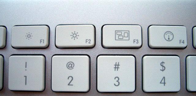
The new keyboard also sports a series of new key assignments. Rather than using the default F9 thru F12 keys for Exposé functions, the new keyboard assigns Exposé's "all windows" hotkey to F3 (it is F9 by default), and similarly maps the Dashboard trigger (usually F12) to F4. Both keys have unique icons that haven't appeared on any keyboards before (below). F1 and F2 are assigned to screen brightness, as they commonly are on Apple's notebooks.
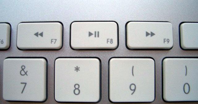
F3 thru F5 are commonly mapped to volume controls on Apple's notebooks, but the thin new aluminum models remap audio controls to the other end of the keyboard. It also adds playback controls for back, play/pause, and forward to F7, F8, F9 (below). These playback controls work for the foreground application. That means if you're listening to music but working in iPhoto, hitting the advance forward button doesn't skip to the next song, but rather advanced to the next photo. Hitting the play icon starts an iPhoto slideshow, and other applications can interpret these keys to mean whatever they wish.
Depending on whether you expect them to only control audio playback (as similar keys on Windows keyboards typically do), or whether you like the idea of having a multifunction set of buttons that work in different applications, this is either a frustrating problem or a great feature.
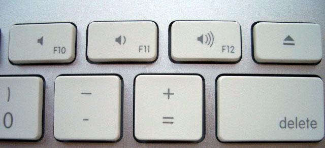
F5 and F6 have no icons, while audio volume controls are mapped to F10, F11, and F12 (below), next to an eject button.
These controls seemed to work inconsistently. When I paired the keyboard to a MacBook Pro, the keys worked as labeled (for example, F4 brought up Dashboard), while the MacBook Pro's own F4 continued to work as a volume key. The wireless keyboard's actions therefore did not match keyboard settings in Mac OS X. Holding down the Function key on the keyboard had no effect on how the F keys worked either.
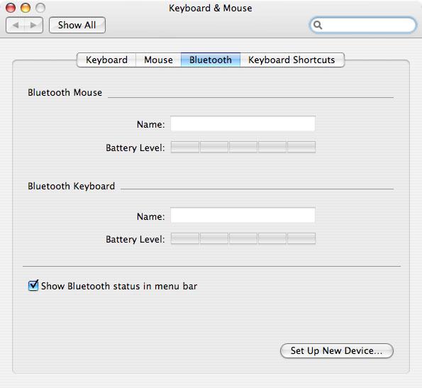
When I paired the keyboard to a different desktop system using a Belkin USB Bluetooth dongle, the keyboard paired properly, but the keys did not work as marked; instead, the F keys all worked as they were assigned by Mac OS X. That system also failed to properly display the keyboard under System Preferences' Keyboard section, which is supposed to indicate its battery level. The keyboard worked, it just failed to show up (below).
This puzzle was only solved by consulting the user manual, which indicated that new software needed to be installed. The keyboard does not ship with a CD (it also requires Mac OS X 10.4.10, so you'll have to have an updated version of Tiger running to use it). Instead, the manual tells you to run Software Update. Unfortunately, my system did not find any updates when I did this. I had to search for the update on Apple's site. Sure enough, Apple released a Keyboard Software Update 1.2 in early September. I had to manually install it.
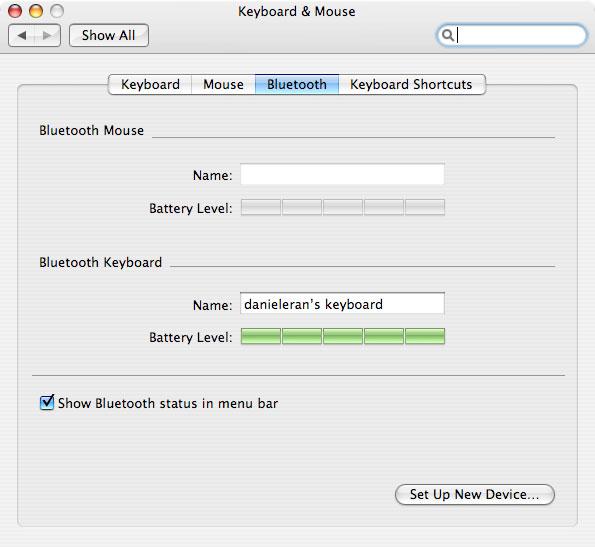
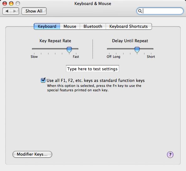
Once installed (it requires a reboot) my battery level indicator worked correctly (below top), the translucent Bezel Services "keyboard disconnect" graphic was updated to match the thin keyboard outline (below middle), and a new check box appeared in System Preferences (below bottom).
The new control in the Keyboard & Mouse settings allows you to choose between using the keyboard keys as they are marked, or to use the default F key settings, which can be configured as desired. Mystery solved.
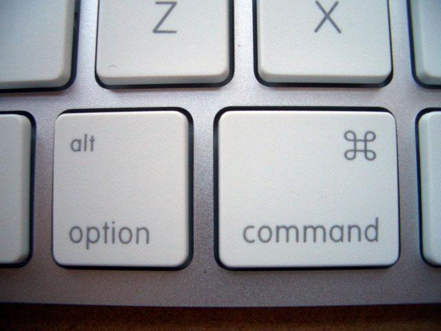
The other change on the new aluminum keyboards is the departure of the Apple logo from the command key, which now features the word "command" along with the Mac propeller icon (below) used for command in menu listings. The story behind that change was related in the article, "How Apple Keyboards Lost a Logo and Windows PCs Gained One."
Somewhat oddly, the Option, Shift and Esc keys are not labeled with their menu icons. Apple only puts some of these icons on foreign keyboard layouts, leaving new users to guess at what the glyphs might mean.
What's Missing?
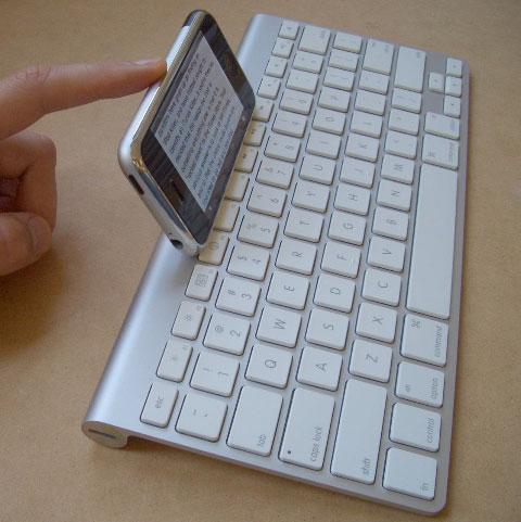
One feature I'd like to see added requires new software support on the iPhone: the ability to pair the phone to the Bluetooth keyboard. Imagine using the duo (below) as a hyper thin traveling companion for taping out notes. Unfortunately, while the iPhone now supports Bluetooth pairing with a computer, it does not yet advertise support for any Bluetooth profiles apart from hands free, which used for the Apple Headset Adapter we reviewed in July: AppleInsider | Review: Apple iPhone Bluetooth Headset.
That means no keyboard input for the iPhone, no stereo Bluetooth headphones for music, no Bluetooth sync, support for printers, nor any other features, at least not yet. Until then, Apple's Bluetooth keyboard makes for a stylish way to work without cords, or to control a PC or Mac from across the room.
With a cheap USB - Bluetooth dongle, the Apple TV would also make a keyboard candidate, particularly if Apple expands upon the device with other applications beyond wireless iTunes access. The ultra thin, ultralight keyboard would pair well with the unit to turn a living room widescreen HDTV into a web browsing, iChatting new general purpose Internet device.
Apart from asking more of systems that might make use of this keyboard, it's hard to find faults with anything in the keyboard itself. It's nearly identical to the MacBook's keyboard, which is quickly becoming one of the most popular notebooks available. Unless you're looking for something big and heavy or cheap and flimsy, the $79 Apple Bluetooth Keyboard represents a very well built, attractive wireless keyboard at a reasonable price.
Rating: 5 of 5
Pros:
- Ultra thin, ultra light, highly portable design.
- Ruggedly solid and rigid construction.
- Elegantly attractive design.
- Comfortable typing angle and key action.
- Easy to set up and use.
- Functional even without installing any software.
- Batteries not excluded; reasonable price.
Â
Cons:
- Had to self-search for applicable software update.
