It's been four years since Microsoft last updated Office for the Mac. Is the new Office just a mild reheating of the last version, or a complete overhaul and fresh revitalization you desperately need? How Mac-like is it, and conversely, how Offlce-like is it, particularly when compared to its Windows cousin? We've spoke to a source testing the beta release of Office 2008 for Mac to find out. Here's an overview of what you can expect related to installation and its new user interface.
Setting the Stage for Office 2008
The last release of Office for Mac was in 2004. That version offered functional improvements over the earlier Office v.X, the first version natively compatible with Mac OS X, but didn't radically change the overall look and feel of the software suite. It also added some new features unique to the Mac version of Office, creating some divergence from the Windows side and allowing Microsoft to note that Mac Office has features that weren't yet in the Windows port.
Microsoft also includes other applications in Office for Windows that it does not offer for the Mac (including Project and the Access database), and there are features missing in the Mac versions of Word, Excel, PowerPoint, and in particular Entourage, when compared to Office for Windows.
Office 2004 also highlighted the difficult engineering challenges facing the Mac Business Unit at Microsoft. To appeal to Mac users, Office has to adopt enough of the expected behaviors of a Mac application. However, to remain compatible with Windows — not just in exchanging files but also in the overall look and features — Office for Mac has to deliver the same direction and strategy of the Windows side.
The more Mac-like Office becomes, the more difficult it can be for corporations to support it, because their information technology managers and trainers have to learn a new environment. However, the more Office-like the product is, the less accessible it will be to home consumers, creative workers, and other users who purposely bought their Mac to benefit from its well integrated, "non-PC" computing environment.
Comparing Mac Office with Office for Windows
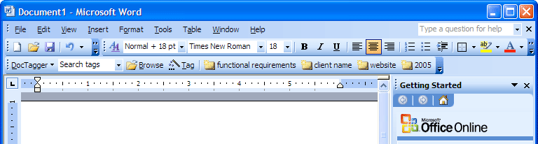
Microsoft's last version of Office (below, Word 2003) looked very similar to the Mac version of Office, but used Windows-style widgets and conventions, such as placing the menu bar within the document window along with the tool bars.
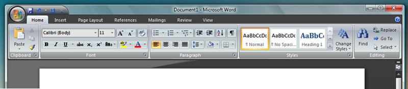
On the Mac, Microsoft not only uses the standard menu bar at the top of the screen, but has also followed its own historical convention of floating a toolbar of icons outside of the document window (below, Office 2004), somewhat similar to the tool palette of Photoshop or other classic Mac applications originally designed in the 80s.
In 2005, Microsoft unveiled a radical rethinking of how Office would look (below, a demo of Word as envisioned in 2005). Office windows would get a flat metallic look, and the menu bar itself would change from standard drop down menus into glowing buttons of the new 'Ribbon' interface, presenting a series of graphical icon regions the user could change around as desired. The Ribbon idea was met with criticism and Microsoft was forced to change the name to the Fluent UI.
The idea behind the Fluent/Ribbon is to present lots of dense information at once. This concept is similar to a previous Microsoft innovation of dropping items from menu bars in Windows XP so users only see the selections they frequently use. The problem is that shifting information around breaks the muscle memory for recalling where items are. In the case of the Fluent Ribbon, the menus are gone entirely, and presented instead as a series of new collections of buttons to learn. Users proficient in Office wouldn't find the new version any more familiar than WordPerfect or Apple's Pages.
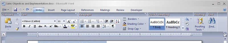
This January, Microsoft finally released Office 2007 for Windows (below, Word 2007 aka 12), in conjunction with the new Windows Vista. The Fluent/Ribbon remained intact, but was joined by a mini toolbar at the top for save and other items, connected to the round Office button designed to reinforce the marketing language of the similarly round Windows logo button that replaces the Start button in Vista. The overall look and feel reflects Microsoft's Vista Aero, with lots of bright, undulating gradients and an extensive use of translucency and glowing shadows in window borders and controls.
Delivering that same look on the Mac would not be acceptable at all. Office 2007's Fluent/Ribbon redefines the menu bar as a fusion of tool bar icons and other presentation, completely destroying the entire concept of unified human interface guidelines. Applications on the Mac don't choose whether to present their menus as menus or as a graphical ribbon, and Mac users don't skin every app to use its own faddish UI of the moment as Windows Media Player does with each release.
While Microsoft gets a lot of flack for copying ideas from elsewhere, it's far better to copy good ideas than to invent bad ideas. The entire premise of a productivity application is to make users productive, not to entertain them.
While the new look of Office 2007 matches Vista and creates a strong brand for Microsoft applications in 2007, it is not designed to translate cross platform; in fact, it was primarily designed to thwart the open source office clones such as Sun's OpenOffice.org. That left the MacBU scrambling to figure out how to deliver a new Office on the Mac.
The New Mac UI
While Microsoft introduced dramatic changes to the look of Office this year, Apple has also significantly evolved the look of Mac applications over the last four years since the days of Mac OS X 10.3 Panther and Office 2004. Apple's bundled applications in Mac OS X followed and expanded upon the Aqua human interface guidelines, sometimes breaking them to try new things. Mail 2.0's bubble Toolbar icons in Mac OS X 10.2 Tiger were roundly criticized for looking different, but Mail, like all other standard Mac OS X apps, still uses the same user customizable Toolbar.
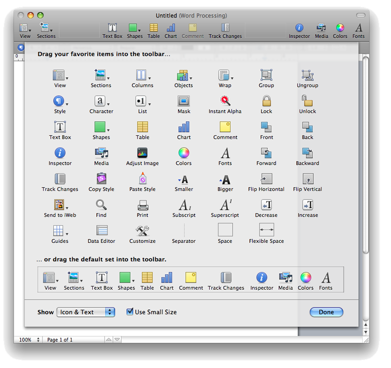
Users can select between icons with text labels, just icons, or just text, and can pick between a large or small icon size. Customizing the Toolbar always means dropping down a sheet of icons that can be dragged and dropped into the Toolbar (below, Pages 08). Apps are also supposed to hide the Toolbar by clicking the pill icon in the top right corner.
Some applications lack a Toolbar altogether, such as TextEdit, iPhoto, or iTunes, and others present a custom Toolbar style; Safari uses a compact Toolbar that doesn't provide text labels for its few buttons, for example, but users still customize the Safari Toolbar the same way as they would Mail, iWork apps, Preview, or any other app with a Toolbar.
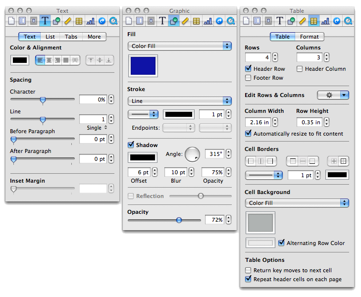
A second major Mac convention among productivity applications is the panel, which is common among applications with a NeXT heritage. Apple defined a standard Color Picker panel and Font selection panel, and then began using a standard Inspector panel (below) that works very similarly between Keynote, Pages, iWeb, and Numbers. Apple also presents a standard Media Panel for selecting from audio, photos, and movies stored within the libraries of iTunes, GarageBand, Photo Booth, iPhoto, and iMovie.
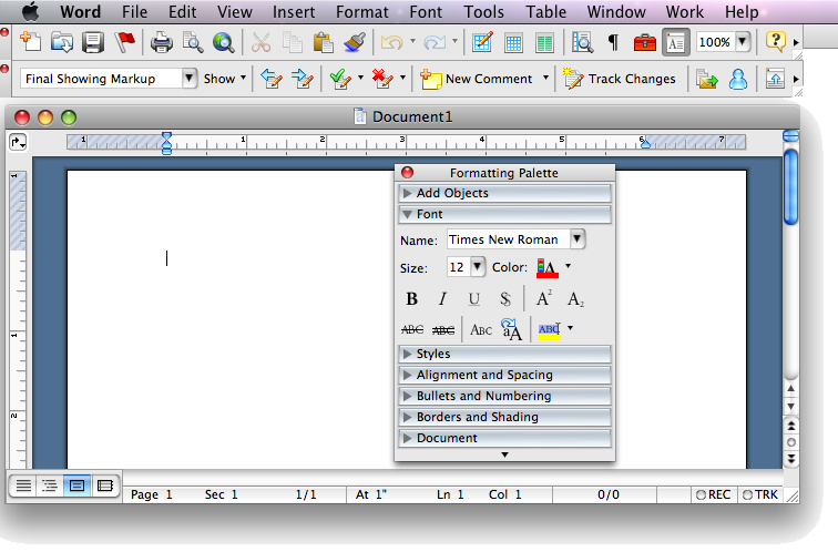
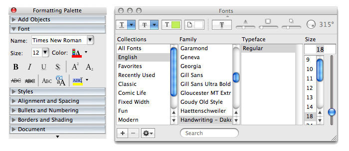
Using the same panel in every application reinforces the simplicity of how applications work, at the expense of limiting how differentiated an application can be. The existing Word 2004 does not use the standard Color, Font, or Media panels. Instead, it presents a strangely modal Color window, its own unique Font Formatting Palette with fewer features (below, next to the standard Mac Fonts panel), and no media selection interface at all. Its use of floating toolbars is also an oddly foreign interface idea for Mac OS X.
On page 2 of 3: The MacBU Middle Ground; and Office 2008 Window Toolbars and Controls.
The challenge to the MacBU was to fit Office 2008 into the modern Mac desktop while incorporating as much similarity with Office for Windows as possible, all while Apple and Microsoft are both working to differentiate themselves in different directions: Apple with simplicity that builds on what users already know, and Microsoft with a complex and flashy information overload that aspires to be completely different in each release.
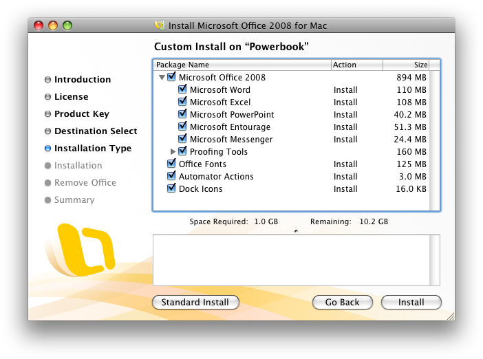
Previous versions of Mac Office catered to the demand for simplicity on the Mac side with drag and drop installation. After you drag the Office 2004 folder into Applications and launch an app, it would run through an initial mini install which copied in Microsoft fonts and other required support files. In Office 2008, this is all gone. It now requires a full standard install. In comparison, while many simple Mac apps support drag and drop installation, even Apple's iLife and iWork suites run through a standard install process.
The standard installer (below) offers customization for excluding specific apps, Office Fonts (which includes the fonts Microsoft commissioned for Vista), and Automator Actions (which are only available if you opt to pay the $150 premium for the Standard Edition over Basic).
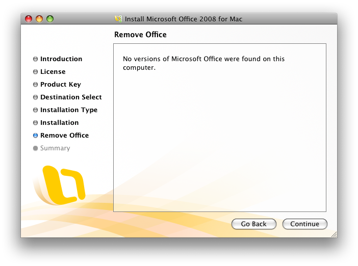
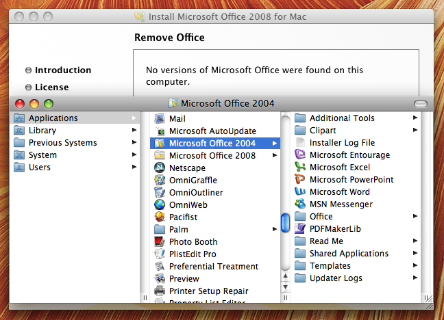
After installing Office 2008, Microsoft recommends you uninstall previous versions, and offers to find and remove earlier versions automatically.
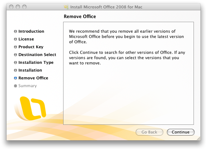
However, the current beta installer couldn't find a previous version of Office 2004, despite it being in the usual location on the drive. (Obviously, this will be fixed in the shipping version.)
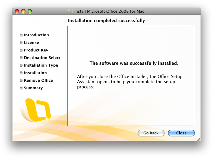
Once finished with the installation (below), it kicks off a secondary Setup Assistant process.
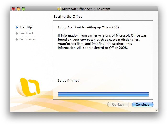
The Setup Assistant (below) offers to import settings from your previous version, which seems like a bit of a puzzle given that the installation process earlier attempted to find and delete any existing versions. Fortunately, the installer couldn't find what was under its nose, so the previous version remained around long enough to allow the new version to import what it needed. In our source's case, it identified two previous versions of Microsoft Identities (mail settings) and asked which should be imported.
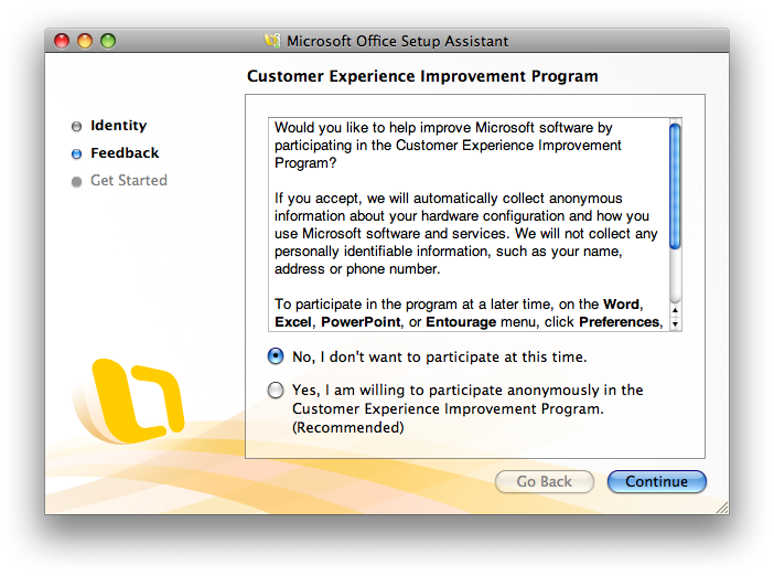
Setup step two is the recommended but optional choice (below) of sending your hardware information to Microsoft along with reports of "how you use Microsoft software and services." This is not enabled by default.
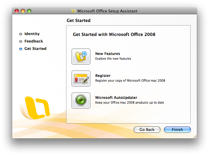
And finally a Get Started page (below) where you can review what's new, register, and check for updates.
Office 2008 Window Toolbars and Controls
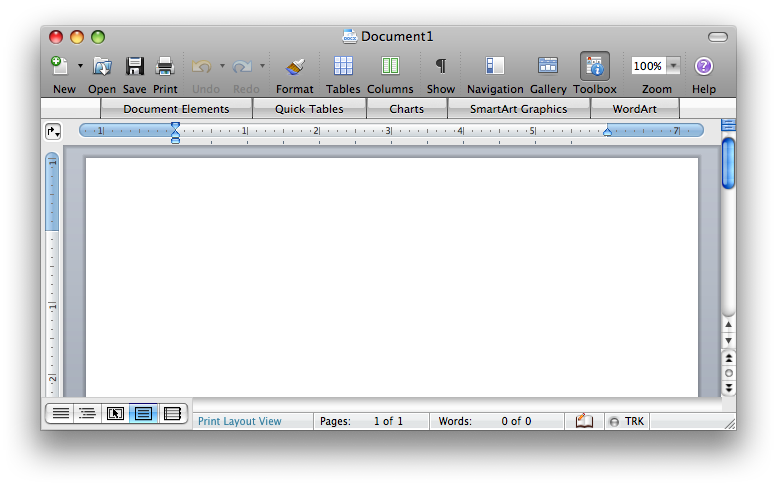
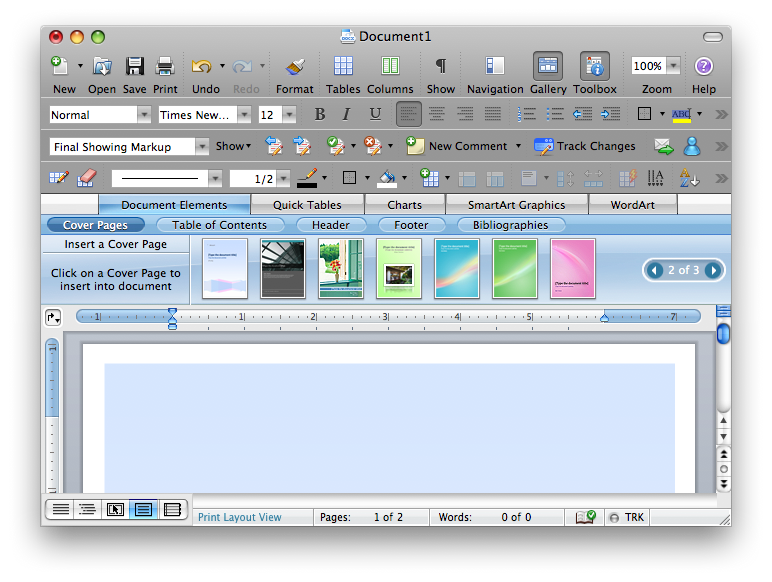
The new Word (below top) shows off the MacBU's compromise between delivering a fairly standard Mac Toolbar appearance on top, along with a Ribbon-like band called the Element Gallery, which mixes in the bright blue gradients and interface density of Vista while also incorporating Mac interface elements such as the Safari-like rounded buttons and the page navigation controls.
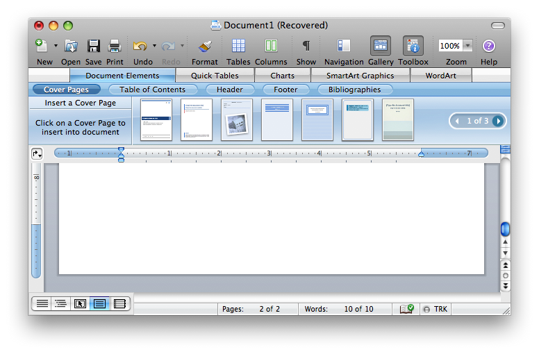
The new interface also adopts the template-centric design of Apple's iWork applications, except that rather than starting with a template, you select individual pages to fill specific components of your document using template pages, such as a cover page, a table of contents, or bibliography page.
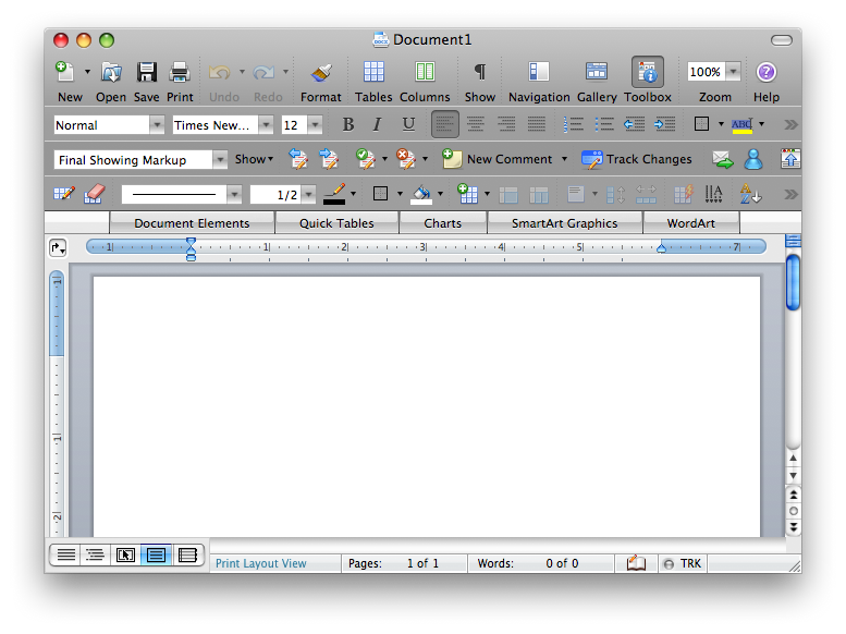
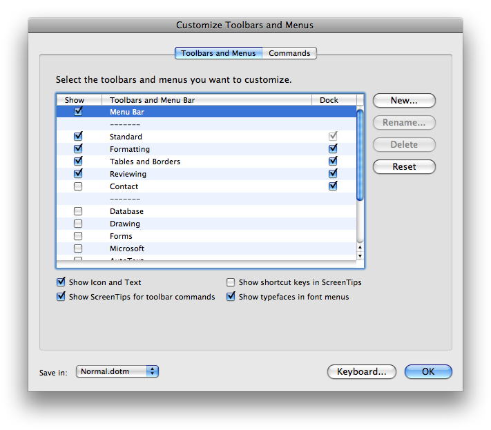
The toolbars used in Office aren't the standard Mac OS X Toolbar; they don't offer to resize icons, you can't just display text labels, and they aren't configured using drag and drop sheets like standard Mac Toolbars as noted above. Instead, the Mac Toolbar is really a replica of the standard Office toolbar, which allows you to select between and customize the rows and rows of familiar icons (below).
You can also choose to display the toolbars as floaters, as was the default in Office 2004 (below), although this only works for additional toolbars and not the Standard home row toolbar, which is permanently affixed to the window. The toolbars make more sense attached to the window, as is the new default.
Using Office style toolbars also means that configuration of the toolbars is done using the same unusual interface as previous versions (below), a kluge of an Access-inspired window. It is nothing like the standard Mac Toolbar sheet with drag and drop icons, in part because Microsoft offers twelve standard toolbars of icons (the above window graphic only displays four of them), and users can remix their own custom toolbars on top of that.
There's simply not room in a graphical selection sheet for all those icons, but whoever uses more than 10 percent of them?
Of course, Office fans who bought the program because they want this type of complex customizability might prefer this familiarity in Office 2008. However, this is now missing on the Windows side, so it is headed toward being entirely obsolete; Office 2007 for Windows uses an entirely new Fluent/Ribbon configuration system.
Unless Microsoft repeals the Fluent/Ribbon in the same way it rolled back the new Word 6 menus for irate Word 5 users, the entire concept of rows and rows of toolbar icons is now dead: frozen in time on the Mac, and abandoned for a different presentation on Windows. The MacBU appears to be stuck in the middle: holding onto the old version, either unwilling or unable to implement a regular Mac Toolbar.
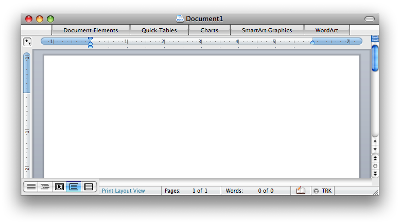
The MacBU's solution to this problem appears to be something of a diversion — the frosted Element Gallery is somewhat like a cool blue icing on top of a burnt cake. If you want to scrape it off, you can deselect the Gallery view using the Toolbar icon. The template section hides to provide a less busy window with an extra inch of content display (below).
However, Microsoft finally fixed the floppy disk icon. Previous versions of Office on both the Mac and Windows depicted the floppy disk with the metal shield backwards from how a real floppy looked, with no hole in the shield and an extra hole in the disk. That wouldn't actually work, of course.
Microsoft's erroneous floppy icon also has no "HD" hole, indicating it only has a 720k capacity and dates from the 80s; it does have a copy protect hole. (The correct but stylized new Mac floppy depicts no holes.) Even this year's Vista version of Office has the same incorrect floppy disk icon. It is amusing that the MacBU fixed this error for Mac users in 2008, ten years after Steve Jobs yanked the floppy out of the iMac and stomped it out of existence.
Even slightly more ironic is the fact that Word 2004 used a Zip drive icon, which at least some PowerMacs prior to the G5 in 2003 offered as an option. Four years later, the MacBU has reverted to the floppy disk, either to atone for Microsoft's decades of error or as a nostalgic nod to saving documents in the era Word originally sprang from.
If you'd rather concentrate on your document contents than the icons, you can also hide the tool bar entirely by clicking on the pill icon (below). Sadly, this doesn't also hide the Gallery menus.
It seems like the MacBU did deliver a simpler, cleaner, more professional, and less menacing looking overall window style compared to Office 2007, but that seems to have more to do with the user interface guidelines of Mac OS X versus Windows Vista. Given the difficult task set in front of it, it is not obvious how the MacBU could have delivered a significantly better overall user interface without simply starting over and using standard Mac window Toolbar.
Doing that would likely have required a massive overhaul to Office for Mac and might have resulted in breaking compatibility with the Windows version, but the Windows version doesn't use the previous Office toolbars anymore either.
As it stands, the Office for Mac interface looks like a cross between Vista and Leopard. The worst part isn't the look, but rather its behavior. While the new Elements Gallery looks nice enough in a screen shot, the interface is hyper-animated in an excessive way.
On page 3 of 3: The Glass Menagerie; Inspector Clouseau; and Worth an Upgrade?
Mousing over the dentures causes them to slowly glow in a blue light. Selecting a tooth rolls down the Gallery view of templates, but then the buttons animate across the screen and the template items dance into place. Mousing over templates invokes a minor magnify effect. Unlike the Dock, the animation feels artificial and jerky. It conveys the behavior of a website built in Flash, except rather than being wowed by an animated interface you'll only encounter once, you're stuck with the glowing, zooming, bouncing animated behavior on a daily basis.
This doesn't seem appropriate for a word processor and other productivity applications. Fortunately, you can mostly ignore the Vista-inspired Elements Gallery (apart from the dentures), and confine yourself to the Office-style toolbars.
The toolbar icons also animate on rollover, somewhat less subtly than the existing Office 2004, but not in the same manner of the hyperactive Gallery. In order to match the unified look of Leopard, which blends the Toolbar into the window title bar, Office 2008 renders all of the Office toolbars in the same dark aluminum finish, which makes its applications look very dark overall.
That darkness seems particularly out of place next to the Gallery decked out in vividly glowing candy colors and bright white highlights (below). The Gallery menu item's teeth also popup a "tool tip" that repeats what is already being displayed below it:
Inspector Clouseau
AppleInsider's initial installment of its Road to Office 2008 series introduced the look of the new Office Formatting Palette, which now looks more like the inspector panel from iWork. The problem is that while it copies the idea of icons across the top, it choses its own icons and functions, so there is no real commonality with Apple's apps.
It might be obvious why the MacBU didn't follow the design of iWork any closer; on one hand, they don't want to look imitative, and on the other, doing so would require reworking a lot of the historical arrangement of settings in Word.
Here is the new Office 2008 palette, the previous version from Office 2004, and the iWork Inspector from Keynote:
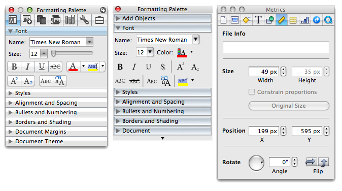
Apart from some new polish, it's the same old Office 2004 Palette; a half dozen rows of settings hiding behind disclosure triangles, and now a series of icons at the top that tack on new features. Some seem smart, like the citation manager window for bibliographies, while others not so much, such as the dictionary, thesaurus, encyclopedia, and translation sections all stuffed into a single panel. (Mac OS X already has a system wide dictionary, but Microsoft has chosen to use its own.)
The MacBU could have delivered a system wide plugin for Mac OS X's new Dictionary 2.0, then added the Microsoft Encarta encyclopedia. Another section of the Palette is the Scrapbook, which could similarly have been delivered as a Dashboard widget. Instead, it too is buried away inside Office, thus far negating some of the value Microsoft could offer customers.
Even more oddly, the Office Palette flips around like an Dashboard widget for setting its display settings, turning into a modal, translucent black window (below). Flipping the palette in the beta of Office 2008 causes other windows to stutter and redraw, making for a somewhat clumsy effect.
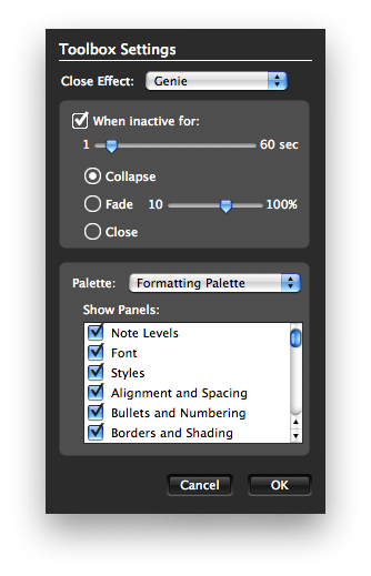
On the flip side, there are settings for configuring what the panel does after a period of inactivity. By default, it rolls up into the icon bar (below). It's an entirely custom built human interface device.

Worth an Upgrade?
It may be that the MacBU can refine certain elements such as the palette to work and act more fluidly over the holidays prior to the mid-January release of Office 2008, but the real issues in Office don't seem like bugs as much as design compromises.
At the same time, there's not many options for replacing Office for Mac. Apple's simpler iWork will appeal to some users, but it doesn't yet deliver all of the features in Microsoft Office. Alternatives such as NeoOffice also have serious weaknesses. The degree of stability Office 2008 attains by January will have a major impact on whether the update gets rated as a buggy mistake or a solid update saddled with a few too many interface features.
Outside of the user interface, Office 2008 also delivers Universal Binary support for Intel Macs, a significant step, albeit a couple years overdue. That alone may be enough for Mac Office users to upgrade in January. So what about the new features of Office? AppleInsider's next article will take a deeper look at Word.