Mac users will feel more at home than ever whether running Windows 7 in a virtual environment, using Boot Camp, or running the system on a generic PC. Less translation between Windows and the Mac desktop means less frustration and fewer interruptions. This segment looks at some of the strongest similarities that debut in Windows 7, starting with the new Taskbar.
The ultra new Taskbar
The new Taskbar in Windows 7 is so greatly improved that Microsoft’s more vocal proponents have begun calling it the Ultrabar, just as Apple fans began calling the new Dock in Leopard the UltraDock.
Actually that never happened. Mac users only complained that the new Leopard Dock in beta, when slid to the vertical side, depicted apps being suspended without any apparent gravity, and insisted Apple correct this problem.
The ultra new Taskbar in the Windows 7 beta is distinguished from previous editions of Windows in that it now shows one icon per application (below), rather than a series of bars that either represented each window on screen, or in some cases an application with many windows open. Mac users will appreciate this more sensible, consistent, and familiar approach Microsoft has taken as they work between the two environments.
Windows 7 beta:
Windows Vista:
Windows XP:
One size fits all
There are still some differences between the Taskbar and the Mac OS X Dock: the Windows 7 version (which may yet still change before its release) must be manually "unlocked†before resizing it, and then can only be resized in half inch-sized increments.
Even so, resizing the Taskbar neither resizes the icons (as it would in Mac OS X) nor provides more vertical room for organizing Taskbar items (as Windows users might expect). You can’t organize icons in vertical rows, making it fairly useless to change the vertical height of the Taskbar. There’s also no Dock-like magnification.
Taskbar app icons sit within a metallic looking panel which becomes glass-like blocks that highlight when the app is active in the foreground or running. The early betas of Mac OS X in 2000 similarly lacked both a transparent background and smooth vector scaling (below, Mac OS X DP3).
Patented Dock features
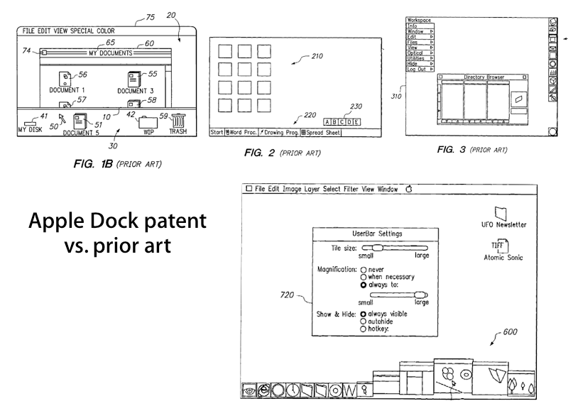
Windows 7 won’t ever look entirely like the Mac’s Dock because Apple successfully applied for a patent on the Dock back in 1999; it was granted last October. The patent makes specific claims related to magnification, auto resizing as new icons are added, auto-hide, rollover text labels, user reorganizing of the icons, and other specific features developed by Apple, in contrast to the prior art citec in the patent filing (below).
To protect its claims, Apple even asked Google to stop hosting an experimental Dock-like interface online. Apple’s patent shouldn’t prevent Microsoft from using its new Dock-like Taskbar entirely, but it does limit what features Microsoft can copy. Having said that, some features, such as the Dock’s zooming magnification effect, are far more fun than they are useful, resulting in many users turning it off after the novelty subsides.
Other aspects of Apple’s patent may be hard to enforce, but it appears Microsoft is treading lightly in its implementation. Apple was only granted its Dock patent four months ago, so Microsoft may also not have been aware of it during the development of the current Windows 7 beta Taskbar.
The road to today’s Dock
Microsoft’s essential adoption of the Mac OS X Dock results in a desktop that looks and in some cases behaves more like the Mac than Windows ever has since 1995, a definite plus for Mac users who might need to switch between the two environments.
Despite the patent covering specific features, neither Apple nor Microsoft can claim having invented the general Dock concept itself. Apple’s original 1984 Mac had no need for a Dock because it could only run one application at a time. As the Classic Mac OS gained the ability to run multiple apps on screen at once, Apple toyed with different interface add-ons that handled app launching and window management, but the Dock as we know it developed outside of Apple.
A number of Apple employees joined Steve Jobs’ NeXT after he left Apple in 1986. That company created an early Dock for the NeXTSTEP operating system that represented each running application with a block, which could be rearranged along the sides of the display. Blocks could also update themselves to provide status updates. NeXT patented that design in 1992 as an invention credited to Jean-Marie Hullot, Steve Jobs, and Christopher Franklin.
Other graphical desktops in the late 80s had also used a Dock-like shortcut bar for launching apps, including Acorn’s UK equivalent to the Mac, the 1987 Archimedes. In the early 90s, Apple itself used a Dock-like launcher in the Newton OS for its Message Pad PDAs. NeXT's patent covered specific inventions related to its Dock, which were unique over the button bars commonly used in many places.
By 1995 Microsoft had consolidated control over the desktop PC. Rather than including a Dock-like interface in its new Windows 95, Microsoft chose its own path with the new Taskbar, resulting in a fifteen year lapse of Dock-goodness on mainstream PCs.
Different to be different
The Windows 95 Taskbar (below) displayed a long rectangle for each task running on the desktop, resulting in a more obvious indicator of the number of applications and windows that were active compared to the standard System 7 desktop on the Mac, but quickly becoming illegible as the Taskbar filled up with rectangles.
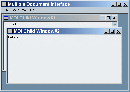
Microsoft had also started charting its own course in other areas of the graphical user interface. Rather than following Apple’s Human Interface Guidelines, which had a decade earlier codified a document-centric view of the computing desktop, Microsoft adopted the MDI (multiple document interface) windowing system.
Rather than using a central menu bar reflecting the current application and putting individual documents each in their own window, MDI puts an application’s menus and toolbar on a floating window, and embeds each of its open documents in a window within that window (below). For the Taskbar, this meant that a rectangle-represented task could be a document in an application, or could be an application with multiple documents.
The waters muddied as Microsoft began breaking its own conventions, first by making some apps behave more like Mac apps, (such as Word, where each document became a free standing window), while leaving other apps as MDI (such as Excel, which retains the embedded document windows idea), while also embracing tabbed windows, which incorporate multiple documents into a single shared window without any window nestling.
The Taskbar initially served only to select between running tasks, but Microsoft then added a Quick Launch area where users could drag app icons for easy startup. This handy feature was actually turned off by default in Windows XP, making a trip through the Start Menu necessary for launching new apps.
Return of the Dock
In Mac OS X, Apple adopted the NeXT Dock as a replacement for a number of interface conventions that had been bolted on to the Classic Mac OS over the years, including the Control Strip, the Application Menu, and the Launcher, as described in the Road to Mac OS X Leopard: Dock 1.6.
Mac OS X’s new Dock not only handled all of those functions, but also served as a way to quickly highlight what apps were open, as well as acting as place to dock minimized windows and frequently opened documents, among the other features Apple patented.
To show off the new system’s advanced graphics compositing engine, Apple also added transparency around the icons in the Dock, vector scaling for resizing the Dock’s icons to any size, a smooth zoom magnification that playfully highlighted the icons as they were moused over, and a bounce notification animation for applications seeking attention. This made the Dock a conspicuous, central aspect of the new Mac desktop.
The Dock comes to Windows
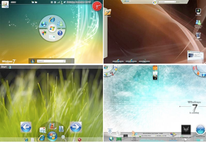
For over ten years, nothing significant happened to the Windows Taskbar apart from the application of new themes. After the release of Vista, Microsoft set out to develop conceptual ideas of how to rethink the Taskbar for the next major version of Windows. The ideas experimented with different types of round dial controls and busy box information panels to replace the standard Taskbar (below).
As Vista failed to gain traction in the market however, Microsoft canceled the more experimental ideas and worked to solve the real problems users had with Vista, converting Windows 7 from a major new release based on a new "MinWin" kernel to a more conservative update of Vista that supplied a simpler, more consistent interface and could be shipped at least a year sooner.
The result was a new Taskbar that borrows extensively from the NeXt/Mac Dock, with icons per application rather than per document, place holders for apps that can be launched, and Docklet menus for selecting an application’s individual windows or other menus specific to the application.
Microsoft also added some new things, including an icon scrub feature that highlights an application's open windows similar to Exposé, as well as a recently used items "Jump List" for each docked application. Apple has yet to show its hand on coming enhancements to the Mac OS X desktop in Snow Leopard, but the back and forth borrowing between Apple and Microsoft may likely incorporate some aspects of the Windows 7, such as its expanded Docklet menus.
There are other new commonalities between Leopard and Windows 7 that Mac users who move between the two will likely find appealingly familiar, as the next segment will examine.
 Prince McLean


-m.jpg)


 Malcolm Owen

 Amber Neely

 Andrew Orr

 Wesley Hilliard
 William Gallagher


 Sponsored Content






93 Comments
Ah, the power of entrenchment and incumbency, especially when combined with a lack of shame.....
What else can you say about MSFT!?
I hate to say it, but the new dock in Windows 7 looks about a million times more functional. I am hoping to god they have those little pop up windows when you mouse over an app in 10.6.
"There are other new commonalities between Leopard and Windows 7 that Mac users who move between the two will likely find appealingly familiar, as the next segment will examine."
As a Mac user forced to used Windows, I find this whole Windows OS copying of Mac OS UI unappealing.
Compared to MS old taskbar?? I guess so considering MS basically got inspired by OSX dock, hmm...well your idea of those tiny pop up windows is useful but I dont understand why Mac users need it, we rarely minimize our window, we just place something over it, want to switch it back? Just use expose app/ expose all. Of course OS X Expose is much better then the Windows version.
Ok, I am going to say this really simple for all the Windows users out there: Microsoft has managed to copy almost everything from OS X. The new taskbar looks identical to the dock in OS X. be original for once microsoft!!