This report goes to great lengths to follow the origins, history, and maturity of the Dock. For those readers with limited time or who are only interested in what's due in Leopard, you can skip to page 2 of this report.
The Dock's Origins
On the Mac, the Dock first appeared to the public in the beta preview of Mac OS X released in late 2000, which debuted the new Aqua interface. However, the ideas behind the Dock weren't all new. In the 1987, Apple's English dopplegänger, Acorn Computers, shipped its Mac-like RISCOS with a desktop operating system featuring an Iconbar. The strip on the lower edge of the screen displayed icons for drives and running applications. By the early 90s, the RISCOS Iconbar displayed icons for RAM disks, printers, folders, applications and system utilities.
The NeXT Dock
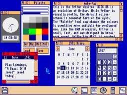
In 1988, Steve Jobs' NeXT began demonstrating the new desktop of NeXTSTEP, which included the new Dock. NeXT's Dock was a series of block icons, each of which could animate and update. Icons in the Dock could represent running applications or apps ready to be launched; the icons of running apps were tagged with an ellipsis to differentiate them (as is the Digital Librarian icon, fourth from the top, in the desktop image below). That made the NeXT Dock more of an application launcher.
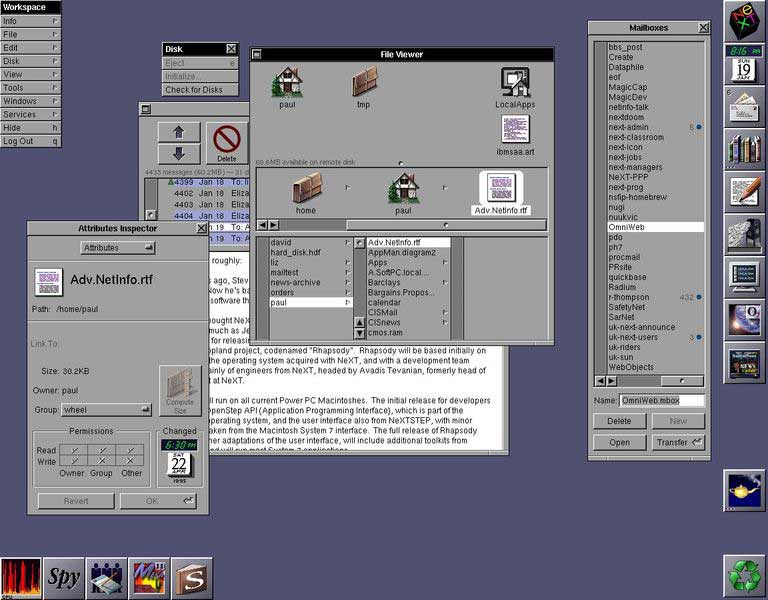
Since icons couldn't be resized, the Dock consumed a lot of screen real estate. NeXT also provided no way to drop other placeholders into the Dock, such as files, folders, or open windows. Files and folders could be instead be dropped into the Shelf, a reserved space in File Viewer windows (analogous to Mac Finder windows).
In the screen shot below, the top four icons in the File Viewer window are sitting in the Shelf, while icons of the Dock are positioned along the right and bottom of the screen. NeXT also moved the desktop Mac trash icon into a Dock icon called the Recycler. The dynamic nature of the icons can be seen in the live time and date displayed by the preferences icon (second from top) and the Mail badge indicating new messages (third from top).
Newton's Dock
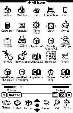
In the early 90s, Apple introduced the MessagePad running Newton OS, which similarly used a "buttonbar" as a launcher. The Newton's buttonbar demonstrated the significant resources Apple invested in reducing the amount of clicking required to pull up common tasks on the Newton. Other items could be dragged into buttonbar from a collection of extras, similar to the row of action icons on the iPhone's More/Edit/Configure screen within its iPod section.
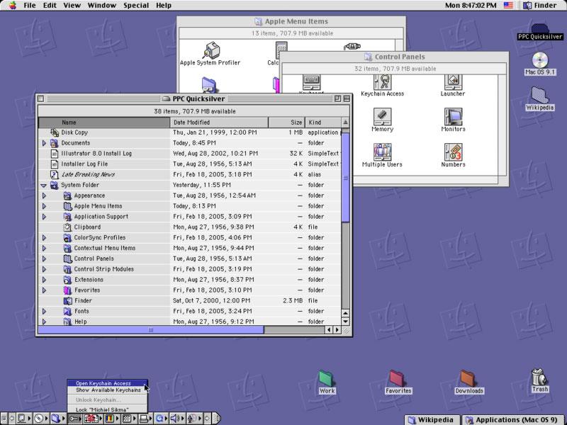
Dock Substitutes in the Classic Mac OS
The Newton's button bar never made it into the classic Mac OS, then called System 7. Instead, Apple rounded up various shareware tools and incorporated them into the Mac desktop throughout the 90s. Oddly, there was never any way to tell at a glance which apps were actively running on the classic Mac, an obvious need solved by NeXT's Dock years before the Mac OS was even routinely running multiple applications at once.
Instead, the classic Mac OS used an icon in the top right to indicate the currently running app, which would drop down a menu of other running applications. This Application Menu also served as a way to select between running apps. It was not an app launcher however.
Apple added various systems to the Mac OS to provide functions later handled by the Mac OS X Dock:
- In System 7, the Control Panel desk accessory for setting system settings such as screen resolution and audio volume was exposed as the Control Strip (above, lower left), a Dock-like selection of small icons that floated on top of other windows. It did not launch or display applications, and was really intended only for use on PowerBooks.
- Later, Tabbed Windows (above, lower right) allowed users to collapse an open window into a labeled tab on the edge of the screen; selecting the tab would pop it up back to full size.
- Windowshade allowed open windows to be alternatively minimized in place, rolling the window's contents up into their titlebar
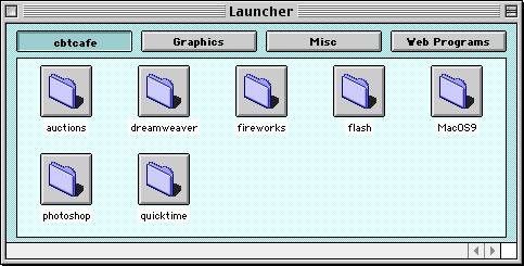
- A separate Launcher in Mac OS 8 (below) provided an editable listing of programs grouped by sections.
Windows: No Dock For You
While Microsoft's Windows borrowed heavily from both the Mac and from NeXT, it did not incorporate anything like the NeXT Dock. Instead, it designated a horizontal TaskBar, which creates a rectangular bay for each open window. The obvious flaw of dividing up the horizontal Start Menu bar into rectangles for each open window is the finite space involved. The perpetually cramped TaskBar doesn't make it clear and obvious which apps are running if more than a few are. Individual windows of a single application are also difficult to represent using wide horizontal bars when more than a half dozen windows are open. There is also no way to scale the tiny icons used in the TaskBar.
In 2001, Windows XP tried to address the problem of cramped boxes in the TaskBar — the inherent result of squeezing multiple, wide bars into a narrow strip — by grouping together the windows of each app into grouped TaskBar items. Grouped items reveal detail when popped-up into a menu of nearly impossible to read window titles. This only further obscured the individual windows of an app, similar to how the classic Mac OS Application Menu made it clumsy to view the currently running applications.
The Windows TaskBar also does nothing to launch applications; Microsoft added a QuickLaunch bar to do that, which sits between the Start Menu and the TaskBar. After launching an app, QuickLaunch does nothing; it doesn't indicate that the app is actually running, and doesn't relate to that application's windows in any way. Oddly, this most useful interface convention of Windows was downplayed in Windows XP Professional, which turns the QuickLaunch off by default; it requires editing the Start Menu settings to restore.
Microsoft may have backpedaled on QuickLaunch to direct attention toward the fancier Start Menu of Windows XP, which requires navigating deeply nestled submenus to launch a application; it was actually presented as a feature. The main problem with QuickLaunch is that it competes with the TaskBar for the minimal space available; having a few QuickLaunch icons means you have even less room to display TaskBar bays for the currently open windows. Users who only ever open three windows won't see the problem, so XP Home leaves the QuickLaunch bar on. However, anyone who uses their PC to do more than browse the web will find the TaskBar nearly worthless even before cramping it up with a selection of QuickLaunch icons.
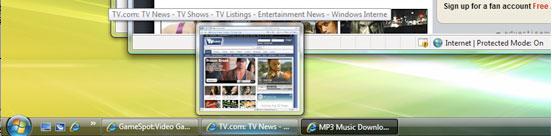
This year's Windows Vista did nothing to fix the absurd Start Menu bar aside from making the Start Menu a round logo ball that conveys even less information about how it might be used, and making the bar itself glossy. The scrunched TaskBar bays can now popup a live preview of the Window they relate to (above), but this requires mousing over each TaskBar bay. Imagine if live previews were just sitting there, live, to preview at a glance without any mousing around? That would take you back half a decade to Mac OS X's Dock.
On page 2: Mac OS X: Return of the Dock; The New Dock in Mac OS X Leopard; and Stacks Take Back the Dock
In 2001, Mac OS X did away with the previous overlapping conventions of the classic Mac OS to deliver a single, simple mechanism for launching apps, storing minimized open windows out of the way, and providing fast access to files and folders. It took its name from NeXT's Dock, but added new functionality by combining the NeXT Dock with the NeXT Shelf; rather than having a limited amount of Shelf space within Finder windows, the Dock gave users an obvious location for dropping anything: apps, files, folders, and open windows: the right end of the new Dock.
The new Dock also demonstrated the graphics prowess of Mac OS X's new Quartz rendering engine by drawing Dock icons with alpha channel transparency, rather than as a series of opaque, square boxes as NeXTSTEP did. Each icon also dynamically and smoothly scales in size along with the Dock. Apple also introduced the magnify effect, which allowed users to shrink the Dock down to a small strip, but blow up icons to a larger size when they are moused-over. Minimized windows animate into the Dock with a genie effect, and icons bounce to indicate that the application demands your attention. Users can also rearrange Dock items using drag-and-drop, dropping new items into it, and dragging unwanted items out. All of these conventions make the Dock highly customizable and information rich, despite being very simple and easy to use.
Like the NeXT Dock, currently running applications in the Mac OS X Dock were tagged with a live indicator (but with a black triangle, rather than an ellipsis), and could be badged by the running application (such as how Mail and iChat get a red badged number indicating new messages). Successive versions of the Dock introduced dockling menus, which allowed users to access functions of apps in the Dock from a popup menu. For example, iTunes' Dock icon allows users to skip the the next song, and iChat's Dock icon lets users set their online status.
Anticipating Vista, the minimized windows in the Dock depict a scaled down version of their contents; a minimized playing movie will even continue to play in its way down into the Dock. With its half decade lead on Windows, the Mac OS X Dock hasn't visibly changed dramatically over the last six years. The translucent Dock background quickly migrated from a ribbed plastic look in the early 10.0 to 10.1 versions (below top) to become a more plainly subtle translucent strip in 10.2 Jaguar through 10.4 Tiger (below bottom). Apple also made it easier for users to hide the Dock, or put the Dock on either side of the screen, functions that were always there but not previously exposed in Dock preferences.


The biggest change related to the Dock in the last several years wasn't even in the Dock, but rather in the new task switcher in Tiger; it painted enlarged versions of the Dock's application icons in prominent view in the center of the screen when using Alt+Tab to jump between applications.
The New Dock in Mac OS X Leopard
It's therefore notable that Leopard sports an entirely new Dock appearance, which now presents its icons as three dimensional objects sitting on a translucent glass shelf, rather than flat objects stuck in a translucent ribbon of icon flypaper. Dock icons now cast a reflection on the Dock (as do other windows on the screen, and even the background image), as well as casting a shadow behind them. The combination of the reflection and the shadow contribute to their dimensional appearance.

The black triangle denoting running applications has been replaced with a more subtle indicator which looks like a glowing blue LED. It's nearly invisible unless you look for it, at which point it is quite obvious. The reflections, shadows, curving texture, indicator lights, and translucency all add up to a new sort of Dock that aspires to show off the user-selected background and add visual interest; one might also complain that it looks busy. I found the new Dock both familiar and fresh. It only looks wrong when you obsess over its details. Once you start looking for reasons to be irritated, you can certainly find all sorts of things that are objectionable; the harder you strain on its details, the more irritating they are. Fortunately, I don't have time to get upset about which way a shadow falls, so I can't complain about nausea and vertigo as some have.
Along with Leopard's translucent menu bar, the new Dock has been a sore spot for users who don't like change; there were similar complaints when Apple changed from the mess of various launchers, switchers, and window minimizers of the Classic Mac OS to using the Dock. Apple has been open to making some changes in response to feedback; it toned down the translucency of the menu bar in recent builds, and made the separator between Dock apps and its Shelf items to the right (it is invisible in the images Apple depicts in its Leopard preview website, such as the image above) more prominent in new builds of the Leopard Dock (A new 'highway stripe' separates the Dock's applications from files, folders, and minimized windows in the image below). Apple didn't go so far as to do away with the new dimensional Dock entirely, however.

The biggest complaints have been that icons in the new Dock sometimes appear to cast multiple shadows (since many icons already include a shadow), and that it looks silly when used on either side of the screen vertically; that's because the more dimensional icons appear to hang in space next to the Dock, rather than seeming to rest on it or float above it as they do in its default bottom position. Of course, if it bothers you that the Docks' icons float in space with no physical structure holding them up when it is positioned vertically, how did you ever survive the logical conundrum of desktop icons floating in space against the Mac desktop, as they have for decades? The other problem inherent with a vertical Dock is that the wide screens of Apple's laptops, iMacs, and other displays can't physically fit in as many icons in a vertical Dock compared to a Dock in the default position along the bottom.
Stacks Take Back the Dock
Many Mac users drop every application they are likely to ever use in the Dock, resulting in a strip of icons that consumes most of the width of their display and forcing individual icons to be drawn smaller. Users with lots of open windows are also likely to minimize them, leaving the Dock burdened on both ends with too many icons to manage. This clouds the original idea of the Dock, which is to present lots of useful information in a simple context. There are two new major features of Leopard that help clean out the Dock and make it more usable.
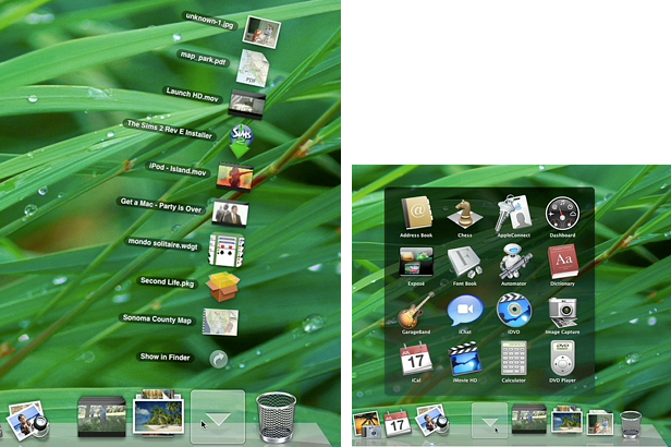
The first is Stacks. Drag a folder to the Dock and it becomes a Stack. Its icon changes from the folder's native icon to instead represent the collection of its contents. So far, that's only a distraction, as the Stack icons look a bit messy and cluttered (as stacks of stuff tend to do).
The real benefit comes from clicking on the Stack. If there are about ten items or less, they fan out in to an arc, like a magician's cards (below left). Click on an item (any item) to launch it, or in the case of a folder, to open it in the Finder. If there are lots of items in the Stack, they pop up into a translucent window area with a grid of icons that can be selected (below right). This makes each Stack item equivalent to a Dock annex.
Apple drops three Stacks in the Dock by default: Applications, Documents, and a new Downloads folder Stack. Any folder or selection of items dragged into the Dock will also become a new Stack, with identical behaviors to those described below. Right-click on a Stack to pop up a menu of options. Among them is the option to use a Fan or Grid style display, or to allow the system to choose which to do automatically based on the number of items in the Stack. You can also set the display order of Stack items to be alphabetical by name; by date added, created, or modified; or sorted by kind.
On page 3: The Applications Stack; The Documents Stack; The Downloads Stack; and The Lean, Clean New Dock
Having the contents of your Applications folder ready for Exposé-esque access with a single click means you don't have to load the Dock with icons for apps you don't use every day. How well does it actually work? Extremely well: click on your Applications Stack to pop up its contents, and you don't even have to scan through all your icons to find what you're looking for; you can type the first letter (or first few letters) to select the app you want, then hit return to launch it. You can also move the selection around with arrow keys, then hit new characters to jump to a new selection. This is a great app launcher.
The only downside is that some developers insist of putting their applications into a folder of junk and then name their apps after themselves, notably Adobe and Microsoft. Dear Adobe, I know you make Photoshop. Don't call my Photoshop "Adobe Photoshop," and please don't stuff it inside an "Adobe Photoshop" folder. Anyone who knows how to transverse folders to install a plugin can probably also handle doing a Show Package Contents. Just give me a Photoshop icon. We're Mac users, remember? We don't need a Programs Folder so messed up that the operating system warns us not to peruse it, as Windows does, expecting that we set up a parallel bunch of icons hidden away in the Start Menu's program manager just to launch apps.
Of course, the Applications Stack isn't the only way to quickly launch a non-Docked app in Leopard. Spotlight is now a Quicksilver-like, fast app launcher as well. Type Apple+Space and then "ill" and it will almost instantly provide "Adobe Illustrator" as a result that can be launched with a hit on the spacebar. Between Spotlight and Application Stacks, you'll be able to launch apps in a flash without leaving piles of app icons loaded in the Dock or app aliases strewn across the desktop. That leaves more room for documents and minimized windows in the Dock.
The Documents Stack
Of course, you won't need to drop all your recent documents in the Dock either. In addition to the Apple Menu's Recent Documents menu that's always offered a quick link to your most commonly used files, the new Documents Stack in the Dock provides quick access to all your folders of documents just like the Application Stack. If you've organized all your client or project files into folders in whatever way makes sense to you, being able to click on the Dock's Documents Stack to pop up a window full of your folders makes it easy to quickly target the subset of files you're looking for in the Finder.
That saves you some clicks over selecting the Finder, creating a new window if you want to preserve the view of the existing one, selecting your Documents folder, then finding the intended folder by sorting through a long list. With the Documents Stack, you can quickly pop right to the subfolder you have in mind without any slow, deliberate navigation.
The fact that Leopard now dynamically depicts the actual contents of many types of documents in their Finder icon (as Windows Vista already does) makes the Document Stack a fast way to find loose documents too, without opening a Finder window and selecting an icon or Cover Flow view. The Documents Stack makes finding what you're looking for fast and intuitive. You can similarly create your own selection of graphics, documents, or movies and drop them into a Stack for easy reference.
The Downloads Stack
Leopard introduces a new convention for downloaded files. Rather than dumping web downloads and saved email attachments on the desktop, it now defaults to throwing all downloads into their own folder: ~/Downloads. The Downloads Stack of that folder makes it easy to find the last few items you've downloaded, without digging around through Finder windows or asking the browser to reveal where it dumped your download.
Once you download something, the Downloads Stack bounces once to indicate that the download completed. The Stack Dock icon is also updated to reflect that your most recent download is sitting on top of the stack. When you click on it to fan out your recent downloads, the newest item is at the bottom, which seems to make less sense but results in it being a closer target to your mouse pointer.
In earlier builds of Leopard (and as Apple depicts on its site), the Downloads Stack formerly put the newest item at the top of the fanned out icons, and put the "show in Finder" link at the bottom of the arc (as depicted in the graphic above left). The latest builds of Leopard switch that around; the Finder link is at the top, and the new download is the closest target at the bottom.
The Lean, Clean New Dock
Those three Stacks, stuck in the Dock by Apple (and removable by a simple drag poof), offer to greatly minimize the number of icons most users will want to leave in their Dock, leaving space open for more minimized windows without cramping down the size of icons. In other words, there's less to clutter in the Dock and on the desktop.
The new Dock, along with Spotlight, makes it easier to quickly locate and target both applications and files. In addition, the new Finder — with its slimmer, space conserving Dock-like sidebar — also acts like a Shelf for sticking files, folders, and applications for later use. As the Road to Mac OS X Leopard: Finder article noted, the new iTunes-like sidebar makes it easy to customize Finder windows with links to whatever files or folder the user desires.
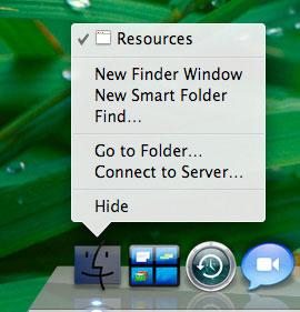
The Finder's Dock icon also gains a few functional shortcuts in its dockling menus for creating a new folder, a new smart folder, performing a search, 'go to folder' (which allows you to type in a path, useful for browsing invisible directories), and 'connect to server' (for browsing or entering a URL address to a WebDAV, FTP, AppleShare, NFS, or SMB Windows file server). Screenshots of Leopard already published on the Web depict these features (below).
The only desktop problem that remains is tons of minimized windows in the Dock. If you hate having to choose between having a desktop cluttered with too many open windows or a Dock full of too many minimized open windows, Leopard provides another new feature to solve that dilemma, which will be examined in an upcoming Road to Leopard report.