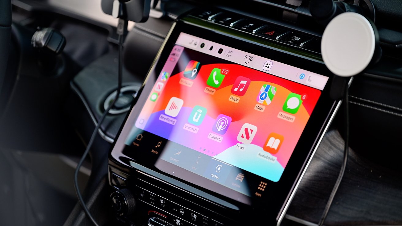
In iOS 18, CarPlay is getting a ton of new features, including accessibility boosts, Siri enhancements, wallpapers, and more! Here are our favorite adds to Apple's in-dash interface.
We've been testing the beta of iOS 18 and have dug through CarPlay, on the lookout for new features and changes. Many changes are coming to existing users, but there is also news on the next-generation update as well.
CarPlay in iOS 18: Siri
Apple's digital assistant is getting a huge makeover with Apple Intelligence, but CarPlay's changes are a bit more minimal.
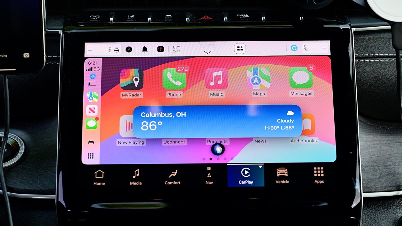
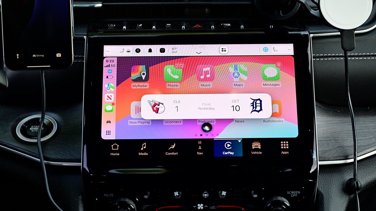
When you query for weather or sports scores, there's a new on-screen UI. It's compact in the middle of the screen with more graphics than before.
Checking in on the score of the Guardians shows each teams logo, where they are in the game, and the current score. It looks very similar to the new Live Activity widget on Apple Watch.
With iOS 18, Siri is also now bilingual. This means you can converse with her in multiple languages. This is especially useful for messages where you switch between a couple languages.
For vehicles that don't have CarPlay, there is a new feature that helps improve Siri's audio quality. When you connect to a car that doesn't have CarPlay via Bluetooth, it will give you new Siri response options in Settings.
It can route audio through the media source and will sound much better. This has been a long-held complaint among non-CarPlay users.
Siri has a new icon in the Settings app too, looking inspired by Apple Intelligence with bright colors on a lighter background.
CarPlay in iOS 18: Messages
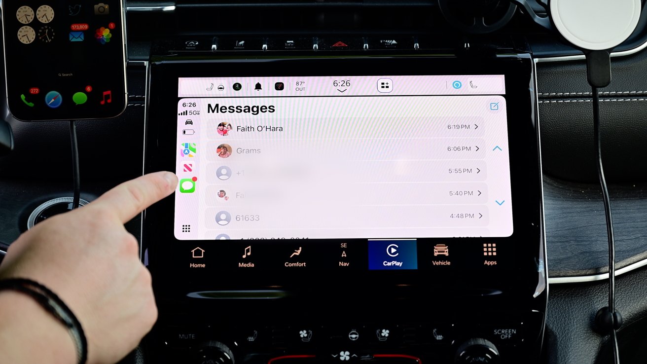
Siri's message-sending user interface is getting a refresh too. It will show your contact's profile picture next to their name.
Below the image and name is still the same cancel, change, and send buttons that existed before.
If you launch the Messages app, these profile photos are carried over here too. It makes the app look more graphical and not so text-heavy, which is probably a good thing for in the car.
CarPlay in iOS 18: Wallpapers
As Apple has nearly every other year, there are several new wallpapers. There are a total of four designs that come in both light and dark hues.
The new wallpapers match that of the stock iOS 18 ones. The colors are blue, grey, yellow, and purple.
@zollotech new CarPlay wallpapers. They also have removed old ones. pic.twitter.com/mj7uP0GlAQ
— Bryce (@PraisebIe) July 23, 2024
You can set this from the Settings app inside your vehicle and they will automatically switch from light to dark if you have it set to automatically.
At the same time, Apple also removed some of the older wallpaper options.
CarPlay in iOS 18: Accessibility
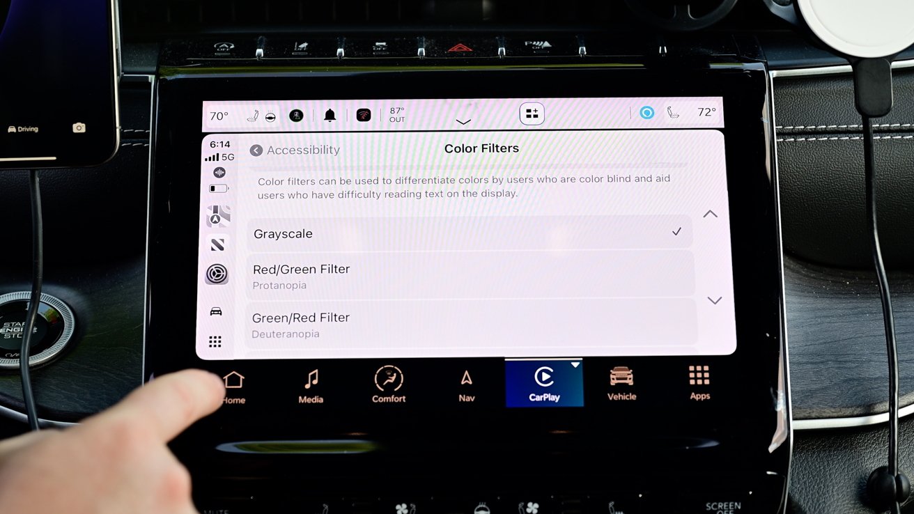
Apple has always prioritized accessibility features across its products, and iOS 18 expands even more of them to CarPlay. First among them is a collection of color filters.
These will help those hard of seeing or that suffer from various degrees of color blindness. It will tint the whole display based on the one you choose.
There's even a greyscale option. Intensity can be controlled too with three levels to choose from.
Outside of color filters, there is a new bold option. This bolds text system-wide, making it easier to read.
Voice Control is new, giving users the ability to navigate the system just by speaking. Without having to say Siri, you can tell the system to select a button, scroll, or go back.
It works very well and is an easy way to use CarPlay hands-free.
Finally, there is sound recognition. With this enabled, CarPlay will alert you if it hears a siren or horn honking around you.
CarPlay in iOS 18: Next-gen carplay
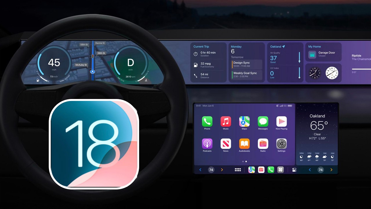
One of the major questions surrounding CarPlay is where the next-generation of it is. Apple announced it years ago, but so far, we've seen very little adoption.
The first vehicles will reportedly arrive by the end of the year, though they've been limited to luxury models. Few mass-market vehicles have even been announced.
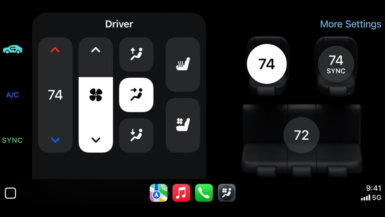
Apple did provide some updates during WWDC, including making it easier for auto manufacturers to implement it. The iPhone-maker is even making some concessions, allowing for interfaces like punch-through apps.
Punch-through apps work for parts like the rear-view camera and display the native UI within CarPlay. This lightens the load for car makers because they don't need to create a whole native experience, but can recycle what they already have.
There are also new alerts that they can use, such as for when an EV has finished charging. They display in the same format as other CarPlay alerts.
With some of these changes, perhaps we'll start to hear more news on future vehicles.
The newest update to CarPlay will be available this fall and is currently available to both developer and public beta testers.
