New Office 11 for Mac sports dense ribbons of buttons
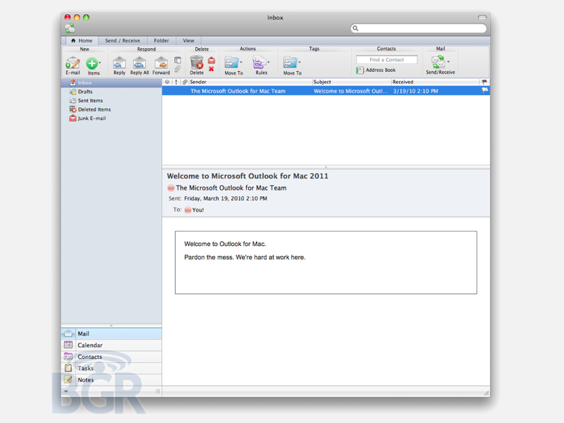
The screenshots, posted by BoyGeniusReport, present the new look of Word, Excel, PowerPoint, and the entirely new Outlook for Mac (with Exchange support) and separate Address Book, Notes, and Calendar apps.
Formerly, Office for Mac combined all messaging related features into Entourage, which has served as a second-rate equivalent to the Windows-only Outlook ever since Microsoft canceled its Mac Outlook client for Exchange nearly a decade ago.
Microsoft has since unbundled its "everything" Outlook strategy to deliver individual contact, email and calendar apps since Windows Vista, matching Apple's component app model for Mac OS X.
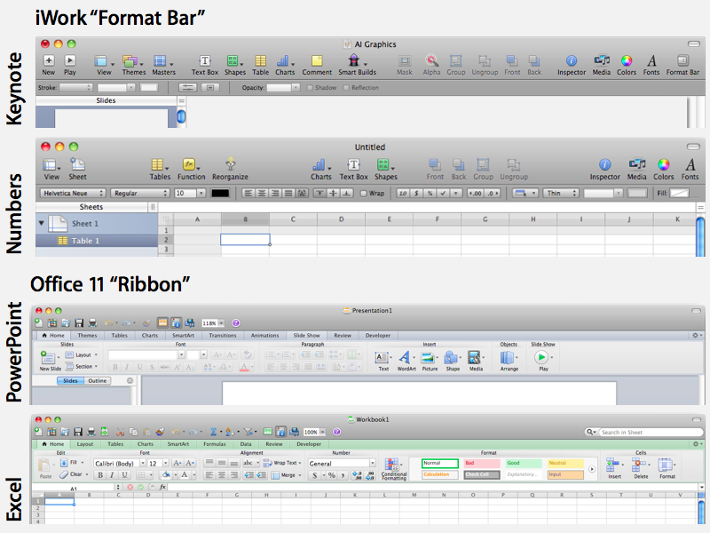
Using a toned down strip of buttons that drops the candy colored theme Office 2008, the upcoming Office 11 for Mac will incorporate a version of the Windows Vista-era "Ribbon" to present organize a huge array of options typically hidden away in standard menus.
The new UI (as demonstrated in Outlook 2011, above) incorporates more of Apple's standard human interface guidelines, in part because it now uses Cocoa, which makes it easier to deliver familiar feeling apps on the Mac than the legacy Carbon framework that Office was originally developed under decades ago.
Office 11 vs iWork 09
Still, Office 11 looks decidedly different than Apple's own iWork apps, which present a standard Mac OS X toolbar along with "Format Bar" of contextually relevant tools that change as different elements are selected.
The iWork apps also leave many minor options hidden within the standard Mac OS X menu bar, which Windows lacks (apps for Windows incorporate menu bars directly within their own window).
For the iPad, Apple adapted the user interface for iWork in such a way so as to present nearly all of the same features without requiring much in the way of relearning how to use it. Microsoft has not delivered a tablet version of Office, reportedly because of political and management issues flaring between the Office group and engineers working on Tablet PC.
The Office Ribbon
Starting with Vista, Microsoft added a "start button" and turned the standard Office menu bars into a Ribbon, which packed a dense number of options into a tight space, organized by feature.
The Ribbon feature has proven controversial, with Microsoft's supporters hailing it as the future of user interfaces, and its critics arguing that the move is simply an arbitrary change intended to derail any familiarity with (and therefore potential for competition from) its free OpenOffice doppelgnger.
Because the Mac version of Office doesn't need to incorporate the system menu bar within its own window, the idea of the Windows Ribbon makes less sense to Mac users, but the MacBU has created a Ribbon for the new Office suite that seems to work, even if it does consume a lot of screen real estate.
 Prince McLean


 Chip Loder
 Andrew Orr
 Marko Zivkovic
 David Schloss

 Malcolm Owen

 William Gallagher

