The multi-million-dollar Kickstarter sensation Pebble smart watch will begin shipping to the first customers later this month.
The company behind the watch announced at CES on Wednesday that Pebble will start shipping on Jan. 23, and all Kickstarter backers should receive their hardware over the course of six to eight weeks. The device raised more than $10 million in funding last year to make it a reality.
About 85,000 people backed the project when it was in the concept stage on Kickstarter. It will take time to deliver to all of those customers, as only about 15,000 Pebbles per week can be manufactured in its current state.
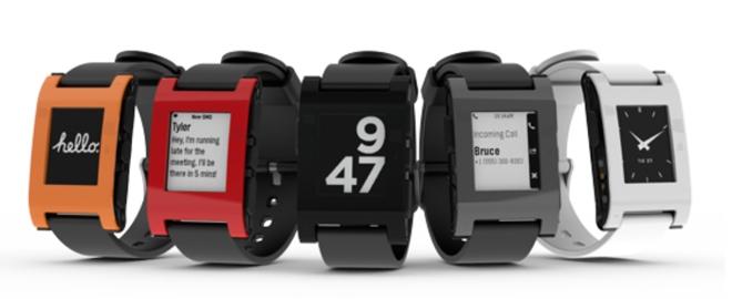
The face of the watch is a black-and-white LCD display, while the device itself receives text messages, phone calls and other notifications from a smartphone connected over Bluetooth.
The Pebble sells for $149 and is available in black, grey, red, orange, and white. Customers who didn't contribute on Kickstarter will start receiving watches once the initial backers have been shipped theirs.
The 1.26-inch Pebble display has a resolution of 144 by 168 pixels. It's a higher quality screen than the top-lit 96-by-96-pixel screen found on the competing MetaWatch, which AppleInsider took a first-look at last month.
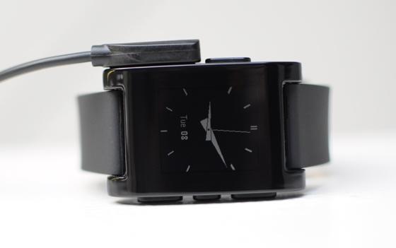
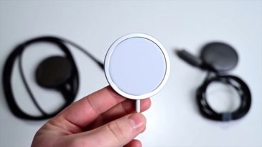
And unlike the MetaWatch, which relies on an awkward charging clip, the Pebble uses a magnetic charging cable that clips to the side of the device. This allows the Pebble to have a water resistance rating of 5ATM, good enough for swimming and washing dishes.
Messages and alerts will be sent from an iPhone or Android device to the Pebble via accompanying applications on the respective platforms.
The company also announced its own cloud tools that will allow users to create their own macros dictating when notifications will be sent to the Pebble. For example, users could have their watch notify them of severe weather alerts, or when a stock hits a certain price.
 AppleInsider Staff




 Christine McKee
 Marko Zivkovic
 Mike Wuerthele

 Amber Neely
 Sponsored Content
 Wesley Hilliard



11 Comments
I'll wait for the iPhone Nano.
I'll wait for the iPhone Nano.
dont hold your breath.
This pebble is a decent start - and better in many ways than anything else so far. Its not ugly, but its hardly something beautiful either - and the need to charge frequently is a major reason why many people who buy it will not use it after the honeymoon
I like it. Torn between this and the Cookoo, but you can actually read texts on this one - much better than looking at a phone in a meeting. I'll wait for youtube reviews before making a decision, I guess.
What an awesome concept that has been executed. This is my favorite one so far... Now if only Apple could improve on it. For the record, I have the new nano- and I like it- beautiful design. But I have questions: Why did the nano have to get bigger? Do I really need a screen that size? Or to watch video? Why, with as big as it is, does it not have a tiny speaker or low quality camera? I only say this because of the size being bigger. If we're going to have it bigger, lets at least make it a poor mans touch without apps. Again- this just goes back to the- why bigger? I don't get it. Personally, I think they should have kept the size the same, given it Bluetooth, fm, and lightning. Then in 2013 they finally push apps and wifi to it. Then in 2014 we finally get our nano watch. But that's just me- I realize there are tons of opinions on the nano.
Looks like a miniature Zune for your wrist.