"Our goal at Apple is to make great products that our customers love," Apple's chief executive Tim Cook stated at the end of the WWDC keynote. Happening upon what customers love is a bit more complicated than it sounds, however.
Prior to the unveiling of iOS 7, it was widely rumored that Apple would strip the "skeuomorphic" aspects of its appearance, details like faux "Corinthian leather" in the Calendar app and the virtual green felt of Game Center.
Less obvious was the actual overall look Apple would target, and particularly how it would going about arriving at a given overall appearance. However, the company has been dropping hints at its design direction for months.
The web pages for iPhone 5 and iPad mini introduced the delicate use of Helvetica Nueue Ultra Light, and apps ranging from last fall's iTunes 11 to the WWDC app itself (below) hinted at a path toward a lighter, cleaner, flatter design.
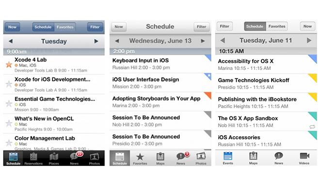
via Garee's Blog
Leveraging technology in design
There's also the general progression of Apple's core technologies. In 2001, Mac OS X introduced "Quartz" as a new compositing graphics engine that enabled real transparency and shadowing effects. Initially, Apple used this to reflect the translucent white plastics of the then new iMac.
It took Microsoft more than half a decade to bring similar advanced graphics compositing to Windows in Vista, giving Apple a design lead advanced through technology.
When the iPhone arrived in 2007, it built upon OS X's advance graphics foundation to deliver hardware accelerated animations throughout the interface that reflected its new multitouch interface, a pair of modern concepts that instantly made the existing crop of button and thumbwheel driven smartphones look ancient.
Similar to Microsoft's Vista, Google's Android smartphones didn't gain similar graphics capabilities until version 4.0 arrived at the end of 2011 (and most Android phones still don't run this version of the software), again about a half decade after Apple unveiled its original iOS product.
Were Apple to simply give iOS 7 a revamped "skin," it would be much easier for Samsung and other Android licensees to duplicate it. But the new release leverages a series of technologies that designed to keep iOS 7 an original product.
Emphasis on simple
iOS 7 clearly aims at delivering simplicity. But as Apple notes, "simplicity is quite complicated."
The company's design overview of iOS 7 states, "Simplicity is often equated with minimalism. Yet true simplicity is so much more than just the absence of clutter or the removal of decoration. It’s about offering up the right things, in the right place, right when you need them. It’s about bringing order to complexity. And it’s about making something that always seems to 'just work.' When you pick something up for the first time and already know how to do the things you want to do, that’s simplicity."
There are plenty of simple Android apps that aren't designed well, don't 'just work,' and aren't intuitive to use. Delivering good simple design isn't just about being simple.
Contrast Apple's first major revision to the appearance of iOS with revamps delivered by Google (Android Holo, in version 3.0 for tablets and 4.0 for smartphones, below top) and Microsoft (Windows Phone 8 "Metro," borrowed from the Zune, below bottom). Apple says iOS 7 "brings clarity to the entire experience," and says "conspicuous ornamentation has been stripped away […] there’s greater focus on what matters most: your content."

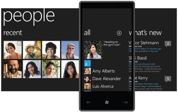
Google's Android Holo appearance is all about the chrome, introducing angular "droid" themed controls. Windows Phone focuses attention on its whimsical typography, tiled boxes design and navigation through OS-centric concepts such as Hubs.
There are certainly elements of iOS 7 that can be linked to portions of Android, WebOS, WP8 or other existing products. But the direction Apple took isn't just a refreshed layer of appearance to bring it into line with the latest design trends.
Further, as Apple notes of its revamping of iOS 7, it has "refined the experience to make it even more effortless and useful. So the everyday things you need to do are the everyday things you want to do. And iOS 7 lets you work in ways that are instantly familiar, so there’s no need to relearn everything."
That's a shot at both Microsoft's radically different Windows Phone / Windows 8 and the inconsistent appearance of devices that make use of Android.
On the corner of technology and Liberal Arts
The layered design approach in iOS 7 exemplifies the leveraging of Apple's compositing graphics prowess that propelled it five years ahead of the status quo twice in the past decade.
In addition to the technical aspects of layering views on top of each other, Apple has also codified a design language to describe how layers should behave. "Distinct and functional layers help create depth and establish hierarchy and order," the company notes.
"The use of translucency provides a sense of context and place. And new approaches to animation and motion make even the simplest tasks more engaging."
Part of this "new approach" is a motion controlled parallax effect that allows you to tilt the device and see an apparent shift between layers.
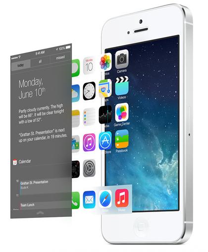
The company also notes other examples of making iOS 7 more cohesive. While many apps in iOS 6 have the original glossy highlight introduced on the first iPhone (apart from a variety of new apps that don't, such as Maps and Notes), and make use of inconsistent styles and colors, iOS 7 works to bring icon designs into focus.
Apple has been "redrawing every icon around a new grid system" for consistency, "and sticking to a precise color palette" to make the overall OS 7 experience cohesive. "They all work together to create a more harmonious relationship between individual elements," the company states.
Transparent panels for notifications, controls, Siri
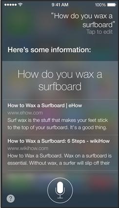
Another applied use of layering via the compositing graphics engine in iOS 7 is the use of transparency to reinforce the modality of features like Notification Center (swiped in from the top), Control Center (swiped up from the bottom) and the enhanced new Siri (invoked by double tapping the Home button).

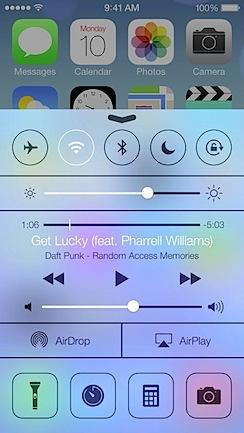
In all three, the use of a translucent background makes it clear you are interacting with a temporary foreground element. All three features were first introduced by other mobile platforms or apps, but Apple integrates and refines them to look and work similarly in iOS 7.
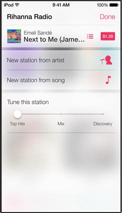
Similar use of transparency to establish a "sense of place" and modality are used in the new iTunes app, such as when editing an iTunes Radio station (below)
Photos to impress
One last example of the graphics technology Apple is leveraging in iOS 7 is in Photos. In 2007, the original iPhone's ability to display hundreds of rows of photos and quickly zip through the list with a finger swipe was an impressive feat.
Android and other devices long had trouble navigating similar lists smoothly, resulting in the stuttering "lag" that users complain about. Apple addressed the issue with advanced hardware acceleration techniques used throughout the interface to provide an instantly responsive experience.
Now, six years later, Apple has added a new layer of sophistication to the design of Photos that builds upon this concept and the increased graphics capabilities of modern mobile devices. Now, Photos are automatically organized into "Moments" by their date and GPS location metadata.
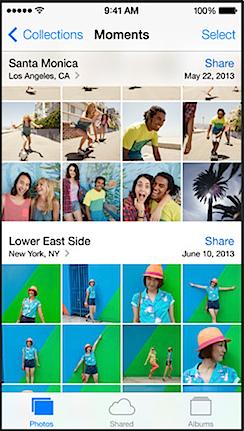
Further, iOS will back out into a year mode that packs hundreds of photos into the screen. By simply scrubbing over the mini-thumbnails with a touch, you can preview and open specific shots taken months ago. That's as impressive as the original iPhone's photo capabilities were when they debuted.
Google hasn't focused on delivering similar functionality for Android users because there's no ad revenue tied to displaying a user's own personal photos. But on top, Apple also has sophisticated media handling technology associated with its iLife and Pro Apps it can use.
Overall, the design cues of iOS 7 reflect not just an interest in creating an attractive, usable interface, but also the sophistication of the technology Apple now leads in many respects, and which it employs to drive the look and feel of iOS 7's new design.