Recent versions of Apple's Mail.app email client haven't been well received, leading to the release of a slew of alternatives. AppleInsider takes a look at how the company is trying to win back its users in OS X Yosemite.
Design & Performance
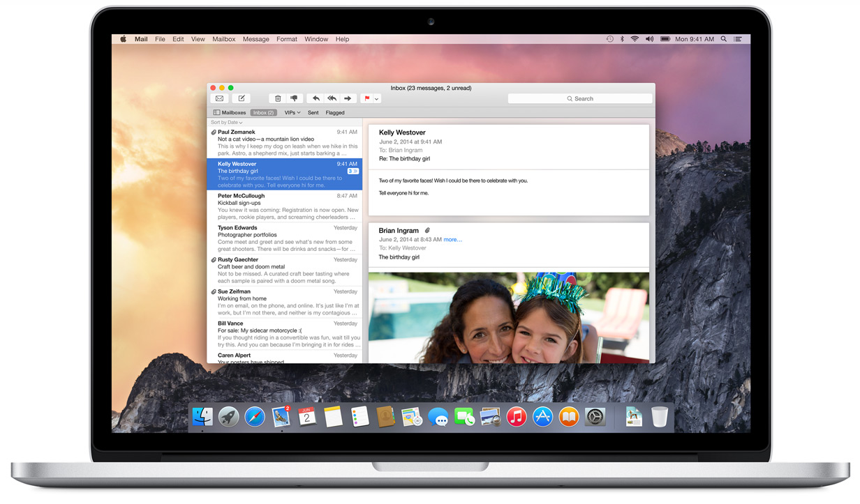
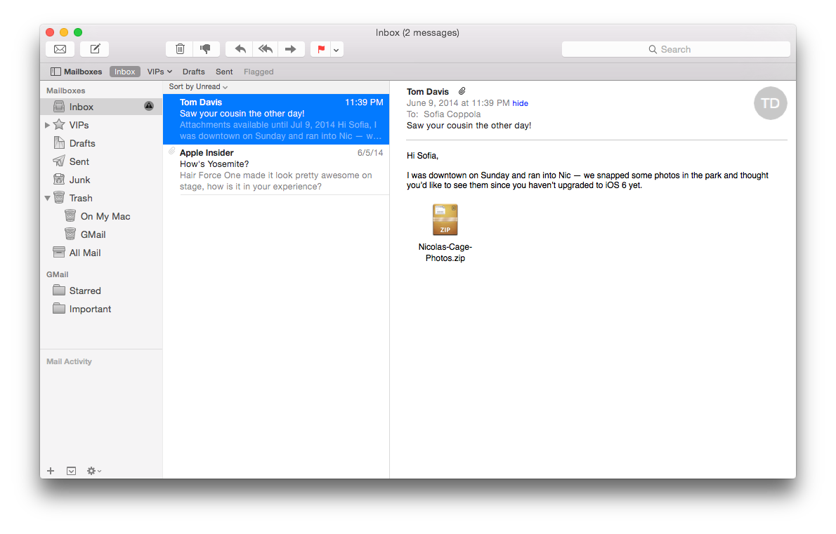
Mail adopts the new design language introduced with OS X Yosemite, featuring a translucent side panel and new, thinner button glyphs. The layout remains largely the same as it has in the past, though many areas have been given minor nips and tucks for simplification.
The message window now features iOS 7-style round profile photos, and displays the sender's white-on-grey initials if no photo has been set.
In our experience,Mail is much snappier than it has been in the past, even when testing with more than 10,000 messages in the inbox. We did experience a number of hangups, but they came almost exclusively during testing of the new Mail Drop feature with multi-gigabyte files and we expect those to be ironed out as the beta program rolls on.
Markup
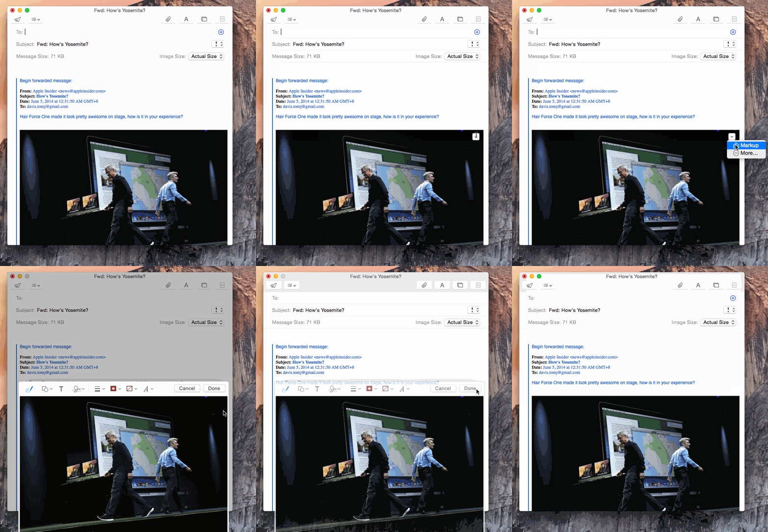
A big to-do was made of the new annotations feature — called "Markup" — during the app's unveiling at Apple's Worldwide Developers Conference, and the feature works as advertised. Users can enter Markup mode by using the contextual menu that now appears in the upper-right hand corner of objects embedded in a message when the user hovers over them with the mouse pointer.
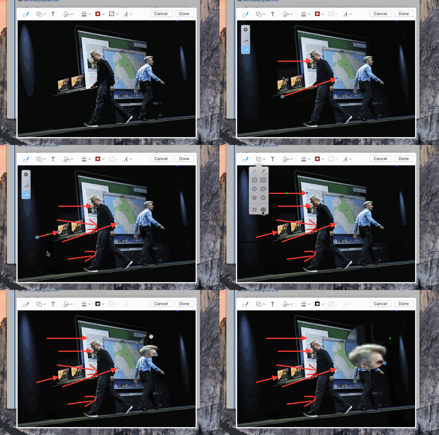
The Markup tools are similar to those found in previous releases of Apple's Preview app, with a few alterations. Users can now sign their name using the trackpad, for instance, rather than having the sometimes-wonky method of signing a piece of paper and holding it up to the camera forced upon them. Markup also adds a new permanent magnifying loupe, letting users zoom in on a specific portion of an image before sending.
The new "draw a shape" feature does needs a bit of refinement — it doesn't accurately detect shapes made from two separate strokes, for example — but it works as demonstrated in the keynote. We found that it's still faster to add Apple's pre-made shapes and simply move them around, however.
Mail Drop
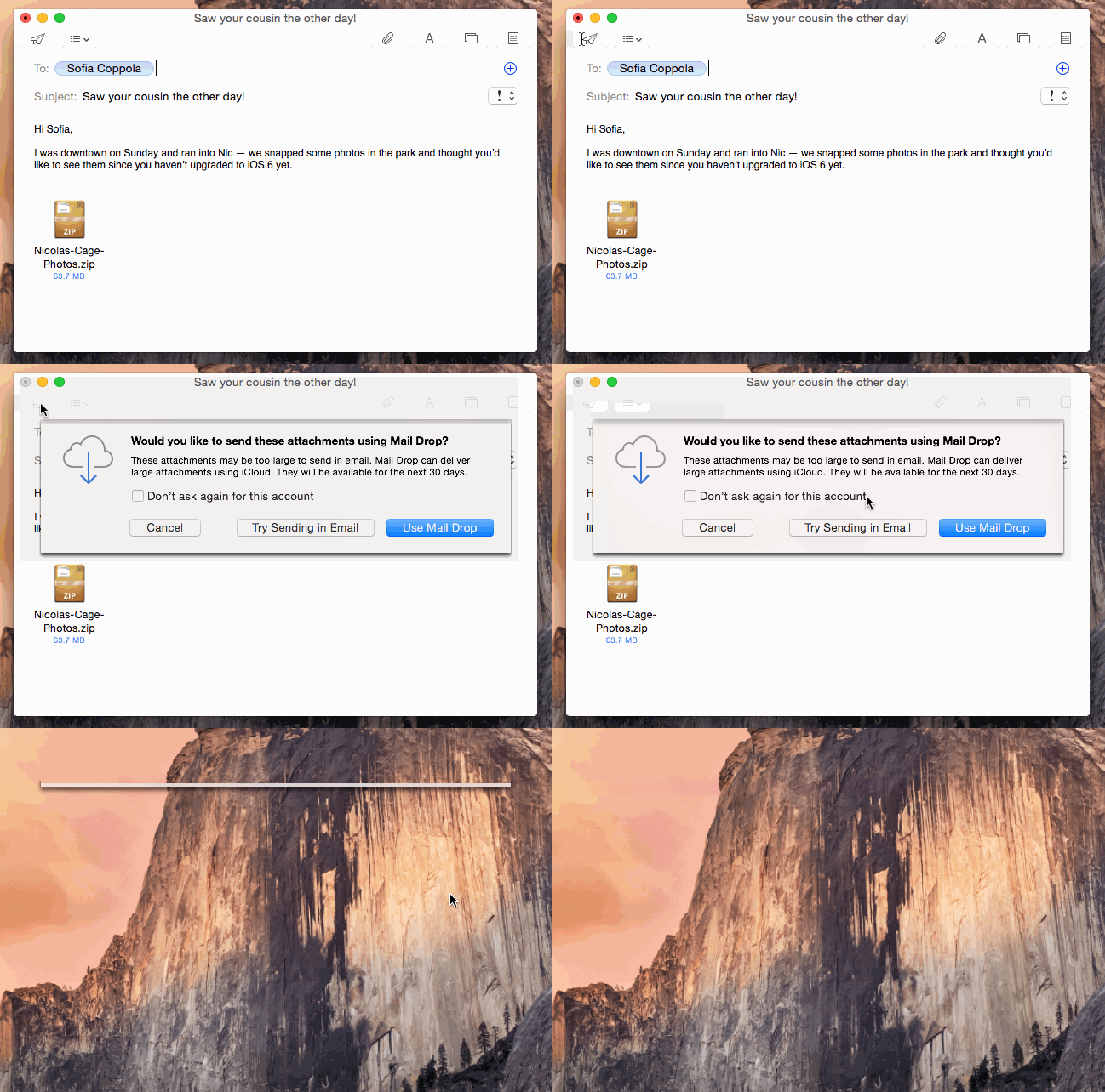
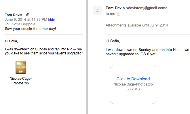
Mail Drop allows users to send files of up to 5 gigabytes as an attachment to an email by sending the file itself to iCloud and forwarding on a link to the file, rather than the file itself. To other Apple Mail users, the process is completely transparent: the file sits in the received email as though it were a normal attachment. Users of third-party clients will receive a text link to download it from Apple's servers.
When users attach a file over a predetermined limit — which appears to be dynamic based on the user's email provider — pressing send will ask whether to use Mail Drop or try to send the attachment normally. In our testing, Mail Drop only worked well with files up to about 100 megabytes; we chalk this up to the app's early beta status, though, and expect it to be fully functional by the time Yosemite is released this fall.
The only downside to using the service for large files is that the email will occasionally arrive before the file has finished uploading to iCloud, resulting in a missing file error for the recipient. We haven't yet been able to determine at what point in the composition process Apple begins the upload, but we suspect that the company can tune Mail Drop to eliminate this issue by altering the time the mail is held before sending.
 Sam Oliver



-m.jpg)


 Marko Zivkovic
 Mike Wuerthele
 Christine McKee
 Amber Neely
 Sponsored Content
 Wesley Hilliard


 William Gallagher







14 Comments
I don't really understand the icon methodology in Yosemite. Why are some dock icons realistic, while others are abstract like their iOS7 counterparts? It's just odd. ie, why did they redesign the mail icon to use the ultra out-dated stamp symbolism? Wouldn't it make more sense if it looked somewhat similar to the iOS mail app, ie. en envelope? I think it would go along way into getting new OSX users to try the mail app (who use it on iOS). I often try to find the logic behind these decisions but have trouble doing so. Having visual consistency for the same iOS/OSX apps (reminders/notes/etc) would seem to make sense.
1) I haven't gotten Mail Drop (or any Continuity feature) to work as of yet. 2) What's with the Nic Cage references on this site? Is there is an inside joke I'm not getting?
I don't really understand the icon methodology in Yosemite. Why are some dock icons realistic, while others are abstract like their iOS7 counterparts? It's just odd. ie, why did they redesign the mail icon to use the ultra out-dated stamp symbolism? Wouldn't it make more sense if it looked somewhat similar to the iOS mail app, ie. en envelope? I think it would go along way into getting new OSX users to try the mail app (who use it on iOS). I often try to find the logic behind these decisions but have trouble doing so. Having visual consistency for the same iOS/OSX apps (reminders/notes/etc) would seem to make sense.
Because Apple experiments with different styles all the time.
They are aware that their first decision will not always be right, so they mix and match quite a bit. iTunes is a great example of this, where iTunes has essentially been a beta for UI features.
The Mail Drop feature is killer (if it works as advertised). Bye-bye Dropbox and all of those free file sending services.
PLEASE Apple add Flag for Followup in Mail like Outlook!
Not simply flagging an email that will appear in a folder, but flagging an email with a followup reminder with alerts (tomorrow, next week, custom date, not specified). Followup pane that has all the emails needing attention sorted by reminder date with not specified at the top. Using not specified is a great way to have a few always used emails quickly at hand, such as a list of name/numbers to people in your group. Again, just copy Outlooks followup feature.
Thanks!
No, I don't want to drag emails into the reminder app or any other cumbersome workaround.