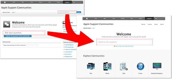
Apple on Thursday updated its forum-style Support Communities webpage with a new dual-purpose text input box that can both search and post questions, as well as and a fresh look more in line with other pages on the company's website.
As seen in the image above, the most obvious change to the Apple Support Communities site is a large central text entry box that rolls in search functions with question submittals. Until now, the two assets have been separate entities.
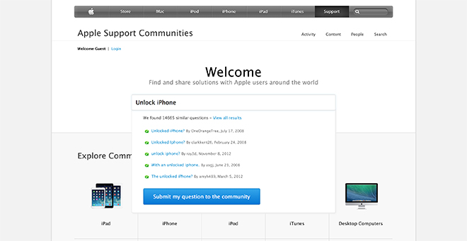
The new search box is also "instant" in that it dynamically runs searches for relevant discussion matches as users type in text, pulling up a list of possible hits from across the Communities website. Alternatively, registered members with a valid Apple ID can type in a question and have it posted to the appropriate forum by clicking on a large button labeled "Submit my question to the community."
Other changes include a new exploration feature that allows users to browse the Community pages by category and topic. Options include current and past devices, software, iCloud, developer forums and tutorials, among others. Forum views are also revamped, with a sliding carousel bar at the top of each page pointing to popular threads and discussions within that section.
Also built in to the revamped design are new sections like "People" that include search functionality. Another section offers quick links to discussions in which users are currently active.
Apple has been working on offering a more consistent online presence by building site design changes that incorporate more iconography and fewer text links.
The tweaks may be a reflection of the company's growing mobile device ecosystem. With more customers reaching Apple.com from iPhones and iPads, the new layout appears to be moving toward one tailored to touchscreen rather than keyboard and mouse input.


