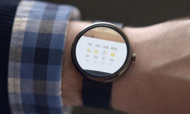
Motorola has finally released its Android Wear-powered Moto 360 smartwatch — Â wisely or not, just days before Apple is expected to debut its "iWatch" — and early reviews say that the device is a fine standard bearer for Google's wearable operating system, though it could benefit from some more time in the lab.
Joanna Stern of the Wall Street Journal
Calling the Moto 360 "a big step in the right direction," Stern praised the device's design and build quality. The stainless steel and leather construction make the watch "look and feel like something you'd find at Tourneau rather than Best Buy," while she appreciated the ease with which the numerous watch faces could be read outside — Â an area where other smart watches fall down.
One factor working against the Moto 360 is its size, Stern said. Its 1.8-inch round display "almost looks like I grabbed a clock off the wall and strapped it to my arm." Combined with its relative thickness, the wearable looks outsized on all but the largest wrists.
Stern also panned the Android Wear software, saying that sheer volume of notifications — Â with little ability to control them — and the lack of an available app ecosystem overshadowed its otherwise useful features. She was impressed by Google Now's ability to help her avoid traffic on the way to her next meeting, for instance, and said that the Moto 360's voice recognition worked well for setting reminders or checking the weather.
The biggest knock on the device, however, is its battery life. Stern was forced to charge the Moto 360 as much as twice a day, and there is no mechanism for using it as a watch — Â smart or dumb — Â once the battery runs dry.
Overall, Stern was impressed, but stopped short of recommending that everyday consumers purchase one. "The Moto 360 tells the time better— and looks better— than any other smartwatch," she wrote. "But right now it's telling me that it's not the time to buy one."
David Pierce of The Verge
Like most others, Pierce complimented the Moto 360's design above all else. "The Moto 360's most impressive feature is that I stopped noticing it almost immediately," he wrote, saying that it felt far more like a watch than a smart watch on his wrist, if not a little thick.
The 320-pixel-by-290-pixel display could be better, Pierce believes, as its low resolution and the cut of its Gorilla Glass cover make it somewhat difficult to read. Like others, Pierce did praise the display's outdoor readability.
Once again, Android Wear proved to be the Moto 360's most glaring weakness, providing "constant confirmation that this operating system was designed with rectangles in mind." Images and text were occasionally cut off on the Moto 360's round screen, Pierce noted, saying that the watch is "at its most basic, just a much more attractive way to see all the same notifications on your phone."
Battery life continued to be a concern as well. Pierce was able to get a day's use from the Moto 360, but lamented that "watch now dies before my phone does, and that's unacceptable."
"If you're buying a smartwatch today," Pierce concludes, "spend $249 and buy the Moto 360. That's an easy call."
Nancy Blair of USA Today
"Make no mistake, this is a BIG watch," Blair wrote, but "the Moto 360 does a great job of feeling more like a wristwatch." She found that the large display made notifications easier to read, and was impressed by its outdoor visibility.
In what is a common thread in early looks at the device, Blair blasted the one-day battery life, calling it "not so charming" in relation to the Moto 360's convenient wireless charging features.
"Overall, the Moto 360 is an appealing take on a smartwatch," Blair believes. "The big question is whether it will stand the test of time amid tough competition."
Others
CNET's Scott Stein found the Moto 360 "really impressive to behold," but panned its rather large size in his early look. He, too, took the one-day battery life to task, but did call the device "absolutely the most exciting looking Android Wear smartwatch I've seen, and the best showcase hardware for Google's Android Wear."
David Gilbert of the International Business Times said that the "Moto 360 stands out from the rest of the smartwatch bunch because it doesn't immediately strike you as a smartwatch," and called the screen "bright and responsive to touches." He came away underwhelmed, however, slamming the battery life and saying that with "the iWatch's release imminent, Motorola could have a challenge to convince people that the Moto 360 is the modern timepiece."
 AppleInsider Staff



-m.jpg)



 Christine McKee
 Chip Loder
 Malcolm Owen
 Marko Zivkovic
 Wesley Hilliard



-m.jpg)


97 Comments
I guess Apple really is needed to show the Android camp how to do things. I want to see who copies Apple the fastest!
So, what makes this watch "smart?" Something that needs to be charged twice a day sounds like a dumb buy. I wonder if one of the notifications is, "Okay, I'm gonna fade to black for a few hours while you charge me up... and I don't care how many notifications you set, I'm not notifying nobody until I'm done getting my twice a day juicing!"
[quote name="leavingthebigG" url="/t/182112/review-roundup-motorolas-moto-360-is-the-best-smartwatch-yet-but-poor-battery-life-is-unacceptable#post_2590062"]I guess Apple really is needed to show the Android camp how to do things. I want to see who copies Apple the fastest![/quote] I think Apple's gonna be hard to copy this time... Lots of leading edge hardware and software melded together to make something never before imagined.
The modern day Casio. Best worn with long sleeves.
I don't understand the attraction to 'round'. Isn't round the least practical shape for displaying digital info that often is required to be laid out in a grid?