With the iOS 8 Mail app, Apple introduces new gestures for easier one-handed navigation and control, fresh message management options and deeper integration with Notification Center.
While the overall design remains largely unchanged from iOS 7, Apple's Mail app has quite a few feature additions under the hood that make it easier to compose, send, receive and manage messages.
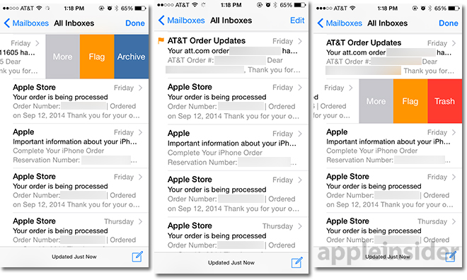
The first substantial change comes in swipe gestures. As seen in the screenshot above, Mail now supports inline swiping gestures for flagging, archiving and deleting messages and threads. Swipe left to reveal email management options directly from the main messages list and tap on a selection to quickly clear an inbox.
A third "More" button brings up a contextual menu to reply, forward, flag, mark as unread, move to junk, move to folder and set an alert notification.
Alternatively, a longer swipe will automatically trash any message without having to perform a lift-and-tap gesture.
In the same vein, swiping right on a message bring up the option to mark it as read, while a longer swipe automatically toggles the read state without needing to tap.
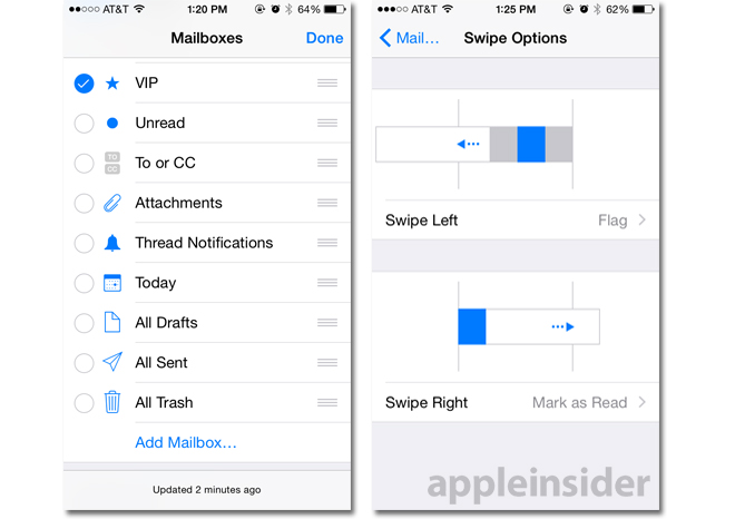
Both right and left swipe gestures can be configured in the Mail, Contacts and Calendars settings menu to perform flag, mark as read and archive operations.
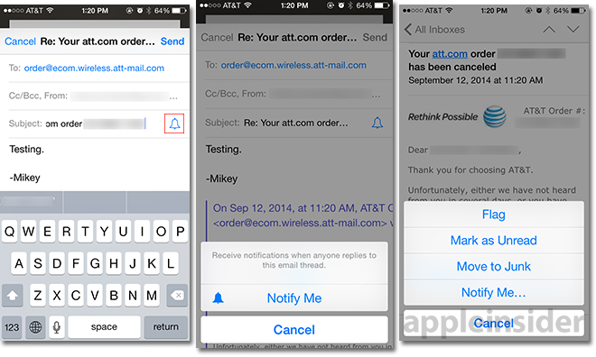
Apple also baked in support for "Notify me" alerts that can be configured to play when Mail receives a reply to an important message. Setting up a reply notification is as easy as clicking on the blue bell icon that appears in the subject line when composing a message.
Alternatively, alerts can be set after a message has been sent by navigating to an email thread, pressing the flag icon at the lower right of the screen and selecting "Notify me" from the contextual pop-up menu. From the main view, notify options can be found by swiping right and selecting "More."
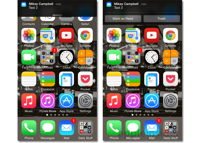
Another handy feature ties into Notification Center. Dubbed interactive notifications, iOS 8 users can now mark messages as read or delete the email altogether from anywhere in the operating system, including the lock screen.
As seen below, the lock screen option is based on the swiping gesture principle, except limits interaction to left swipes only. When an email is received, users can swipe left and tap to mark the message as read or delete it without entering the Mail app.
Elsewhere in iOS, emails will appear in an overlay at the top of the screen via Notification Center. Pulling down on the white "handlebar" will bring up the same "Mark as Read" and "Trash" options.
Another addition is integration with QuickType, Apple's predictive text input system that comes as part of the new iOS 8 soft keyboard. Based on contextual clues, QuickType will suggest a number of word choices or phrases that appear just between the keyboard and text box (or message body in the case of Mail). Tapping on a suggestion will automatically input that text into a message, saving unnecessary key presses and possibly allowing an entire email to be written with a few taps.
According to Apple, QuickType knows who a user is talking to, as well as what the message is concerning, meaning suggestions that pop up for a friend will may be different than those for a colleague. Along with Apple's familiar keyboard, the QuickType API is available to developers making third-party products like Swype.
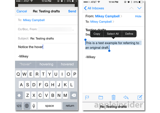
Apple has also made it easier to switch between a drafts and inbox messages, letting users reference information from a received email without having to copy/paste or back out of the draft completely. As seen in the screenshots above, the draft message — or reply message — "hovers" over past emails and can be swiped down to reveal Mail's inbox. From there, users can select, copy and paste information into the new draft or simply refer to previous messages while writing.
Finally, Mail includes buffed data detectors that automatically scan a message for pertinent information like event dates, times and locations, as well as sender information, for quick storage in the Calendar or Contacts apps.
 Mikey Campbell



-m.jpg)



 Wesley Hilliard
 Malcolm Owen
 Amber Neely
 Christine McKee
 Andrew Orr
 Mike Wuerthele and Malcolm Owen







6 Comments
Every year I wonder how they can possibly make it better whilst still keeping it simple and accessible. Every year they amaze me with new, and critically, useful features.
Loving this update already. Quite a bit to learn over the next few days.
Love all the new features of Mail. I would be interested if they could incorporate mail management similar to "Mailbox" however I'm not sure that could be done without making things too complicated. Plus not everyone would use features like that. I'm torn between which of those two mail clients I prefer but if there was an easy way to set a reminder on my emails and have them hidden from my mailbox until they were due then Mail would easily become my favourite.
I'm rather grumpy about the "swipe to archive/delete" behavior. Far too easy to accidentally delete something. I much preferred two intentional actions - swipe & push a button.
Loving the long swipe left to delete. Eliminates a lingering annoyance. ????